Robin's Blog

John Snow’s Cholera data in more formats

In honour of the bicentenary of John Snow’s birth – and because I was asked to by someone via email – I have now released my digitisation of John Snow’s Cholera data in a few other formats: KML and as Google Fusion Tables.

To save you reading my previous blog posts on the subject, I’ll give a brief overview of my data. John Snow produced a famous map in 1854 showing the deaths caused by a cholera outbreak in Soho, London, and the locations of water pumps in the area. By doing this he found there was a significant clustering of the deaths around a certain pump – and removing the handle of the pump stopped the outbreak. This is a bit of a simplification (see Wikipedia or the John Snow Society for more details), but generally covers what happened.

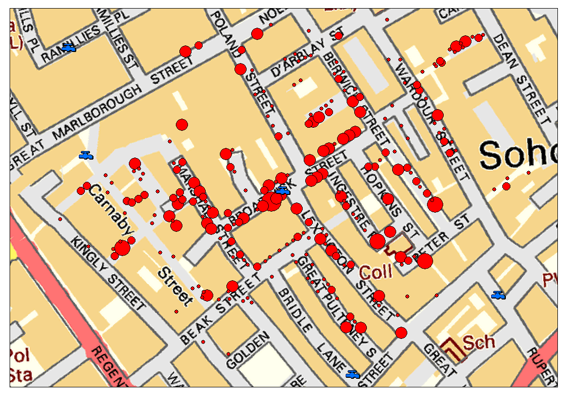
Anyway, I digitised John Snow’s original data and georeferenced it to the Ordnance Survey co-ordinate system, so that I could overlay it on modern maps of that area, as below (using the OS OpenData StreetView data, containing Ordnance Survey data © Crown copyright and database right 2013):

Locations of deaths from Snow's analysis shown on a modern OS Map

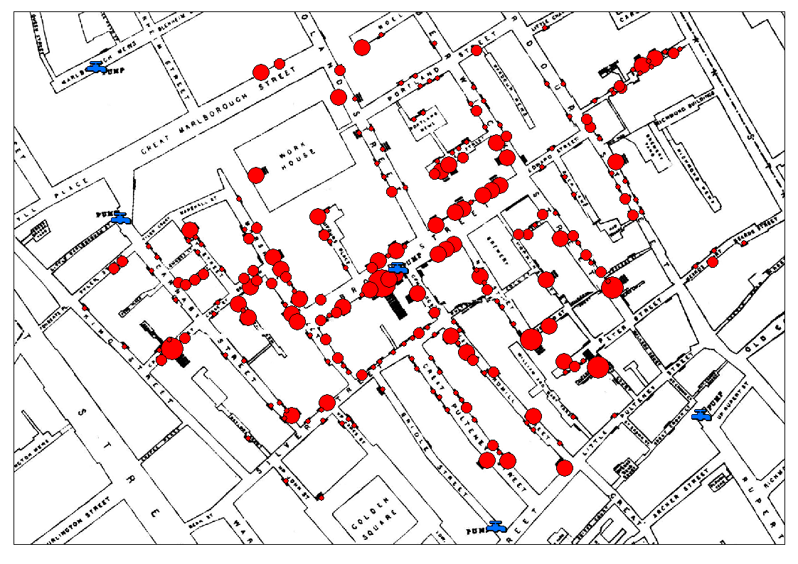
while still being able to overlay it on John Snow’s original map:

Snow's original map with the vector data for pumps and deaths overlainAnyway, the data that is available is:

  • Cholera Death locations (Vector) with attribute data giving the number of deaths at each point
  • Pump locations (Vector)
  • John Snow’s original map georeferenced to the Ordnance Survey National Grid (Raster)
  • Current Ordnance Survey maps of the area (from those released under OS OpenData; Contains Ordnance Survey data © Crown copyright and database right 2013Raster)

These are available for download/use in a number of formats:

  • A zip file with the Vector data as Shapefiles and the Raster data as TIFF images
    (this is the original data provided for download by me – and is probably what you want for importing into a GIS system)
    Download
  • A zip file with the Vector data as KML files and the Raster data as TIFF images
    (suitable for importing into Google Earth and other products that use KML files)
    Download
  • Links to Google Fusion Tables with the vector data already imported
    Cholera Deaths
    Pumps
    Deaths and Pumps together (this dataset has both pump and death points in the same table: pump points have Count values of -999, death points have Count values > 0 which give the number of Cholera deaths at that location)

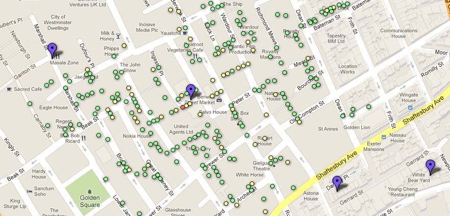
The latter is particularly cool, I think as it allows you to very easily overlay the data on modern Google Maps data, and should allow some interesting ‘mashups’ to be created. All of the tables are set to be shared publically, so you could be able to copy them (using the Copy Table command in the File menu) and play around with them as much as you want! If you click the Example Map tab then you’ll see a very rudimentary map I’ve created using the data on top of Google Maps (see below) – I’m sure you’ll be able to do far better visualisations than that.

Example map from Google Fusion Tables

The folks at CartoDB have also used this data in one of their tutorials which shows you how to import the data to CartoDB and create a styled map to show the deaths with different sized markers – yet another way you can use the ‘first real GIS data’ in today’s modern web-based GIS tools.

So, enjoy – and please let me know (via the comments below) what you create!

Update: There was a problem with the KML files and Google Fusion Tables that I uploaded yesterday, caused by an incorrect co-ordinate transformation between the Ordnance Survey grid references and latitude/longitude. This has now been fixed and the downloads and tables have been updated. Sorry about this.


If you found this post useful, please consider buying me a coffee.
This post originally appeared on Robin's Blog.


Categorised as: Academic, GIS, Python, R


47 Comments

  1. TimSalabim says:

    Hey Robin,
    I am intending to use this in a visualisation course next semester. Thanks for providing the data.
    Cheers
    Tim

  2. […] • DATA: download the full spreadsheet as a Google Fusion table• Available in more formats here […]

  3. […] • DATA: download the full spreadsheet as a Google Fusion table • Available in more formats here […]

  4. […] Z tej okazji na Robin’s Blog pojawiÅ‚y siÄ™ dane zebrane przez Johna Snowa w kilku formatach, miÄ™dzy innymi .shp czy .kml. Po szczegóły zapraszam – dane cholery z roku 1854. […]

  5. […] legacy lives on in health maps everywhere. The London School of Hygiene and Tropical Medicine (LSHTM) is […]

  6. Vincent says:

    Awesome job, thank you.

  7. […] problem.  Here are a variety of resources to explore this classic example.  Here is an article that highlights the spatial thinking that produced this map, with KML files and in Google Fusion […]

  8. […] it to a polluted section of the River Thames. Recent “re-visualizations” of Snow’s data by Robin Wilson and Simon Rogers, using digital mapping techniques, make the connection even more […]

  9. […] map is often used as an example of data visualisation – where new information appears by showing data in a […]

  10. Karen O'Neill says:

    Will use this for politics of environmental issues course on origins of public health policies. Thanks!

  11. […] My work on John Snow’s cholera map was featured in the Guardian datablog purely because they found me on Google (my university press […]

  12. […] 2 https://blog.rtwilson.com/ […]

  13. Clare Griffiths says:

    This is great, really helpful, thank you!

  14. Great post!
    I’ve just created my John Snow’s Map using Google Maps Engine!
    Map: http://goo.gl/ObNRdg
    Related information (in portuguese): http://www.allaboutlocation.net/2014/05/outro-mapa-de-john-snow.html

  15. Jo says:

    Thanks!!!! It was great to find the data. I am making a map for Intro to Cart, thanks.

  16. […] I was working for a training on data visualization, I wanted to get a nice visual for John Snow’s cholera dataset. This dataset can actually be found in a nice package of famous historical […]

  17. […] see what can be done with that package, we will use one more time the John Snow’s cholera dataset, discussed in previous posts (one to get a visualisation on a google map background, and the second […]

  18. […] очаги эпидемии холеры в 1854 году, опираясь на данные John Snow`s Cholera data. Результат наглядно показал, что данный пакет отлично […]

  19. Vineet says:

    Hey Robin,
    This is a great post!!! Will use this visualization for presenting John Snow data in Spatial Class!

  20. Curious if anyone is working with Snows original data, and if he tracked not just deaths by location, but date as well? Looking to insert a time element to the cholera map.

    Thanks,
    David

  21. Robin Wilson says:

    Hi David,

    I’d be interested to know that too – does anyone else on here know anything about temporal data? It’d be great to see how the epidemic developed over time – I can see the potential for some fascinating analyses…

    Cheers,

    Robin

  22. […] • DATA: download the full spreadsheet as a Google Fusion table • Available in more formats here […]

  23. Wei Tu says:

    Hi, Robin:

    Could you please tell me what projection was used for the vector data? I have downloaded the death data and I am trying to run some analyses using ArcGIS software.

    Thanks!

    Wei

  24. Robin Wilson says:

    Hi,

    It’s the Ordnance Survey British National Grid projection (see http://spatialreference.org/ref/epsg/osgb-1936-british-national-grid/). Projection files are included with the shapefiles in the download, so it should automatically be projected properly in ArcGIS.

    Cheers,

    Robin

  25. Wei Tu says:

    Robin:

    Thanks a lot for the explanation. The points somehow were not automatically projected first time that I had tried, but let me try it again.

    Best,

    Wei

  26. Thanks for the data table Robin.
    We have been studying diseases with our Year 9 students and I have made a GoogleEarth kml file displaying the data as 3D polygons and adding links, photos etc.. Only shame is that on Streetview at the moment, you can’t see ‘the’ pump as there is a building site around it!
    The kml is on the KS3 page of our department website (http://www.brygeog.net/ks3.html) under the Tropical Diseases section.

  27. Mohamed Sallam says:

    DId it happen and any of you guys has a shape file for population density during that time?
    Thanks

  28. Robin Wilson says:

    Sorry, no, I don’t know of any information on population density at the time.

  29. Jocelyn Lu says:

    Hi, Robbins,

    I will use these graphs as a good example in a course of data visualization. Thanks for your great job!

  30. Hello Robbin I just located you site and did not know you existed. Do you have any access to Snow’s data from the two water companies. I wanted the statistics from the first and 2nd experiment to see how significant it might be. Unfortunately I am giving a talk on Wed of this wee (10/3/18) so there is little time but in the event that you happen to have access I can use it later. Sorry for the short notice.

  31. Robin Wilson says:

    Unfortunately I don’t have any more information than the stuff that’s already on my website. Sorry!

  32. […] ricostruzione moderna (ad opera di Robin Wilson) della mappa di Snow. I rubinetti azzurri rappresentano le posizioni delle fontanelle, i dischi […]

  33. […] Snow’s Cholera data. (2013). [image] Available at: https://blog.rtwilson.com/john-snows-cholera-data-in-more-formats/ [Accessed 30 Jul. […]

  34. […] So I wanted to give it a try and map an alternative version with Datawrapper. Thanks to Robin Wilson’s digitization, the Cholera map data is available […]

  35. Good day! I am a US-based educator and curriculum developer with North Carolina 4-H. We are creating digital assets aligned to our Microbiology units to support youth during COVID-19. We were wondering if we may please use your work with the John Snow data as the basis for a middle school-level mapping activity we would like to develop. If so, please let me know how you would like to be credited. Thank you so much!

  36. Robin Wilson says:

    Hi – yes that’s fine, please credit me as Robin Wilson and link to the relevant blog post.

  37. Cristina says:

    Hello Robin.
    Congratulations on the blog post!
    I am wondering if I could use your work with the John Snow data in an online course, for a tutorial.
    As you mentioned above, I will credit the data source as Robin Wilson, and add a link to this blog post.
    Thank you!

  38. Robin Wilson says:

    Yes, go ahead – that’s fine.

  39. […] Daten auch in modernen Geodatenformaten herunter laden könnt, in Robin’s Blog im Beitrag „John Snow’s Cholera data in more formats“ [3]. Zur Verfügung stehen die Daten als ESRI-Shapes, TIFFs und […]

  40. Hugh Craig says:

    This looks fabulous. I would love to have this as a data layer for demonstration purposes in our Time-Layered Cultural Map of Australia. However, I can’t get any of the download links to work, apart from the Ordnance Survey one. Clicking on the Google Fusion tables links returns an error message, file not found, and clicking on the other links gives no result. Any thoughts?

  41. benmehal says:

    merci pour le partage

  42. Sabine Timpf says:

    Hi Robin, thank you so much for the data. I am using them in a course on agent-based modeling in a geoinformatics masters programme. If I am happy with the students’ work, I will post it on my teaching webpage.

  43. Rose Batot says:

    Hi Robin, as others have asked – I would like to use this data for my class as a motivation for why data visualization is so important to understanding complex issues. As someone else pointed out, the Google Fusion table links appear to be broken – is there anywhere we could access these?

  44. Robin Wilson says:

    Hi – unfortunately Google ‘turned off’ Google Fusion tables a few years ago (like many other Google products, they didn’t last long). The download links for the GIS data formats on the page should still be working though. Are those any good for you?

  45. […] John Snow’s Cholera data in more formats […]

Leave a Reply

Your email address will not be published. Required fields are marked *