As many of you probably know, I’ve been working towards a PhD at the University of Southampton. This post is the brief story of my PhD, my graduation and my future plans.
So, back in the dim and distant days of 2010, I started a PhD with the Institute for Complex Systems Simulation (ICSS) at the University of Southampton. This is a Doctoral Training Centre (now known as Centres for Doctoral Training, because of an acronym clash!) which offers four-year PhDs: you start off with a year of taught courses (at MSc level, though you don’t actually get awarded an MSc), focused on building skills for your research, and then continue with a fairly standard three-years of research.
My first year was very useful, and covered a range of topics including introductions to complexity science and simulation methods, significant skills development in programming (particularly high-performance computing) and statistics, plus domain-specific courses (such as computer vision, remote sensing and machine learning). Many of these courses were coursework-focused, and helped me develop my writing skills (I also used this opportunity to properly learn LaTeX).
At the end of the taught year I did a ‘Summer Project’, which was equivalent to a MSc dissertation project. Mine had the wonderful title of "Can a single cloud spoil the view?": Modelling the effect of an isolated cumulus cloud on calculated surface solar irradiance". The story of this project is a blog post in itself, but in the mean time you can read my thesis here. I was particularly pleased to find out later that my thesis won the Remote Sensing and Photogrammetry Society (RSPSoc) Masters Thesis Prize – a highly-competitive award.
Paths taken by light in the ray-tracing Radiative Transfer Model I developed for my MSc
One of the benefits of doing a PhD through the ICSS was that I didn’t have to have a detailed plan for my entire PhD when I started: in fact, some of my colleagues didn’t even know what department they wanted to work in, and used the first year as an opportunity to ‘date’ potential supervisors and try out potential topics. I came in knowing I wanted to do a PhD in remote sensing, probably focusing on some sort of quantitative methods development, potentially in the areas of correction and calibration of satellite imagery (areas I’d worked on for my undergraduate dissertation), but I didn’t know much more than that.
By the time I got to the end of my taught year and actually started the ‘research component’ I’d narrowed down a little bit, and realised that I wanted to do something to do with atmospheric aerosols and atmospheric correction. I came up with a plan which involved looking at the spatial variability of atmospheric conditions (principally the aerosol content, as measured by Aerosol Optical Thickness, and water content, as measured by Precipitable Water Vapour). I can’t actually find a copy of this plan at the moment (it’s probably on one of my many external hard disks somewhere), so that vague memory will have to do for now!
What I have managed to find, however, is a copy of a report I produced for my first six-monthly supervisory meeting, summarising roughly what I’d done in that period. Looking back, I’m actually impressed as to what I’d managed to achieve:
I’d started to investigate the spatial variability of the atmosphere over southern England, and had really been struggling with the availability and quality of data. This struggle actually led to a lot of interesting work, one of which was investigating the relationship between visibility (as measured by meteorological stations and airports) and Aerosol Optical Thickness (AOT, the measure of the ‘clarity of the atmosphere’ that I was interested in). According to my notes, I had submitted a paper about this within the first six months – and although that version of the paper was rejected, a later version was published as Wilson et al., 2015 (PDF).
I had finished v1.0 of Py6S, my Python interface to the 6S Radiative Transfer Model. 6S simulates how light passes through the atmosphere under configurable atmospheric conditions, and is widely-used in atmospheric correction of satellite images. Again, I will probably write another article about how the idea for Py6S came about and the way it developed over time, but here I’ll just summarise by saying that developing Py6S was a great idea, it gave me a really useful framework for implementing the rest of my PhD projects, and it saved me a huge amount of time in the long run. Luckily, my supervisors were very supporting of me taking time to create a fully-featured version of Py6S, and I later published a paper on it in Computers & Geosciences as Wilson, 2013 (PDF)
I’d investigated various other ideas, some of which came to fruition throughout the rest of my PhD (developing LED-based sun photometers, validation of GPS-based water vapour measurements, working with other radiative transfer models) and some of which didn’t (attempting to use webcams to monitor visibility and therefore AOT, monitoring various other environmental changes from webcams, developing full spectrometers using LEDs).
I’m pretty sure some of those things were done ‘on the side’ during my taught year, but I can’t remember exactly what I did when. Anyway, by the end of the first six months of full-time research I had a number of interesting ideas, some significant frustrations, some potential papers, and some big questions about where my PhD was going.
I was very aware that a PhD had to ‘tell a story’ and have a coherent thread running through it: I was confident that I could do research, but I knew that putting together 4-5 completely unrelated chapters wouldn’t satisfy an examiner. Reading my notes from meetings at the time show that I was really quite worried about this – there are lots of question marks all over the page, and notes about the importance of finding a good overall structure and aim.
This would come, but it would take some time – and you’ll have to wait until Part 2 for that…
Google have recently introduced a new way of loading their javascript APIs: their Google API Loader. To use it, all you do is add a script tag in your HTML:
and the callback function will run after all of the APIs have loaded.
This is far nicer than including individual URLs to APIs as separate script tags, but the documentation is a bit limited. For example, the list of supported APIs doesn’t include the Google Maps API, but sample code from another team within Google (the Earth Engine team) already uses this method of loading the Maps API.
The problem is that I couldn’t find a way to specify that I wanted to load the Google Maps Places library – so I had to go back to including a script tag:
During the last week, I attended the Next Generation Computational Modelling (NGCM) Summer Academy at the University of Southampton. Three days were spent on a detailed IPython course, run by MinRK, one of the core IPython developers, and two days on a Pandas course taught by Skipper Seaborn and Chris Fonnesbeck.
The course was very useful, and I’m going to post a series of blog posts covering some of the things I’ve learnt. All of the posts will be written for people like me: people who already use IPython or Pandas but may not know some of the slightly more hidden tips and techniques.
Useful Keyboard Shortcuts
Everyone knows the Shift-Return keyboard shortcut to run the current cell in the IPython Notebook, but there are actually three ‘running’ shortcuts that you should know:
Shift-Return: Run the current cell and move to the cell below
Ctrl-Return: Run the current cell and stay in that cell
Opt-Return: Run the current cell, create a new cell below, and move to it
Once you know these you’ll find all sorts of useful opportunities to use them. I now use Ctrl-Return a lot when writing code, running it, changing it, running it again etc – it really speeds that process up!
Also, everyone knows that TAB does autocompletion in IPython, but did you know that Shift-TAB pops up a handy little tooltip giving information about the currently selected item (for example, the argument list for a function, the type of a variable etc. This popup box can be expanded to its full size by clicking the + button on the top right – or, by pressing Shift-TAB again.
Magic commands
Again, a number of IPython magic commands are well known: for example, %run and %debug, but there are loads more that can be really useful. A couple of really useful ones that I wasn’t aware of are:
%%writefile
This writes the contents of the cell to a file. For example:
%%writefile test.txt
This is a test file!
It can contain anything I want...

And more...
Writing test.txt
!cat test.txt
This is a test file!
It can contain anything I want...

And more...
%xmode
This changes the way that exceptions are displayed in IPython. It can take three options: plain, context and verbose. Let’s have a look at these.
First we create a simple module with a couple of functions, this basically just gives us a way to have a stack trace with multiple functions that leads to a ZeroDivisionError.
Now we’ll look at what happens with the default option of context
importmodmod.g(0)
---------------------------------------------------------------------------ZeroDivisionError Traceback (most recent call last)
<ipython-input-6-a54c5799f57e> in <module>() 1import mod
----> 2mod.g(0)/Users/robin/code/ngcm/ngcm_ipython_tutorial/Robin'sNotes/mod.py in g(y) 4 5def g(y):----> 6return f(y+1)/Users/robin/code/ngcm/ngcm_ipython_tutorial/Robin'sNotes/mod.py in f(x) 1 2def f(x):----> 3return1.0/(x-1) 4 5def g(y):ZeroDivisionError: float division by zero
You’re probably fairly used to seeing that: it’s the standard IPython stack trace view. If we want to go back to plain Python we can set it to plain. You can see that you don’t get any context on the lines surrounding the exception – not so helpful!
%xmode plain
Exception reporting mode: Plain
importmodmod.g(0)
Traceback (most recent call last):
File "<ipython-input-8-a54c5799f57e>", line 2, in <module>
mod.g(0)
File "/Users/robin/code/ngcm/ngcm_ipython_tutorial/Robin'sNotes/mod.py", line 6, in g
return f(y+1)
File "/Users/robin/code/ngcm/ngcm_ipython_tutorial/Robin'sNotes/mod.py", line 3, in f return 1.0/(x-1)ZeroDivisionError: float division by zero
The most informative option is verbose, which gives all of the information that is given by context but also gives you the values of local and global variables. In the example below you can see that g was called as g(0) and f was called as f(1).
%xmode verbose
Exception reporting mode: Verbose
importmodmod.g(0)
---------------------------------------------------------------------------ZeroDivisionError Traceback (most recent call last)
<ipython-input-10-a54c5799f57e> in <module>() 1import mod
----> 2mod.g(0)globalmod.g= <function g at 0x10899aa60>/Users/robin/code/ngcm/ngcm_ipython_tutorial/Robin'sNotes/mod.py in g(y=0) 4 5def g(y):----> 6return f(y+1)globalf= <function f at 0x10899a9d8>y= 0/Users/robin/code/ngcm/ngcm_ipython_tutorial/Robin'sNotes/mod.py in f(x=1) 1 2def f(x):----> 3return1.0/(x-1)x= 1 4 5def g(y):ZeroDivisionError: float division by zero
%load
The load magic loads a Python file, from a filepath or URL, and replaces the contents of the cell with the contents of the file. One really useful application of this is to get example code from the internet. For example, the code %load http://matplotlib.org/mpl_examples/showcase/integral_demo.py will create a cell containing that matplotlib example.
%connect_info & %qtconsole
IPython operates on a client-server basis, and multiple clients (which can be consoles, qtconsoles, or notebooks) can connect to one backend kernel. To get the information required to connect a new front-end to the kernel that the notebook is using, run %connect_info:
%connect_info
{
  "control_port": 49569,
  "signature_scheme": "hmac-sha256",
  "transport": "tcp",
  "stdin_port": 49568,
  "key": "59de1682-ef3e-42ca-b393-487693cfc9a2",
  "ip": "127.0.0.1",
  "shell_port": 49566,
  "hb_port": 49570,
  "iopub_port": 49567
}

Paste the above JSON into a file, and connect with:
    $> ipython <app> --existing <file>
or, if you are local, you can connect with just:
    $> ipython <app> --existing kernel-a5c50dd5-12d3-46dc-81a9-09c0c5b2c974.json
or even just:
    $> ipython <app> --existing
if this is the most recent IPython session you have started.
There is also a shortcut that will load a qtconsole connected to the same kernel:
%qtconsole
Stopping output being printed
This is a little thing, that is rather reminiscent of Mathematica, but can be quite handy. You can suppress the output of any cell by ending it with ;. For example:
5+10
15
5+10;
Right, that’s enough for the first part – tune in next time for tips on figures, interactive widgets and more.
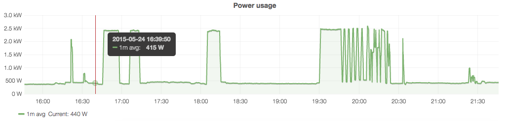
At the end of my last post I left you with a taster of what Part 2 would provide: a way of producing automatically-updating graphs of power usage over time. Part 1 was based purely on Python code that would run on any system (Windows, Linux or OS X) but this part will require a Linux machine running a tool called graphite. Don’t worry, it’s nice and easy to set up, and I’ll take you through it below.
In summary, we are going to set up Graphite, a tool for storing time series data with automatic aggregation to different resolutions, and then write a small daemon in Python to automatically push the power usage data from the CurrentCost to Graphite. Finally, we’ll set up a nicer web interface to Graphite that will give us graphs like this:
(For those who are familiar with it, Graphite is very similar to rrdtool, but – in my humble opinion – a bit nicer to use and more ‘modern-feeling’)
Step 1: Install Graphite
I basically followed the DigitalOcean instructions here, but modified them slightly to my needs. So, read that link for all of the details, but on Ubuntu that is what I did:
Modify /etc/graphite/local_settings.py
Set the key configuration parameters: SECRET_KEY, TIME_ZONE, USE_REMOTE_USER_AUTHENTICATION
Create the database structure sudo graphite-manage syncdb
Modify /etc/default/graphite-carbon
Set CARBON_CACHE_ENABLED=true
Modify /etc/carbon/storage-schemas.conf
This file allows you to configure the ‘storage schemas’ in Graphite that control how aggregation works. This is key to efficient use of Graphite, and it’s worth getting the right schema set up from the start.
The storage schema defines what resolution data is stored for what period of time. For example, have a look at the [default] section at the end of the file. The pattern section specifies a regular expression to match the name of a metric in Graphite. A metric is simply something you’re measuring – in this case we will have two metrics: power usage and temperature, as these are the two interesting things that the CurrentCost measures.
Graphite works down this file from top to bottom, stopping when it finds a match. So, in the [default] section we have a pattern that matches anything – as by the time it gets to this final section we want it to match anything. The retentions section is the interesting bit: here it states 60s:1d, which means to keep data at a 60-second resolution (that is, one data point per minute) for 1 day. Graphite will deal with ensuring that this is the case – aggregating any data that is pushed to Graphite more frequently than once per minute, and removing data that is older than one day.
A more complicated example of a retention string would be 10s:6h,1m:30d,10m:5y,30m:50y, which instructs Graphite to keep data at 10s resolution for 6 hours, 1m resolution for 30 days, 10 minute resolution for 5 years and 30 minute resolution for 50 years. Again, graphite will deal with the resampling that is needed, and this will mean that your detailed 10s-resolution data won’t be kept for 50 years.
I created the following two new entries to store data from my CurrentCost:
[powerusage]

pattern = ^house.power.usage

retentions = 10s:6h,1m:30d,10m:5y,30m:50y
You can see here that I am storing the temperature data at a lower resolution than the power usage data: I will probably want to play around turning appliances on and off in my house to see the effect on the power usage – so I’ll need a high resolution – but I’m unlikely to need that with the temperature. Also note the names that I gave the metrics: it is considered standard to split the name by .’s and work downwards in specificity. I might use this Graphite install for monitoring more metrics about my house, so I’ve decided to use house as an over-arching namespace and then power for everything to do with power monitoring.
Start the carbon service: sudo service carbon-cache start
Setting up the Graphite web interface
Right, you’ve got the basic Graphite system installed: we now just need to set up the web interface. Here I’m going to point you to the Install and Configure Apache section of the DigitalOcean instructions, as it’s a bit too detailed to repeat here. However, just for reference, the content of my virtual host file is here – I had to fiddle around a bit to get it to run on port 81 (as I already had things running on port 80), but using this file plus adding:
Listen 81
NameVirtualHost *:81
to /etc/apache2/ports.conf made it all work happily.
Once you’ve got all of the Apache stuff sorted you should be able to go to http://servername or http://ipaddress (if you’re running this on your local machine then http://127.0.0.1 should work fine) and see the Graphite user interface. Expand the Graphite item in the tree view on the left-hand side, and work your way down until you find the carbon metrics: these are automatically recorded metrics on how the Graphite system itself is working. Clicking on a few metrics should plot them on a graph – and you should see something a bit like this (probably with less interesting lines as your server isn’t doing much at this point):
Step 2: Get CurrentCost data into Graphite
If you’re bored you can just grab the code from this Github repository, but I’m going to take you through it step-by-step here.
Basically, every time you send data to Graphite you need to tell it what metric you’re sending data for (eg. home.power.usage), the value (eg. 436) and the current timestamp. Luckily there’s a Python module that makes this really easy. It’s called graphitesend, and it’s got really good documentation too!
You should be able to install it by running pip install graphitesend, and then you can try running some code. To test it, load up the interactive Python console and run this:
Simple, isn’t it! All we do is initialise the client by giving it the name of the graphite server, and a few configuration options to say what group and prefix we’re going use for the metrics, and then send a dictionary of data.
So, it’s really easy to hook this up to the Python code that I showed in Part 1 that grabs this data from the CurrentCost.
I’ve put these two pieces of code together, and turned the script into a daemon: that is, a program that will stay running all of the time, and will send data to Graphite every 5 seconds or so. All of the code is in the Github repository, and is fairly simple – it uses the python-daemon library to easily run as a ‘well-behaved’ unix daemon. Remember to install this library first with pip install python-daemon.
All you should need to do is grab the code from Github, and then run ./currentcost_daemon.py start to start the daemon and (surprise surprise) ./currentcost_daemon.py stop to stop the daemon. Simple!
Step 4: View the data
Once you’ve got the daemon running you should be able to refresh the Graphite web interface and then drill down in the tree on the left-hand side to house->power->usage, and see a graph of the data. You can experiment with the various items in the Graphite web interface, but if you’re like me then you won’t like the interface much!
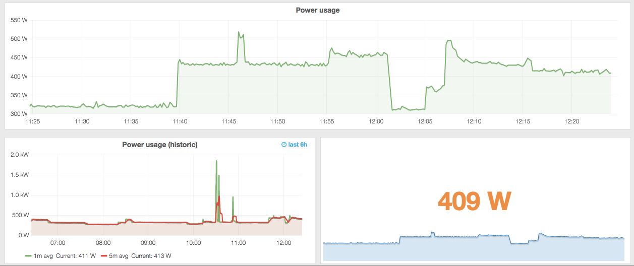
Luckily, there are all sorts of other interfaces to Graphite, including a lovely one called Grafana. Again, it is very well documented, so all I’m going to do is point you to the installation instructions and leave you to it. Without much effort you should be able to produce a power dashboard that looks something like this:
Or even this (with some averages and colour-coded numbers):
After borrowing a CurrentCost electricity usage meter from my local library (if you’re in the area, then Eastleigh library will loan you one for free!), I decided to buy one, as I’d found it very useful in trying to reduce my electricity usage. The benefit of buying one as opposed to borrowing one was that I could start connecting it to a computer and logging data (the one I borrowed didn’t come with a connection cable).
I was impressed with how easy it was to get data from it to the computer. All I did was:
Plug it in to a USB port on my Linux server with the cable (which was provided, but can also be bought separately if necessary – or even madeyourself)
Check what serial device the USB-to-serial adaptor (which is built-in to the cable) is coming up as by running dmesg and checking the final lines of the output. A similar command should work on OS X, and on Windows you should be able to check Device Manager and see what COM port number it has been assigned. In my case, it was /dev/ttyUSB0.
Test it using a serial communication program. For example, on Linux I ran sudo minicom -D /dev/ttyUSB0 -b 57600 (the last argument is essential as it sets the baud rate correctly for the device). On Windows something like Hyperterminal could be used.
You should find that you get a nice XML string back – something like this:
That’s fairly self-explanatory, but just for reference:
src: the model number of the CurrentCost
dsb: days since birth (how long since you turned on the CurrentCost and it started collecting data)
time: self-explanatory
tmpr: temperature (degrees C)
ch1: you can have multiple sensors attached to the CurrentCost, so this tells you which one it is
watts: current power usage in Watts
I’ve written the Python code below to read the XML over the serial connection, parse the data and return it. You’ll need to install pyserial and untangle (a handy XML parsing library for simple, small bits of XML) first using pip.
In the next part of this series, I’ll show how I linked this data up to Graphite to make lovely plots. As a quick taster, here is my current ‘dashboard’ (click for a larger view):
This is really just a quick note for me in the future, and for anyone else who might find this useful.
I have been involved in doing some administration of a Linux server recently – although I haven’t had full control over the server as administrators from the company that own the server have been doing the ‘low-level’ administration, and we need to get permission from them to do various administration tasks.
Anyway, recently they installed a new hard drive as we needed more space on the server. Prior to the installation we had one disk mounted on /, and a lot of data stored in /data. When they mounted the new hard disk they mounted it on /data. Now, we then logged on to the server and found that there was nothing in /data…all of our data had vanished!
Now, although we thought we knew what the cause was, we wanted to tread carefully so we didn’t accidentally do anything would actually lose us any data. So, we did a bit of investigation.
The output of df -h showed that the data that had gone ‘missing’ was still on the disk, as we only had about 50Gb free (hence why a new hard disk had been installed). However, running du -h --max-depth=1 / showed no space was taken up by /data, and the total given at the bottom of the du output didn’t match the total disk usage according to df.
This all confirmed our suspicion that the data was there, but that it was hidden by the new hard disk being mounted ‘over’ it. We simply ran umount /data, and all of our data appeared again, and df and du now agreed.
So, we resolved this long term by:
Mounting the new disk as /newdata
Copying everything from /data to /newdata
Deleting everything inside /data (but not the folder itself)
Remounting /newdata as /data
So, overall it was quite simple, but it was one of those occasions in which we really needed to stop and think, just so we didn’t do anything stupid and lose the valuable data that was on the server.
Summary: Fascinating book covering the whole breadth of high performance Python. It starts with detailed discussion of various profiling methods, continues with chapters on performance in standard Python, then focuses on high performance using arrays, compiling to C and various approaches to parallel programming. I learnt a lot from the book, and have already started improving the performance of the code I wrote for my PhD (rather than writing up my thesis, but oh well…).
Reference: Gorelick, M. and Ozsvald, I., 2014, High Performance Python, O’Reilly, 351pp, Publishers Link
I would consider myself to be a relatively good Python programmer, but I know that I don’t always write my code in a way that would allow it to run fast. This, as Gorelick and Ozsvald point out a number of times in the book, is actually a good thing: it’s far better to focus on programmer time than CPU time – at least in the early stages of a project. This has definitely been the case for the largest programming project that I’ve worked on recently: my PhD algorithm. It’s been difficult enough to get the algorithm to work properly as it is – and any focus on speed improvements during my PhD would definitely have been a premature optimization!
However, I’ve now almost finished my PhD, and one of the improvements listed in the ‘Further Work’ section at the end of my thesis is to improve the computational efficiency of my algorithm. I specifically requested a review copy of this book from O’Reilly as I hoped it would help me to do this: and it did!
I have a background in C and have taken a ‘High Performance Computing’ class at my university, so I already knew some of theory, but was keen to see how it applied to Python. I must admit that when I started the book I was disappointed that it didn’t jump straight into high performance programming with numpy, and parallel programming libraries – but I soon changed my mind when I learnt about the range of profiling tools (Chapter 2), and the significant performance improvements that can be done in pure Python code (Chapters 3-5). In fact, when I finished the book and started applying it to my PhD algorithm I was surprised just how much optimization could be done on my pure Python code, even though the algorithm is a heavy user of numpy.
When we got to numpy (Chapter 6) I realised there were a lot of things that I didn’t know – particularly the inefficiency of how numpy allocates memory for storing the results of computations. The whole book is very ‘data-driven’: they show you all of the code, and then the results for each version of the code. This chapter was a particularly good example of this, using the Linux perf tool to show how different Python code led to significantly different behaviour at a very low level. As a quick test I implemented numexpr for one of my more complicated numpy expressions and found that it halved the time taken for that function: impressive!
I found the methods for compiling to C (discussed in Chapter 7) to be a lot easier than expected, and I even managed to set up Cython on my Windows machine to play around with it (admittedly by around 1am…but still!). Chapter 8 focused on concurrency, mostly in terms of asynchronous events. This wasn’t particularly relevant to my scientific work, but I can see how it would be very useful for some of the other scripts I’ve written in the past: downloading things from the internet, processing data in a webapp etc.
Chapter 9 was definitely useful from the point of view of my research, and I found the discussion of a wide range of solutions for parallel programming (threads, processes, and then the various methods for sharing flags) very useful. I felt that Chapter 10 was a little limited, and focused more on the production side of a cluster (repeatedly emphasising how you need good system admin support) than how to actually program effectively for a cluster. A larger part of this section devoted to the IPython parallel functionality would have been nice here. Chapter 11 was interesting but also less applicable to me – although I was surprised that nothing was mentioned about using integers rather than floats in large amounts of data where possible (in satellite imaging values are often multiplied by 10,000 or 100,000 to make them integers rather than floats and therefore smaller to store and quicker to process). I found the second example in Chapter 12 (by Radim Rehurek) by far the most useful, and wished that the other examples were a little more practical rather than discussing the production and programming process.
Although I have made a few criticisms above, overall the book was very interesting, very useful and also fun to read (the latter is very important for a subject that could be relatively dry). There were a few niggles: some parts of the writing could have done with a bit more proof-reading, some things were repeated a bit too much both within and between chapters, and I really didn’t like the style of the graphs (that is me being really picky – although I’d still prefer those style graphs over no graphs at all!). If these few niggles were fixed in the 2nd edition then I’d have almost nothing to moan about! In fact, I really hope there is a second edition, as one of the great things about this area of Python is how quickly new tools are developed – this is wonderful, but it does mean that books can become out of date relatively quickly. I’d be fascinated to have an update in a couple of years, by which time I imagine many of the projects mentioned in the book will have moved on significantly.
Overall, I would strongly recommend this book for any Python programmer looking to improve the performance of their code. You will get a lot out of it whether you write in pure Python or use numpy a lot, whether you are an expert in C or a novice, and whether you have a single machine or a large cluster.
I’ve just had my second journal paper published, and so I thought I’d start a series on my blog where I explain some of the background behind my publications, explain the implications/applications that my work has, and also provide a brief layman’s summary for non-experts who may be interested in my work. Hopefully this will a long-running series, with at least one post for each of my published papers – if I forget to do this in the future then please remind me!
So, this first post is about:
Wilson, R. T., Milton, E. J., & Nield, J. M. (2014). Spatial variability of the atmosphere over southern England, and its effect on scene-based atmospheric corrections. International Journal of Remote Sensing, 35(13), 5198-5218.
Satellite images are affected by the atmospheric conditions at the time the image was taken. These atmospheric effects need to be removed from satellite images through a process known as ‘atmospheric correction’. Many atmospheric correction methods assume that the atmospheric conditions are the same across the image, and thus correct the whole image in the same way. This paper investigates how much atmospheric conditions do actually vary across southern England, and tries to understand the effects of ignoring this and performing one of these uniform (or ‘scene-based’) atmospheric corrections. The results show that the key parameter is the Aerosol Optical Thickness (AOT) – a measure of the haziness of the atmosphere caused by particles floating in the air – and that it varies a lot over relatively small distances, even under clear skies. Ignoring the variation in this can lead to significant errors in the resulting satellite image data, which can then be carried through to produce errors in other products produced from the satellite images (such as maps of plant health, land cover and so on). The paper ends with a recommendation that, where possible, spatially-variable atmospheric correction should always be used, and that research effort should be devoted to developing new methods to produce high-resolution AOT datasets, which can then be used to perform these corrections.
Key conclusions
I always like my papers to answer questions in a way that actually affects what people do, and in this case there are a few key ‘actionable’ conclusions:
Wherever possible, use a spatially-variable (per-pixel) atmospheric correction – particularly if your image covers a large area.
Effort should be put into developing methods to retrieve high-resolution AOT from satellite images, as this data is needed to allow per-pixel corrections to be carried out.
Relatively low errors in AOT can cause significant errors in atmospheric correction, and thus errors in resulting products such as NDVI. These errors may result from carrying out a uniform atmospheric correction when the atmosphere was spatially-variable, but they could just be due to errors in the AOT measurements themselves. Many people still seem to think that the NDVI isn’t affected by the atmosphere, but that is wrong: you must perform atmospheric correction before calculating NDVI, and errors in atmospheric correction can cause significant errors in NDVI.
Key results
The range of AOT over southern England was around 0.1-0.5 on both days
The range of PWC over southern England was around 1.5-3.0cm and 2.0-3.5cm on the 16th and 17th June respectively
An AOT error of +/- 0.1 can cause a 3% error in the NDVI value
History & Comments
When I started my PhD I tried to find a paper like this one – and I couldn’t find one. I could find all sorts of comments in the literature – and in informal conversations with academics – that said that per-pixel atmospheric corrections were far better than scene-based corrections, but no-one seemed to have actually investigated the errors involved. So, I decided to investigate this myself as a sort of ‘Pilot Study’ for my PhD. This paper is basically a re-working of this Pilot Study.
Once I got started on this work I realised why no-one had done it! The first thing I needed to do was to use data on Aerosol Optical Thickness (AOT) and Precipitable Water Vapour (PWC) to find out how much spatial variation there is in these parameters. Unfortunately, the data is generally very low resolution, and so it is difficult to get a fair sense of how these parameters vary. In fact, almost half of the paper is taken up with describing the datasets that I’ve used, doing some validation on them, and then explaining how I used these datasets to estimate the range of values found over southern England during the dates in question. The datasets didn’t always agree particularly well, but we managed to establish approximate ranges of the values over the days in question.
Both of the days in question were relatively clear summer days, and I was surprised about the range of AOT and PWC values that we found. They were definitely nothing like uniform!
Once we’d established the range of AOT and PWC values, we performed simulations to establish the difference between a uniform atmospheric correction and a spatially-variable atmospheric correction. These simulations were carried out using Py6S: my Python interface to the 6S radiative transfer model. This made it very easy to perform multiple simulations at a range of wavelengths and with varying AOT and PWC values, and then process the data to produce useful results.
When performing a uniform atmospheric correction, a single AOT (or PWC) value is used across the whole image. We took this value to be the mean of the AOT (or PWC) values measured across the area, and then examined the errors that would result from correcting a pixel with this mean AOT when it actually had a higher or lower AOT. We performed simulations taking this higher AOT to be the 95th percentile of the AOT distribution, and the lower AOT to be the 5th percentile of this distribution. This meant that the errors found from the simulations would be found in at least 10% of the pixels in an image covering the study area.
Data, Code & Methods
Unfortunately I did the practical work for this paper before I had really taken on board the idea of ‘reproducible research’, so the paper isn’t easy to reproduce automatically. However, I do have the (rather untidy) code that was used to produce the results of the paper – please contact me if you would like a copy of this for any reason. The data are available from the following links – some of it is freely available, some only for registered academics:
MODIS: Two MODIS products were used, the MOD04 10km aerosol product and the MOD05 1km water vapour product. These were both acquired for tile h17v03 on the 16th and 17th June 2006, and are available to download through LADSWEB.
AERONET: Measurements from the Chilbolton site were used – available here.
The last few months have seen a flurry of activity in Py6S – probably caused by procrastinating from working on my PhD thesis! Anyway, I thought it was about time that I summarised the various updates and new features which have been released, and gave a few more details on how to use them.
These have all been released since January 2014, and so if you’re using version 1.3 or earlier then it’s definitely time to upgrade! The easiest way to upgrade is to simply run
pip install -U Py6S
in a terminal, which should download the latest version and get it all set up properly. So, on with the new features.
A wide range of bugfixes
I try to fix any actual bugs that are found within Py6S as soon as they are reported to me. The bugs fixed since v1.3 include:
More accurate specificiation of geometries (all angles were originally specified as integers, now they are specified as floating point values)
Fixed errors when setting custom altitudes in certain situations – for example, when altitudes have been set and then re-set
Fixes for ambiguity in dates when importing AERONET data – previously if you specified a date such as 01/05/2014 which could be interpreted either day-first (1st May) or month-first (5th January) then it assumed month-first, which was the opposite what the documentation specified. This now assumes day first – consistent with the documentation
Error handling has been improved for situations when 6S itself crashes with an error – rather than Py6S crashing it now states that 6S itself has encountered an error
Added the extraction of two outputs from the 6S output file that weren’t extracted previously: the integrated filter function and the integrated solar spectrum
Parallel processing support
Now when you use functions that run 6S for multiple wavelengths or multiple angles (such as the run_landsat_etm or run_vnir functions) they will automatically run in parallel. From the user’s point of view, everything should work in exactly the same way, but it’ll just be faster! How much faster, depends on your computer. If you’ve got a dual-core processor then it should be almost (but not quite) twice as fast. For a quad-core then it will probably be around three times faster, for an eight-core machine then it will probably be more like five times as fast. If you want to experiment then there is an extra parameter that you can pass to any of these functions to specify how many 6S runs to perform in parallel – just run something like:
run_landsat_etm(s, 'apparent_radiance', n=3)
to run three 6S simulations in parallel.
I’ve tested the parallel processing functionality extensively, and I’m very confident that it produces exactly the same answers as the non-parallel version. However, if you do run into any problems then please let me know immediately, and I’ll do whatever fixes are necessary.
Python 3 compatibility
Py6S is now fully compatible with Python 3. This has involved a number of changes to the Py6S source code, as well as doing some alterations to some of the dependencies so that they all work on Python 3 too. I don’t use Python 3 much myself, but all of the automated tests for Py6S now run on both Python 2.7 and Python 3.3 – so that should pick up any problems. However, if you do run into any issues, then please contact me.
Added wavelengths for two more sensors
Spectral response functions for Landsat 8 OLI and RapidEye are now included in the PredefinedWavelengths class, making it easy to simulate using these bands by code as simple as:
I’m happy to add the spectral response functions for other sensors – please email me if you’d like another sensor, and provide a link to the spectral response functions, and I’ll do the rest.
The future…
I’ve got lots of plans for the future of Py6S. Currently I’m finishing off my PhD, which is having to take priority over Py6S, but as soon as I’ve finished I should be able to release a number of new features.
Currently I’m thinking about ways to incorporate the building of Lookup Tables into Py6S – this should make running multiple simulations far quicker, and is essential to use Py6S for performing atmospheric corrections on images. I’m also considering a possible restructuring of the Py6S interface (or possibly a separate ‘modern’ Pythonic interface) for version 2.0 or 3.0. I’m also planning to apply to the Software Sustainability Institute Open Call, next year, with the aim of developing the software, and the community, further.
This post is more a note to myself than anything else – but it might prove useful for someone sometime.
In the dim and distant mists of time, I set up a startup file for ENVI which automatically loaded a specific image every time you opened ENVI. I have no idea why I did that – but it seemed like a good idea at the time. When tidying up my hard drive, I removed that particular file – and ever since then I’ve got a message each time I load ENVI telling me that it couldn’t find the file.
I looked in the ENVI preferences window, and there was nothing listed in the Startup File box (see below) – but somehow a file was still being loaded at startup. Strange.
I couldn’t find anything in the documentation about where else a startup file could be configured, and I searched all of the configuration files in the ENVI program folder just in case there was some sort of command in one of them – and I couldn’t find it anywhere.
Anyway, to cut a long story short, it seems that ENVI will automatically run a startup file called envi.ini located in your home directory (C:\Users\username on Windows, \home\username on Linux/OS X). This file existed on my machine, and contained the contents below – and deleting it stopped ENVI trying to open this non-existent file.
; envi startup script
open file = C:\Data\_Datastore\SPOT\SPOT_ROI.bsq