Last week I presented a poster at PyData Global 2020, about linking the pint and SQLAlchemy libraries together to provide robust handling of units with databases in Python.
The poster is shown below: click to enlarge so you can read the text:
The example code is available on Github and is well-commented to make it fairly easy to understand.
That poster was designed to be read when you had the opportunity to chat to me about it: as that isn’t necessarily the case, I’ll explain some of it in more detail below.
Firstly, the importance of units: I’m sure you can come up with lots of examples of situations when it’s really important to know what units your data are in. 42 metres, 42 miles and 42 lightyears all mean very different things in the real world! One of the most famous examples of this is the failure of the Mars Climate Orbiter – a spacecraft sent to observe Mars which failed when some data was provided in the wrong units.
The particular situation in which we came across this problem was in some software for processing shipping data. This data was derived from a range of sources, all of which used different units. We needed to make sure that we were associating each measurement with the right units, so that we could then accurately compare measurements.
When you need to deal with units in Python, the answer is almost always to use the pints library. This provides a great Quantity object which stores a numerical value alongside its units. These objects can be created really easily using the multiplication operator. For example:
distance = 5.2 * unit_registry.metres
(Yes, as someone asked in the poster session, both spellings of metres/meters are accepted!)
Pint has data on almost every unit you could think of built-in, along with their conversion factors, their unit abbreviations, and so on.
Once you’ve got a Quantity object like that, you can do useful things like convert it to another unit:
distance.to(unit_registry.miles)
This is great, and we built this in to our software from an early stage, using Quantity objects as much as possible. However, we then needed to store these measurements in a database. Originally our code looked like this:
# Read measurement from file
measurement = 50.2
# Assign units to it
measurement = measurement * unit_registry.yards
# Convert to units we want in the database
measurement_in_m = measurement.to(unit_registry.metre)
# Store in the database
db_model.distance = measurement
This was very error-prone, as we could forget to assign the proper units, or forget to convert to the units we were using in the database. We wanted a way for our code to stop us making these sorts of mistakes!
We found we could do this by implementing a hybrid_property in our SQLAlchemy model, which would check our data and do any necessary conversions before setting the value in the database. These work in the same way as standard ‘getter and setter’ properties on objects, where they run some code when you set or get a value from an attribute.
As is often the case with using getter/setters methods, the actual value is stored in a variable prefixed with an underscore – such as _distance, and the getter/setter names are distance.
In the getter we grab the value from _distance, which is always stored in metres, and return it as a Quantity object with the units set to metres.
In the setter, we check that the value we’re passing has a unit assigned, and then check the ‘dimensionality’ of the unit – for example, we check it is a valid length unit, or a valid speed unit. We then convert it to metres and store it in the _distance member variable.
For more details on how this all works, have a look at the example code.
This is ‘good enough’ for the work I’m doing at the moment, but I’m hoping to find some time to look at extending this: someone at the conference suggested that we could get rid of some of the boilerplate here by using factories or metaclasses, and I’d like to investigate that.
I’ve neglected this blog for a while – partly due to the chaos of 2020 (which is not great), and partly due to being busy with work (which is good!). Anyway, I’m starting to pick it up again, and I thought I’d start with something that caught me out the other day.
So, let’s start with some fairly simple code using the sqlite3 module from the Python standard library:
import sqlite3
with sqlite3.connect('test.db') as connection:
    result = connection.execute("SELECT name FROM sqlite_master;")
    # Do some more SQL queries here

# Do something else here
What would you expect the state of the connection variable to be at the end of that code?
If you thought it would be closed (or possibly even undefined), then you’ve made the same mistake that I made!
I assumed that using sqlite3.connect as a context manage (in a with block) would open a connection when you entered the block, and close a connection when you exited the block.
It turns out that’s not the case! According to the documentation:
Connection objects can be used as context managers that automatically commit or rollback transactions. In the event of an exception, the transaction is rolled back; otherwise, the transaction is committed.
That is, it’s not the connect function that is providing the context manager, it’s the connection object that the functions returns which provides the context manager. And, using a connection object as a context manager handles transactions in the database rather than opening or closing the database connection itself: not what I had imagined.
So, if you want to use the context manager to get the transaction handling, then you need to add an explicit connection.close() outside of the block. If you don’t need the transaction handling then you can do it the ‘old-fashioned’ way, like this:
import sqlite3

connection = sqlite3.connect('test.db')
result = connection.execute("SELECT name FROM sqlite_master;")
# Do some more SQL queries here
connection.close()
Personally, I think that this is poor design. To replicate the usage of context managers elsewhere in Python (most famously with the open function), I think a context manager on the connect call should be used to open/close the database, and there should be a separate call to deal with transactions (like with connection.transaction():). Anyway, it’s pretty-much impossible to change it now – as it would break too many things – so we’d better get used to the way it is.
For context (and to help anyone Googling for the exact problem I had), I was struggling with getting some tests working on Windows. I’d opened a SQLite database using a context manager, executed some SQL, and then was trying to delete the SQLite file. Windows complained that the file was still open and therefore it couldn’t be deleted – and this was because the context manager wasn’t actually closing the connection.
I made a concerted effort to read more in 2019 – and I succeeded, reading a total of 42 books over the year (and this doesn’t even include the many books I read to my toddler).
I’ve chosen a selection of my favourites from the year to highlight in this blog post in the hope that you may enjoy some of them too.
Non-fiction
Countdown to Zero Day: Stuxnet and the Launch of the World’s First Digital Weapon by Kim Zetter
This book covers the fascinating story of the Stuxnet virus which was created to attack nuclear enrichment plants in Iran. It has enough technical details to satisfy me (particularly if you read all the footnotes), but is still accessible to less technical readers. The story is told in a very engaging manner, and the subject matter is absolutely fascinating. My only criticism would be that the last couple of chapters get a bit repetitive – but that’s a minor issue. Amazon link
Just Mercy by Bryan Stephenson
I saw this book recommended on many other people’s reading lists, and was glad it read it. It was well-written and easy to read from a language point of view, but very hard to read from an emotional point of view. The stories of miscarriages of justice – particularly for black people – are terrifying, and really reinforced my opposition to capital punishment. Amazon link
The Hut 6 Story by Gordon Welchman
I visited Bletchley Park last year – on a rare child-free weekend with my wife – and saw this book referred to a number of times in the various exhibitions there. I’d read a lot of books about the Bletchley Park codebreakers before but this one is far more technical than most and gives a really detailed description of the method that Gordon worked out for cracking one of the Enigma codes. I must admit that the appendix covering how the ‘diagonal board’ addition to the Bombes worked went a bit over my head – but the rest of it was great. Amazon link
Atomic Accidents by James Mahaffey
I was recommended this book by various people on Twitter who kept quoting bits about how people thought ‘Plutonium fires wouldn’t be a big deal’, alongside other amusing quotes. I thought I knew quite a bit about nuclear accidents – given that I worked for a nuclear power station company, and have quite an interest in accident investigations – but I really enjoyed this book and learned a lot about various accidents that I hadn’t heard of before. It’s very readable – although occasionally a bit repetitive – and a fun read. Amazon link
Prisoners of Geography by Tim Marshall
I can’t remember how I came across this book, but I’m glad that I did – it’s a fascinating look at how geography (primarily physical geography) affects countries and their relationships with each other. Things like the locations of mountain ranges, or places where you can access deep-water ports, have huge geopolitical consequences – and this book explores this for a selection of ten countries/regions. This book really helped me understand a number of world events in their geopolitical context, and I think of it often when listening to the news or reading about current events. Amazon link
The Matter of the Heart: A History of the Heart in Eleven Operations by Thomas Morris
This is a big book – and fairly heavy-going in places – but it’s worth the effort. It’s a fascinating look at the heart and how humans have learnt to ‘fix’ it in various ways. It’s split into chapters about various different operations – such as implanting pacemakers, replacing valves, or transplanting an entire heart – and each chapter covers the whole historical development of that operation, from first conception to eventual widespread success. There are lot of fascinating stories (did you know that CPR was only really introduced in the 1960s?) and it’s amazing how informally a lot of these operations started – and how many people unfortunately died before the operations became successful. Amazon link
The Dam Busters by Paul Brickhill
I’d enjoyed some of Paul Brickhill’s other books (such as The Great Escape), and yet this book had been sitting on my shelf, unread, for years. I finally got round to reading it, and enjoyed it more than I thought. A lot of the first half of the book is actually about the development of the bomb – I thought it would be all about the actual raid itself – and I found this very enjoyable from a technical perspective. The story of the raid is well-written – but I found the later chapters about some of the other things that the squadron did less interesting. Amazon link
The Vaccine Race: How Scientists Used Human Cells to Combat Killer Viruses by Meredith Wadman
I’d never really thought about how vaccines were made – but I found this book around the time that I took my son for some of his childhood vaccinations, and found it fascinating. There are a lot of great stories in this book, but the reason it’s at the end of my list is that it is a bit heavy-going at times, and some of the stories are probably a bit gruesome for some people. Still, it’s a good read. Amazon link
Fiction
I’ve read far more fiction in the last year than I have for quite a while – but they were mostly books by two authors, so I’ll deal with those two authors separately below.
Robert Harris
I read Robert Harris’ book Enigma many years ago and really enjoyed it, but never got round to reading any of his other work. This year I made up for this, reading Conclave – which is about the intrigue surrounding the election of a new Pope, Pompeii – which focuses on an aqueduct engineer noticing changes around Vesuvius before the eruption, and An Officer and a Spy – which tells the true story of a miscarriage of justice in 19th century France. I thoroughly enjoyed all of these – there’s something about the way that Harris sets a scene and really helps you to get the atmosphere of Roman Pompeii or the Sistine Chapel during the vote for a new Pope.
Rosie Lewis
I came across Rosie Lewis through a free book available on the Kindle store and was gripped. Rosie is a foster carer and writes with clarity and feeling about her experiences fostering various children. Her books include Torn, Taken, Broken and Betrayed, and each of them has thoroughly engaged me. As with Just Mercy above, it is an easy, but emotional, read – I cried multiple times while reading these. My favourite was probably Taken, but they were all good.
The Last Days of Night by Graham Moore
This book is a novelisation of true events around the development of electricity and the electric light bulb, focusing particularly on the patent dispute between Tesla, Westinghouse and Edison over who invented the lightbulb – and also their arguments over the best sort of current to use (AC vs DC). The book has everything: nice technical detail on electrical engineering, and a love story with lots of intrigue along the way. Amazon link
As I’ve mentioned before, I give talks on a range of topics to various different audiences, including local science groups, school students and at programming conferences.
I’ve already got a number of talks in the calendar for this year, as detailed below. I’ll try and keep this post up-to-date as I agree to do more talks. All of these talks (so far) are in southern England – so if you’re local then please do come along and listen.
So far all of my bookings are for one of my talks – an introduction to satellite imaging and remote sensing called Monitoring the environment from space. I do a number of other talks (see list here) and I’d love the opportunity to present them to your group: please get in touch to find out more details.
Southampton Cafe Scientifique
21st January @ 20:00
St Denys, Southampton
Title: Monitoring the environment from space More details
Isle of Wight Cafe Scientifique
10th February @ 19:00
Shanklin, Isle of Wight
Title: Monitoring the environment from space More details
Three Counties Science Group
17th February @ 13:45
Chiddingford, near Godalming, Surrey
Title: Monitoring the environment from space More details
Southampton Astronomy Society
9th April @ 19:30
Shirley, Southampton
Title: Monitoring the environment from space More details
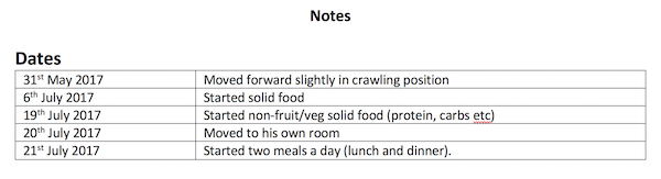
For a number of years – since my now-toddler son was a small baby – I’ve been keeping track of various childhood achievements or memories. When I first came up with this I was rather sleep-deprived, and couldn’t decide what the best way to store this information would be – so I went with a very simple option. I just created a Word document with a table in it with two columns: the date, and the activity/achievement/memory. For example:
This was very flexible as it allowed me to keep anything else I wanted in this document – and it was portable (to anyone who have access to some way of reading Word documents) – and accessible to non-technical people such as my son’s grandparents.
After a while though, I wondered if I’d made the right decision: shouldn’t I have put it into some other format that could be accessed programmatically? After all, if I kept doing this for his entire childhood then I’d have a lot of interesting data in there…
Well, it turns out that a Word table isn’t too awful a format to store this sort of data in – and you can access it fairly easily from Python.
Once I realised this, I worked out what I wanted to create: a service that would email me every morning listing the things I’d put as diary entries for that day in previous years. I was modelling this very much on the Timehop app that does a similar thing with photographs, tweets and so on, so I called it julian_timehop.
If you just want to go to the code then have a look at the github repo – otherwise, read on to find out how I did it.
Steps
Let’s start by thinking about what the main steps we need to take are:
First we need to get hold of the document. I update it fairly regularly, and it lives on my laptop – whereas this script would need to run on my Linux server, so it can easily run at the same time each day. The easiest way around this was to store the document in Dropbox and use the Dropbox API to grab a copy when we run the script.
We then need to parse the document to extract the table of diary entries.
Once we’ve got the table, we can subset it to the rows that match today’s date (ignoring the year)
We then need to prepare the text of an email based on these rows, and then send the email
Let’s look at each of these in turn now.
Getting the file from Dropbox
We want to do pretty-much the simplest operation possible using the Dropbox API: login and retrieve the latest version of a file. I’ve used the Dropbox API from Python before (see my post about analysing my thesis-writing timeline with Dropbox) and it’s pretty easy. In fact, you can accomplish this task with just four lines of code.
First, we need to connect to Dropbox and authenticate. To do this, we’ll use a Dropbox API key (see here for instructions on how to get one). We don’t want to include this API key directly in the code – as we could accidentally share it with someone else (for example, by uploading the code to Github) – so we store in an environment variable called DROPBOX_KEY.
We can get the key from this environment variable with
dropbox_key = os.environ.get('DROPBOX_KEY')
We can then create a Dropbox API connection and authenticate
dbx = dropbox.Dropbox(dropbox_key)
To download a file, we just call the files_download_to_file method
dbx.files_download_to_file(output_filename, path)
In this case the path argument is the path of the file inside the Dropbox folder – in my case the path is /Notes and diary entries for Julian.docx as the file is in the root Dropbox folder.
Putting this together we get a function to download a file from Dropbox
def download_file(path):
    """
    Download a file from Dropbox, returning the local filename of the downloaded file

    Requires the DROPBOX_KEY env var to be set to a valid Dropbox API key
    """
    dropbox_key = os.environ.get('DROPBOX_KEY')
    dbx = dropbox.Dropbox(dropbox_key)
    output_filename = 'document.docx'
    dbx.files_download_to_file(output_filename, path)

    return output_filename
That’s the first step completed; next we need to extract the table from the Word document.
Extracting the table
In a previous job I did some work which involved automating the creation of Powerpoint presentations, and I used the excellent python-pptx library for reading and writing Powerpoint files. Conveniently, there is a sister library available for Word documents called python-docx which works in a very similar way.
We’re going to convert the Word table to a pandas DataFrame, so after installing python-docx we need to import the main Document class, along with pandas itself
from docx import Document
import pandas as pd
We can parse the document by creating an instance of the Document class with the filename as a parameter
doc = Document(filename)
The doc object has various useful methods and attributes – and one of these is a list of tables in the document. We know that we want to parse the first table – so we just select the 0th index
tab = doc.tables[0]
To create a pandas DataFrame, we need a list containing the contents of each column: here that means a list of dates and a list of entries.
tab.column_cells(0) gives us an iterator over all the cells in column 0, and each cell has a .text method to give the text content of that cell – so we can write a list comprehension to extract all of the contents into a list
dates = [cell.text for cell in tab.column_cells(0)]
We can then use the very handy pd.to_datetime function to convert these to actual date objects. We pass the argument errors='coerce' to force it to parse all entries in the list, without giving errors if one of them isn’t a valid date (in this case it will return NaT or Not a Time).
We can do the same for descriptions, and then put the descriptions and dates together into a DataFrame.
Here is the full code:
def read_table_from_doc(filename):
    doc = Document(filename)
    tab = doc.tables[0]

    dates = [cell.text for cell in tab.column_cells(0)]
    dates = pd.to_datetime(dates, errors='coerce')

    descs = [cell.text for cell in tab.column_cells(1)]

    df = pd.DataFrame({'desc':descs}, index=dates)

    return df
Creating the text for an email
The next step is to create the text to put in an email message, listing the date and the various memories. I wanted an output that looked like this:
01 December
2018:
Memory from 2018
2018:
Another memory from 2018
2017:
A memory from 2017
The code for this is fairly simple, and I’ll only mention the interesting bits.
Firstly, we create a subset of the DataFrame, where we only have the rows where the date was the same as today’s date (ignoring the year):
Here we’re combining two boolean indexing operations with & – though do remember to use brackets, as the order of precedence inside these boolean expressions doesn’t always work in the way you’d expect (I’ve been caught out by this a number of times).
As I knew this would only be running on my server, I could use new Python 3.7 features – so I used f-strings. This means that the body of my loop to create the HTML for the email body looks like this
text += f"<p><b>{i.year!s}:</b></br>{row['desc']}</p>\n\n"
Here we’re including variables such as i.year (the year value of the datetime index) and row['desc'] (the value of the desc column of this row).
Putting it together into a function gives the following code, which either returns the HTML text of the email or None if there are no events matching this date
def get_formatted_message(df):
today = datetime.datetime.now()
subdf = df[(df.index.month == today.month) & (df.index.day == today.day)]
if len(subdf) == 0:
return
title_date = datetime.datetime.now().strftime('%d %B')
text = f'<h2>{title_date}</h2>\n\n'
for i, row in subdf.iterrows():
text += f"<p><b>{i.year!s}:</b></br>{row['desc']}</p>\n\n"
return text
Sending the email
I’ve written code to send emails in Python before, and had great difficulty. Emails are a lot more difficult than a lot of people think, and often my emails never got sent, or never got to their destination, or broke in some other way.
This time I managed to avoid all of those problems by using the emails library. Writing a send_email function using this library was so easy:
All of the code above is self-explanatory: we’re creating a HTML email message (it details with all of the escaping and encoding necessary), grabbing the password from another environment variable and then sending the email. Easy!
Putting it all together
We’ve now written a function for each individual step – and now we just need to put the functions together. The benefit of writing your script this way is that the main part of your script is just a few lines.
In this case, all we need is
filename = download_file('/Notes and diary entries for Julian.docx')
df = read_table_from_doc(filename)
text = get_formatted_message(df)
if text is not None:
    send_email(text)
Another benefit of this is that for anyone (including yourself) coming back to it in the future, it is very easy to get an overview of what the script does, before delving into the details.
So, I now have this set up on my server to send me an email every morning with some memories of my son’s childhood. Here’s to many more happy memories – and remember to check out the code if you’re interested.
I do freelance work on Python programming and data science – please see my freelance website for more details.
My son goes to a nursery part-time, and the nursery uses a system called ParentZone from Connect Childcare to send information between us (his parents) and nursery. Primarily, this is used to send us updates on the boring details of the day (what he’s had to eat, nappy changes and so on), and to send ‘observations’ which include photographs of what he’s been doing at nursery. The interfaces include a web app (pictured below) and a mobile app:
I wanted to be able to download all of these photos easily to keep them in my (enormous) set of photos of my son, without manually downloading each one. So, I wrote a script to do this, with the help of Selenium.
If you want to jump straight to the script, then have a look at the ParentZonePhotoDownloader Github repository. The script is documented and has a nice command-line interface. For more details on how I created it, read on…
Selenium is a browser automation tool that allows you to control pretty-much everything a browser does through code, while also accessing the underlying HTML that the browser is displaying. This makes it the perfect choice for scraping websites that have a lot of Javascript – like the ParentZone website.
To get Selenium working you need to install a ‘webdriver’ that will connect to a particular web browser and do the actual controlling of the browser. I’ve chosen to use chromedriver to control Google Chrome. See the Getting Started guide to see how to install chromedriver – but it’s basically as simple as downloading a binary file and putting it in your PATH.
My script starts off fairly simply, by creating an instance of the Chrome webdriver, and navigating to the ParentZone homepage:
The next line: driver.implicitly_wait(10) tells Selenium to wait up to 10 seconds for elements to appear before giving up and giving an error. This is useful for sites that might be slightly slow to load (eg. those with large pictures).
We then fill in the email address and password in the login form:
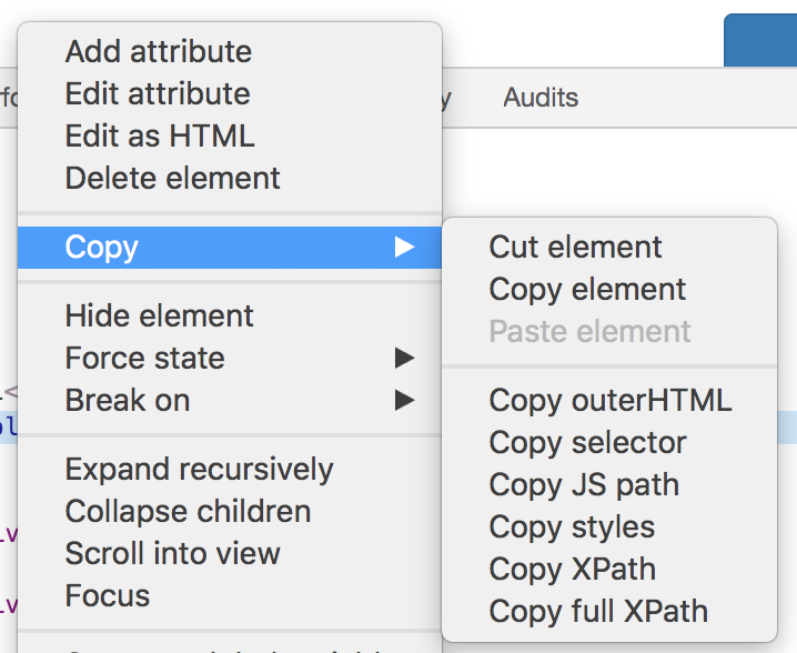
Here we’re selecting the email address field using it’s XPath, which is a sort of query language for selecting nodes from an XML document (or, by extension, an HTML document – as HTML is a form of XML). I have some basic knowledge of XPath, but usually I just copy the expressions I need from the Chrome Dev Tools window. To do this, select the right element in Dev Tools, then right click on the element’s HTML code and choose ‘Copy->Copy XPath’:
We then clear the field, and fake the typing of the email string that we took as a command-line argument.
We then repeat the same thing for the password field, and then just send the ‘Enter’ key to submit the field (easier than finding the right submit button and fake-clicking it).
Once we’ve logged in and gone to the correct page (the ‘timeline’ page) we want to narrow down the page to just show ‘Observations’ (as these are usually the only posts that have photographs). We do this by selecting a dropdown, and then choosing an option from the dropdown box:
I found the right value (7) to set this to by reading the HTML code where the options were defined, which included this line: <option value="7">Observation</option>.
Now we get to the bit that had me stuck for a while… The page has ‘infinite scrolling’ – that is, as you scroll down, more posts ‘magically’ appear. We need to scroll right down to the bottom so that we have all of the observations before we try to download them.
I tried using various complicated Javascript functions, but none of them seemed to work – so I settled on a naive way to do it. I simply send the ‘End’ key (which scrolls to the end of the page), wait a few seconds, and then count the number of photos on the page (in this case, elements with the class img-responsive, which is used for photos from observations). When this number stops increasing, I know I’ve reached the point where there are no more pictures to load.
The code that does this is fairly easy to understand:
html = driver.find_element_by_tag_name('html')
old_n_photos = 0
while True:
    # Scroll
    html.send_keys(Keys.END)
    time.sleep(3)
    # Get all photos
    media_elements = driver.find_elements_by_class_name('img-responsive')
    n_photos = len(media_elements)

    if n_photos > old_n_photos:
        old_n_photos = n_photos
    else:
        break
We’ve now got a page with all the photos on it, so we just need to extract them. In fact, we’ve already got a list of all of these photo elements in media_elements, so we just iterate through this and grab some details for each image. Specifically, we get the image URL with element.get_attribute('src'), and then extract the unique image ID from that URL. We then choose the filename to save the file as based on the type of element that was used to display it on the web page (the element.tag_name). If it was a <img> tag then it’s an image, if it was a <video> tag then it was a video.
We then download the image/video file from the website using the requests library (that is, not through Selenium, but separately, just using the URL obtained through Selenium):
# For each image that we've found
for element in media_elements:
    image_url = element.get_attribute('src')
    image_id = image_url.split("&d=")[-1]

    # Deal with file extension based on tag used to display the media
    if element.tag_name == 'img':
        extension = 'jpg'
    elif element.tag_name == 'video':
        extension = 'mp4'
    image_output_path = os.path.join(output_folder,
                                        f'{image_id}.{extension}')

    # Only download and save the file if it doesn't already exist
    if not os.path.exists(image_output_path):
        r = requests.get(image_url, allow_redirects=True)
        open(image_output_path, 'wb').write(r.content)
Putting this all together into a command-line script was made much easier by the click library. Adding the following decorators to the top of the main function creates a whole command-line interface automatically – even including prompts to specify parameters that weren’t specified on the command-line:
@click.command()
@click.option('--email', help='Email address used to log in to ParentZone',
              prompt='Email address used to log in to ParentZone')
@click.option('--password', help='Password used to log in to ParentZone',
              prompt='Password used to log in to ParentZone')
@click.option('--output_folder', help='Output folder',
              default='./output')
So, that’s it. Less than 100 lines in total for a very useful script that saves me a lot of tedious downloading. The full script is available on Github
_I do freelance work in Python programming and data science – see my freelance website for more details._
This is more a ‘note to myself’ than anything else, but I expect some other people might find it useful.
I’ve often struggled with accessing MySQL from Python, as the ‘default’ MySQL library for Python is MySQLdb. This library has a number of problems: 1) it is Python 2 only, and 2) it requires compiling against the MySQL C library and header files, and so can’t be simply installed using pip.
There is a Python 3 version of MySQLdb called mysqlclient, but this also requires compiling against the MySQL libraries and header files, so can be complicated to install.
The best library I’ve found as a replacement is PyMySQL which is a pure Python library (so no need to install MySQL libraries and header files). It’s API is basically exactly the same as MySQLdb, so it’s easy to switch across.
Right, that’s the introduction – and we’re really at the actual point of this post, which is how to go about using the PyMySQL library ‘under the hood’ when you’re accessing databases through SQLAlchemy.
The weird thing is that I’m not actually using SQLAlchemy by choice in my code – but it is used by pandas to convert between SQL and data frames.
For example, you can write code like this:
from sqlalchemy import create_engine
eng = create_engine('mysql://user:pass@127.0.0.1/database')
df.to_sql('table', eng, if_exists='append', index=False)
which will append the data in df to a table in a database running on the local machine.
The create_engine call is a SQLAlchemy function which creates an engine to handle all of the complex communication to and from a specific database.
Now, when you specify a database connection string with the mysql:// prefix, SQLAlchemy tries to use the MySQLdb library to do the underlying communication with the MySQL database – and fails if it can’t be found.
So, now we’re at the actual solution: which is that you can give SQLAlchemy a ‘dialect’ to use to connect to a database – and this can be used to change the underlying library that is used to talk to the database.
So, you can change your connection string to mysql+pymysql://user:pass@127.0.0.1/database and it will use the PyMySQL library. It’s as simple as that!
There are other dialects that you can use to connect to MySQL using different underlying libraries – although these aren’t recommended by the authors of SQLAlchemy. You can find a list of them here.
_I do data science work – including processing data in MySQL databases – as part of my freelance work. Please contact me for more details._
Just a quick post today, to tell you about a couple of simple zsh functions that I find handy as a Python programmer.
First, pyimp – a very simple function that tries to import a module in Python and displays the output. If there is no output then the import succeeded, otherwise you’ll see the error. This saves constantly going into a Python interpreter and trying to import something, making that ‘has it worked or not’ cycle a bit quicker when installing a tricky package.
The function is defined as
function pyimp() { python -c "import $1" }
This just calls Python with the -c flag which tells it to execute the code you’ve given on the command line – which in this case is just an import command.
You can see below that it returns nothing for a module which is importable, but returns the error for anything which fails:
$ pyimp numpy
$ pyimp blah
Traceback (most recent call last):
  File "<string>", line 1, in <module>
ModuleNotFoundError: No module named 'blah'
The second is pycd which changes directory to the folder where a particular module is defined. This can be useful if you want to inspect the code of the module in depth, or if you’ve installed the module in ‘develop mode’ and want to actually edit the code.
Another quick matplotlib tip today: specifically, how easily specify colours from the standard matplotlib colour cycle.
A while back, when matplotlib overhauled their themes and colour schemes, they changed the default cycle of colours used for lines in matplotlib. Previously the first line was pure blue (color='b' in matplotlib syntax), then red, then green etc. They, very sensibly, changed this to a far nicer selection of colours.
However, this change made one thing a bit more difficult – as I found recently. I had plotted a couple of simple lines:
This produces a shaded line which extends from 5 below the line to 5 above the line:
Unfortunately the colours don’t look quite right: the line isn’t yellow, so doing a partially-transparent yellow background doesn’t look quite right.
I spent a while looking into how to extract the colour of the line so I could use this for the shading, before finding a really easy way to do it. To get the colours in the default colour cycle you can simply use the strings 'C0', 'C1', 'C2' etc. So, in this case just
The result looks far better now the colours match:
I found out about this from a wonderful graphical matplotlib cheatsheet created by Nicolas Rougier – I’d strongly suggest you check it out, there are all sorts of useful things on there that I never knew about!
Just in case you need to do this the manual way, then there are two fairly straightforward ways to get the colour of the second line.
The first is to get the default colour cycle from the matplotlib settings, and extract the relevant colour:
Here we save the result of the plt.plot call when we plot the second line. This gives us a list of the Line2D objects that were created, and we then extract the first (and only) element and call the get_color() method to extract the colour.
I do freelance work in data science and data visualisation – including using matplotlib. If you’d like to work with me, have a look at my freelance website or email me.
As you may have noticed, I hadn’t blogged here for quite a while, but have recently started blogging regularly again. This is mostly due to sorting out various WordPress issues I was having, and installing some new plugins to make writing blog posts fun again.
Ever since I installed the WordPress update that added the ‘Gutenberg’ editor, I had various problems with editing and creating new posts. I eventually switched back to the Classic Editor (following these instructions), but still wasn’t really happy. I’ve never really been a huge fan of the WordPress editor – it has been a fiddly to get things formatted the way I want, and it’s never dealt with code snippets very well.
I’ve had some plugins installed to do syntax highlighting, but these have required typing the code into a separate little dialog, and not being able to edit it easily after adding it. I really wanted to be able to include code as easily as I do in Markdown documents using ‘code fence’ syntax. For example, something like this:
  `python
def func(x):
    print(x)
    return 2*x
  `
(with no spaces between the backticks – I had to include those or that example would have been syntax highlighted for me)
Basically, I wanted to write my posts in Markdown. I investigated static blog generators, but didn’t want to deal with converting all of my previous posts, and trying to make sure URLs still redirected properly and so on.
Anyway, I found a solution which works really well for me: the WP Githuber MD plugin.
This allows you to write your posts in Markdown, and it supports Github-style fenced code blocks, with syntax highlighting.
All you need to do is install it and then enable the correct settings. To do this:
Go to the Plugins -> Installed Plugins page
Find ‘WP Githuber MD’ and click ‘Settings’
Go to the ‘Modules’ tab at the top
Turn the switch on the right-hand side of the ‘Syntax Highlight’ heading on
Fiddle with the syntax highlighting settings to your own preferences
(Optional) Turn on the switch next to ‘Image Paste’ to make it really easy to add images to your posts
That’s all that needs doing – now your code blocks will be nicely formatted, and you don’t have to bother with typing code into silly dialogs, just write the post in Markdown and insert code as usual and everything ‘just works’.
As a brief postscript, the ‘Image Paste’ functionality is also really useful. Simply copy an image from somewhere on your computer – often I’m copying something like a matplotlib graph produced by a Python script – and then switch to the Markdown editor and paste. The image will then be uploaded to your WordPress Media Library and the right code to include the image will be inserted. All done with a single keypress!
So yes, overall, I am a big fan of WP Githuber MD – I’ve not been asked to say this, but it has really transformed my blog editing experience!