I keep gathering links of interesting Python things I’ve seen around the internet: new packages, good tutorials, and so on – and so I thought I’d start a series where I share them every so often.
Not all of these are new new – some have been around for a while but are new to me – and so they might be new to you too!
Also, there is a distinct ‘PyData’ flavour to these things – they’re all things I’ve come across in my work in data science and geographic processing with Python.
I try really hard to follow the PEP8 style guide for my Python code – but I wasn’t so disciplined in the past, and so I’ve got a lot of old code sitting around which isn’t styled particularly well.
One of the things PEP8 recommends against is using: from blah import *. In my code I used to do a lot of from matplotlib.pyplot import *, and from Py6S import * – but it’s a pain to go through old code and work out what functions are actually used, and replace the import with something like from matplotlib.pyplot import plot, xlabel, title.
removestar is a tool that will do that for you! Just install it with pip install removestar and then it provides a command-line tool to fix your imports for you.
If you use OS X then you’ll know about the very handy ‘quicklook’ feature that shows you a preview of the selected file in Finder when pressing the spacebar. You can add support for new filetypes to quicklook using quicklook plugins – and I’d already set up a number of useful plugins which will show syntax-highlighted code, preview JSON, CSV and Markdown files nicely, and so on.
I only discovered ipynb-quicklook last week, and it does what you’d expect: it provides previews of Jupyter Notebook files from the Finder. Simply follow the instructions to place the ipynb-quicklook.qlgenerator file in your ~/Library/QuickLook folder, and it ‘Just Works’ – and it’s really quick to render the files too!
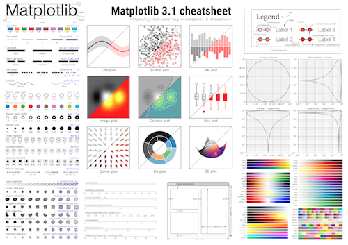
This is a great cheatsheet for the matplotlib plotting library from Nicolas Rougier. It’s a great quick reference for all the various matplotlib settings and functions, and reminded me of a number of things matplotlib can do that I’d forgotten about.
Find the high-resolution cheatsheet image here and the repository with all the code used to create it here. Nicolas is also writing a book called Scientific Visualization – Python & Matplotlib which looks great – and it’ll be released open-access once it’s finished (you can donate to see it ‘in progress’).
If you’re not interested in geographic data processing using Python then this probably won’t interest you…but for those who are interested this looks great. PyGEOS provides native Python bindings to the GEOS library which is used for geometry manipulation by many geospatial tools (such as calculating distances, or finding out whether one geometry contains another). However, by using the underlying C library PyGEOS bypasses the Python interpreter for a lot of the calculations, allowing them to be vectorised efficiently and making it very fast to apply these geometry functions: their preliminary performance tests show speedups ranging from 4x to 136x. The interface is very simple too – for example:
This project is still in the early days – but definitely one to watch as I think it will have a big impact on the efficiency of Python-based spatial analysis.
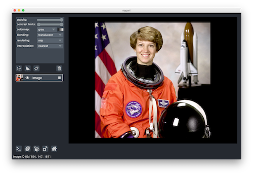
napari is a fast multi-dimensional image viewer for Python. I found out about it through an extremely comprehensive blog post written by Juan Nunez-Iglesias where he explains the background to the project and what problems it is designed to solve.
One of the key features of napari is that it has a full Python API, allowing you to easily visualise images from within Python – as easily as using imshow() from matplotlib, but with far more features. For example, to view three of the scikit-image sample images just run:
from skimage import data
import napari

with napari.gui_qt():
    viewer = napari.Viewer()
    viewer.add_image(data.astronaut(), name='astronaut')
    viewer.add_image(data.moon(), name='moon')
    viewer.add_image(data.camera(), name='camera')
You can then add some vector points over the image – for example, to use as starting points for a segmentation:
That is very useful for me already, and it’s just a tiny taste of what napari has to offer. I’ve only played with it for a short time, but I can already see it being really useful for me next time I’m doing a computer vision project, and I’m already planning to discuss some potential new features to help with satellite imagery work. Definitely something to check out if you’re involved in image processing in any way.
If you liked this, then get me to work for you! I do freelance work in data science, Python development and geospatial analysis – please contact me for more details, or look at my freelance website
Following on from my last post on plotting choropleth maps with the leaflet-choropleth library, I’m now going to talk about a small addition I’ve made to the library.
Leaflet-choropleth has built-in functionality to automatically categorise your data: you tell it how many categories you’d like and it splits it up. However, once I’d set up my webmap with leaflet-choropleth, using the automatically generated categories, my client said she wanted specific categories to be used. Unfortunately leaflet-choropleth didn’t support that…so I added it!
(It always pleases me a lot that if you’re in a situation where some open-source code doesn’t do what you want it to do, you can just modify it – and then you can contribute the code back to the project too!)
The pull request for this new functionality hasn’t yet been merged, but the updated code is available from my fork. The specific file you need is the updated choropleth.js file. Once you’ve replaced the original choropleth.js with this new version, you will be able to use a new limits option when calling L.choropleth. For example:
The value of the limits property should be the ‘dividing lines’ for the limits: so in this case there will be categories of < 1000, 1000-5000, etc.
I think that’s pretty-much all I can say about this – the code for an example map using this new functionality is available on Github and you can see a live map demo here.
This work was done while analysing GIS data and producing a webmap for a freelancing client. If you’d like me to do something similar for you, have a look at my freelance website or email me.
Some work I’ve been doing recently has involved putting together a webmap using the Leaflet library. I’ve been very impressed with how Leaflet works, and the range of plugins available for it.
leaflet-choropleth is an extension for Leaflet that allows easy generation of choropleth maps in Leaflet. The docs for this module are pretty good, so I’ll just show a quick example of how to use it in a fairly basic way:
This displays a choropleth based on the GeoJSON data in geojson, and uses a red-orange-yellow colourmap, basing the colours on the IMDRank property of each GeoJSON feature.
This will produce something like this – a map of Index of Multiple Deprivation values in Southampton, UK (read later if you want to see a Github repository of a full map):
One thing I wanted to do was create a legend for this layer in the Leaflet layers control. The leaflet-choropleth docs give an example of creating a legend, but I don’t really like the style, and the legend appears in a separate box rather than in the layers control for the map.
So, I put together a javascript function to create the sort of legend I wanted. For those who just want to use the function, it’s below. For those who want more details, read on…
function legend_for_choropleth_layer(layer, name, units, id) {
// Generate a HTML legend for a Leaflet layer created using choropleth.js
//
// Arguments:
// layer: The leaflet Layer object referring to the layer - must be a layer using
// choropleth.js
// name: The name to display in the layer control (will be displayed above the legend, and next
// to the checkbox
// units: A suffix to put after each numerical range in the layer - for example to specify the
// units of the values - but could be used for other purposes)
// id: The id to give the <ul> element that is used to create the legend. Useful to allow the legend
// to be shown/hidden programmatically
//
// Returns:
// The HTML ready to be used in the specification of the layers control
var limits = layer.options.limits;
var colors = layer.options.colors;
var labels = [];
// Start with just the name that you want displayed in the layer selector
var HTML = name
// For each limit value, create a string of the form 'X-Y'
limits.forEach(function (limit, index) {
if (index === 0) {
var to = parseFloat(limits[index]).toFixed(0);
var range_str = "< " + to;
}
else {
var from = parseFloat(limits[index - 1]).toFixed(0);
var to = parseFloat(limits[index]).toFixed(0);
var range_str = from + "-" + to;
}
// Put together a <li> element with the relevant classes, and the right colour and text
labels.push('<li class="sublegend-item"><div class="sublegend-color" style="background-color: ' +
colors[index] + '">Â </div>Â ' + range_str + units + '</li>');
})
// Put all the <li> elements together in a <ul> element
HTML += '<ul id="' + id + '" class="sublegend">' + labels.join('') + '</ul>';
return HTML;
}
This function is fairly simple: it loops through the limits that have been defined for each of the categories in the choropleth map, and generates a chunk of HTML for each of the different categories (specifically, a <li> element), and these elements are put together and wrapped in a <ul> to produce the final HTML for the legend. We also set CSS classes for each element of the legend, so we can style them nicely later.
When setting up the layers control in Leaflet you pass an object mapping display names (the text you want displayed in the layers control) to Layer objects – something like this:
var layers = {
    'OpenStreetMap': layer_OSM,
    'IMD': layer_IMD
};

var layersControl = L.control.layers({},
    layers,
    { collapsed: false }).addTo(map);
To use the function to generate a legend, replace the simple display name with a call to the function, wrapped in []‘s because of javascript’s weird inability to parse function calls in object keys. For example:
Here we’re passing layer_IMD as the Layer object, IMD as the name to display above the legend, no units (so the empty string), and telling it to give the legend HTML element an ID of legend_IMD.
This produces a legend that looks something like this:
To get this nice looking legend, we use the following CSS:
Just for one final touch, I’d like the legend to disappear when the layer is ‘turned off’, and appear again when it is ‘turned on’ again. This is particularly useful when you have multiple choropleth layers on a map and the combined length of the legends make the layers control very long.
We can do this with a quick bit of jQuery (yes, I know it can be done in pure javascript, but I prefer using jQuery as it’s generally easier). Remember that one of the parameters to the legend_for_choropleth_layer function was the HTML ID to give the legend? Now you know why: we need to use that ID to hide and show the legend.
We connect to some of the Leaflet events to find out when the layers are turned on or off, and then use the jQuery hide and show methods. There’s one little niggle though: we have to use the setTimeout function to ensure that we only run this once – otherwise we get multiple events raised and it causes problems. So, the code to do this is:
layer_IMD.on('add', function () {
    // Need setTimeout so that we don't get multiple
    // onadd/onremove events raised
    setTimeout(function () {
        $('#legend_IMD').show();
    });
});

layer_IMD.on('remove', function () {
    // Need setTimeout so that we don't get multiple
    // onadd/onremove events raised
    setTimeout(function () {
        $('#legend_IMD').hide();
    });
});
You can see how this works by looking at the final map here – try turning the IMD layer off and on again.
All of the code behind this example is available on Github if you want to check how it all fits together.
This work was done while analysing GIS data and producing a webmap for a freelancing client. If you’d like me to do something similar for you, have a look at my freelance website or email me.
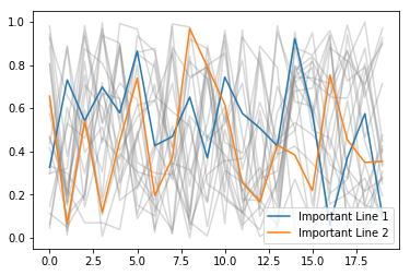
When producing some graphs for a client recently, I wanted to hide some labels from a legend in matplotlib. I started investigating complex arguments to the plt.legend function, but it turned out that there was a really simple way to do it…
If you start your label for a plot item with an underscore (_) then that item will be hidden from the legend.
You can see that the third line is hidden from the legend – just because we started its label with an underscore.
I found this particularly useful when I wanted to plot a load of lines in the same colour to show all the data for something, and then highlight a few lines that meant specific things. For example:
for i in range(20):
    plt.plot(np.random.rand(20), label='_Hidden', color='gray', alpha=0.3)
plt.plot(np.random.rand(20), label='Important Line 1')
plt.plot(np.random.rand(20), label='Important Line 2')
plt.legend()
My next step was to do this when plotting from pandas. In this case I had a dataframe that had a column for each line I wanted to plot in the ‘background’, and then a separate dataframe with each of the ‘special’ lines to highlight.
This code will create a couple of example dataframes:
df = pd.DataFrame()

for i in range(20):
    df[f'Data{i}'] = np.random.rand(20)

special = pd.Series(data=np.random.rand(20))
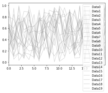
Plotting this produces a legend with all the individual lines showing:
df.plot(color='gray', alpha=0.3)
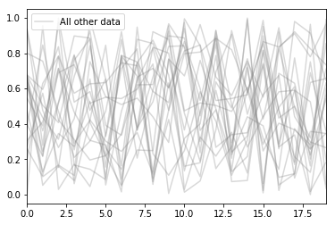
However, just by changing the column names to start with an underscore you can hide all the entries in the legend. In this example, I actually set one of the columns to a name without an underscore, so that column can be used as a label to represent all of these lines:
cols = ["_" + col for col in df.columns]
cols[0] = 'All other data'
df.columns = cols
Plotting again using exactly the same command as above gives us this – along with some warnings saying that a load of legend items are going to be ignored (in case we accidentally had pandas columns starting with _)
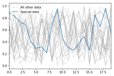
Putting it all together, we can plot both dataframes, with a sensible legend:
A user of Py6S recently contacted me to ask if it was possible to get an output of Rayleigh reflectance from Py6S. Unfortunately this email wasn’t sent to the Py6s Google Group, so I thought I’d write a blog post explaining how to do this, and showing a few outputs (reminder: please post Py6S questions there rather than emailing me directly, then people with questions in the future can find the answers there rather than asking again).
So, first of all, what is Rayleigh reflectance? Well, it’s the reflectance (as measured at the top-of-atmosphere) that is caused by Rayleigh scattering in the atmosphere. This is the wavelength-dependent scattering of light by gas molecules in the atmosphere – and it is an inescapable effect of light passing through the atmosphere.
So, on to how to calculate it in Py6S. Unfortunately the underlying 6S model doesn’t provide Rayleigh reflectance as an output, so we have to do a bit more work to calculate it.
First, let’s import Py6S and set up a few basic parameters:
from Py6S import *

s = SixS()

# Standard altitude settings for the sensor
# and target
s.altitudes.set_sensor_satellite_level()
s.altitudes.set_target_sea_level()

# Wavelength of 0.5nm
s.wavelength = Wavelength(0.5)
Now, to calculate the reflectance which is entirely due to Rayleigh scattering we need to ‘turn off’ everything else that is going on that could contribute to the reflectance. First, we ‘turn off’ the ground reflectance by setting it to zero, so we won’t have any contribution from the ground reflectance:
We can then run the simulation (using s.run()) and look at the outputs. The best way to do this is to just run:
print(s.outputs.fulltext)
to look at the ‘pretty’ text output that Py6S provides. The value we want is the ‘apparent reflectance’ – which is the reflectance at the top-of-atmosphere. Because we’ve turned off everything else, this will be purely caused by the Rayleigh reflectance.
We can access this value programmatically as s.outputs.apparent_reflectance.
So, that’s how to get the Rayleigh reflectance – but there are a few more interesting things to say…
Firstly, we don’t actually have to set the ground reflectance to zero. If we set the ground reflectance to something else – for example:
and run the simulation, then we will get a different answer for the apparent radiance – because the ground reflectance is now being taken into account – but we will see the value we want as the atmospheric intrinsic reflectance. This is the reflectance that comes directly from the atmosphere (in this case just from Rayleigh scattering, but in normal situations this would include aerosol scattering as well). This can be accessed programmatically as s.outputs.atmospheric_intrinsic_reflectance.
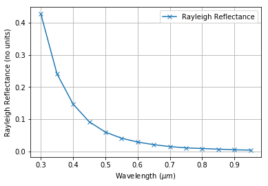
One more thing, just to show that Rayleigh reflectance in Py6S behaves in the manner that we’d expect from what we know of the physics… We can put together a bit of code that will extract the Rayleigh reflectance at various wavelengths and plot a graph – we’d expect an exponentially-decreasing curve, showing high Rayleigh reflectance at low wavelengths, and vice versa.
The code below will do this:
from Py6S import *
import numpy as np
import pandas as pd
import matplotlib.pyplot as plt
%matplotlib inline

s = SixS()

s.altitudes.set_sensor_satellite_level()
s.altitudes.set_target_sea_level()
s.aero_profile = AeroProfile.PredefinedType(AeroProfile.NoAerosols)
s.atmos_profile = AtmosProfile.PredefinedType(AtmosProfile.NoGaseousAbsorption)

wavelengths = np.arange(0.3, 1.0, 0.05)
results = []

for wv in wavelengths:
    s.wavelength = Wavelength(wv)
    s.run()

    results.append({'wavelength': wv,
                   'rayleigh_refl': s.outputs.atmospheric_intrinsic_reflectance})

results = pd.DataFrame(results)

results.plot(x='wavelength', y='rayleigh_refl', style='x-', label='Rayleigh Reflectance', grid=True)
plt.xlabel('Wavelength ($\mu m$)')
plt.ylabel('Rayleigh Reflectance (no units)')
This produces the following graph, which shows exactly what the physics predicts:
There’s nothing particularly revolutionary in that chunk of code – we’ve just combined the code I demonstrated earlier, and then looped through various wavelengths and run the model for each wavelength.
The way that we’re storing the results from the model deserves a brief explanation, as this is a pattern I use a lot. Each time the model is run, a new dict is appended to a list – and this dict has entries for the various parameters we’re interested in (in this case just wavelength) and the various results we’re interested in (in this case just Rayleigh reflectance). After we’ve finished the loop we can simply pass this list of dicts to pd.DataFrame() and get a nice pandas DataFrame back – ready to display, plot or analyse further.
You can probably tell from the sudden influx of matplotlib posts that I’ve been doing a lot of work plotting graphs recently…
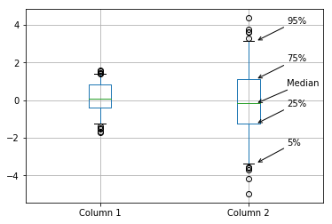
I have produced a number of boxplots to compare different sets of data. Some of these graphs are for a non-technical audience, and my client agreed that a boxplot was the best way to visualise the data, but wanted the various elements of the boxplot to be labelled so the audience could work out how to interpret it.
I started doing this manually using the plt.annotate function, but quickly got fed up with manually positioning everything – so I wrote a quick function to do it for me.
If you just want the code then here it is – it’s not perfect, but it should be a good starting point for you:
def annotate_boxplot(bpdict, annotate_params=None,
                     x_offset=0.05, x_loc=0,
                     text_offset_x=35,
                     text_offset_y=20):
    """Annotates a matplotlib boxplot with labels marking various centile levels.

    Parameters:
    - bpdict: The dict returned from the matplotlib `boxplot` function. If you're using pandas you can
    get this dict by setting `return_type='dict'` when calling `df.boxplot()`.
    - annotate_params: Extra parameters for the plt.annotate function. The default setting uses standard arrows
    and offsets the text based on other parameters passed to the function
    - x_offset: The offset from the centre of the boxplot to place the heads of the arrows, in x axis
    units (normally just 0-n for n boxplots). Values between around -0.15 and 0.15 seem to work well
    - x_loc: The x axis location of the boxplot to annotate. Usually just the number of the boxplot, counting
    from the left and starting at zero.
    text_offset_x: The x offset from the arrow head location to place the associated text, in 'figure points' units
    text_offset_y: The y offset from the arrow head location to place the associated text, in 'figure points' units
    """
    if annotate_params is None:
        annotate_params = dict(xytext=(text_offset_x, text_offset_y), textcoords='offset points', arrowprops={'arrowstyle':'->'})

    plt.annotate('Median', (x_loc + 1 + x_offset, bpdict['medians'][x_loc].get_ydata()[0]), **annotate_params)
    plt.annotate('25%', (x_loc + 1 + x_offset, bpdict['boxes'][x_loc].get_ydata()[0]), **annotate_params)
    plt.annotate('75%', (x_loc + 1 + x_offset, bpdict['boxes'][x_loc].get_ydata()[2]), **annotate_params)
    plt.annotate('5%', (x_loc + 1 + x_offset, bpdict['caps'][x_loc*2].get_ydata()[0]), **annotate_params)
    plt.annotate('95%', (x_loc + 1 + x_offset, bpdict['caps'][(x_loc*2)+1].get_ydata()[0]), **annotate_params)
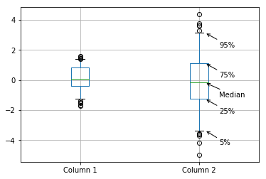
You can pass various parameters to change the display. For example, to make the labels closer to the boxplot and lower than the thing they’re pointing at, set the parameters as: text_offset_x=20 and text_offset_y=-20, giving:
So, how does this work? Well, when you create a boxplot, matplotlib very helpfully returns you a dict containing the matplotlib objects referring to each part of the boxplot: the box, the median line, the whiskers etc. It looks a bit like this:
{'boxes': [<matplotlib.lines.Line2D object at 0x1179db908>,
           <matplotlib.lines.Line2D object at 0x1176ac3c8>],
 'caps': [<matplotlib.lines.Line2D object at 0x117736668>,
          <matplotlib.lines.Line2D object at 0x1177369b0>,
          <matplotlib.lines.Line2D object at 0x1176acda0>,
          <matplotlib.lines.Line2D object at 0x1176ace80>],
 'fliers': [<matplotlib.lines.Line2D object at 0x117736dd8>,
            <matplotlib.lines.Line2D object at 0x1176b07b8>],
 'means': [],
 'medians': [<matplotlib.lines.Line2D object at 0x117736cf8>,
             <matplotlib.lines.Line2D object at 0x1176b0470>],
 'whiskers': [<matplotlib.lines.Line2D object at 0x11774ef98>,
              <matplotlib.lines.Line2D object at 0x117736320>,
              <matplotlib.lines.Line2D object at 0x1176ac710>,
              <matplotlib.lines.Line2D object at 0x1176aca58>]}
Each of these objects is a matplotlib.lines.Line2D object, which has a get_xdata() and get_ydata() method (see the docs for more details). In this case, all we’re interested in is the y locations, so get_ydata() suffices.
All we do then is grab the right co-ordinate from the list of co-ordinates that are returned (noting that for the box we have to look at the 0th and the 2nd co-ordinates to get the bottom and top of the box respectively). We also have to remember that the caps dict entry has two objects for each individual boxplot – as there are caps at the bottom and the top – so we have to be a bit careful with selecting those.
The other useful thing to point out is that you can choose what co-ordinate systems you use with the plt.annotate function – so you can set textcoords='offset points' and then set the same xytext value each time we call it – and all the labels will be offset from their arrowhead location the same amount. That saves us manually calculating a location for the text each time.
This function was gradually expanded to allow more configurability – and could be expanded a lot more, but should work as a good starting point for anyone wanting to do the same sort of thing. It depends on a lot of features of plt.annotate – for more details on how to use this function look at its documentation or the Advanced Annotation guide.
Just a quick post here to let you know about a matplotlib feature I’ve only just found out about.
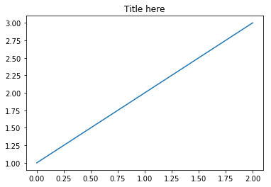
I expect most of my readers know how to produce a simple plot with a title using matplotlib:
plt.plot([1, 2, 3])
plt.title('Title here')
which gives this output:
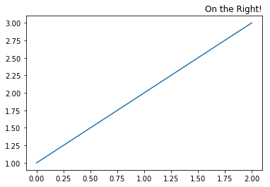
I spent a while today playing around with special code (using plt.annotate) to put some text on the right-hand side of the title line – but found it really difficult to get the text in just the right location…until I found that you can do this with the plt.title function:
plt.plot([1, 2, 3])
plt.title('On the Right!', loc='right')
giving this:
You can probably guess how to put a title on the left – yup, it’s loc='left'.
What makes things even better is that you can put multiple titles in different places:
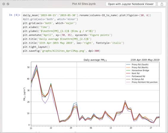
I used this recently as part of some freelance work to produce graphs of air quality in Southampton. I had lots of graphs using data from different periods – one might be just for spring, or one just for early August – and I wanted to make it clear what date range was used for each graph. Putting the date range covered by each graph on the right-hand side of the title line made it very easy for the reader to see what data was used – and I did it with a simple bit of code like this:
plt.plot([1, 2, 3])
plt.title('Straight line graph')
plt.title('1st-5th June', loc='right', fontstyle='italic')
producing this:
(Note: you can pass arguments like fontstyle='italic' to any matplotlib function that produces text – things like title(), xlabel() and so on)
I’ve been doing a bit of freelancing ‘on the side’ for a while – but now I’ve made it official: I am available for freelance work. Please look at my new website or contact me if you’re interested in what I can do for you, or carry on reading for more details.
Since I stopped working as an academic, and took time out to focus on my work and look after my new baby, I’ve been trying to find something which allows me to fit my work nicely around the rest of my life. I’ve done bits of short part-time work contracts, and various bits of freelance work – and I’ve now decided that freelancing is the way forward.
I’ve created a new freelance website which explains what I do and the experience I have – but to summarise here, my areas of focus are:
Remote Sensing – I am an expert at processing satellite and aerial imagery, and have processed time-series of thousands of images for a range of clients. I can help you produce useful information from raw satellite data, and am particularly experienced at atmospheric remote sensing and atmospheric correction.
GIS – I can process geographic data from a huge range of sources into a coherent data library, perform analyses and produce outputs in the form of static maps, webmaps and reports.
Data science – I have experience processing terabytes of data to produce insights which were used directly by the United Nations, and I can apply the same skills to processing your data: whether it is a single questionnaire or a huge automatically-generated dataset. I am particularly experienced at making research reproducible and self-documenting.
Python – I am an experienced Python programmer, and maintain a number of open-source modules (such as Py6S). I produce well-written, Pythonic code with high-quality tests and documentation.
The testimonials on my website show how much previous clients have valued the work I’ve done for them.
I’ve heard from a various people that they were rather put off by the nature of the auction that I ran for a day’s work from me – so if you were interested in working with me but wanted a standard sort of contract, and more than a day’s work, then please get in touch and we can discuss how we could work together.
(I’m aware that the last few posts on the blog have been focused on the auction for work, and this announcement of freelance work. Don’t worry – I’ve got some more posts lined up which are more along my usual lines. Stay tuned for posts on Leaflet webmaps and machine learning of large raster stacks)
Just a quick reminder that you’ve only got until next Tuesday to bid for a day’s work from me – so get bidding here.
The full details and rules are available in my previous post, but basically I’ll do a day’s work for the highest bidder in this auction – working on coding, data science, GIS/remote sensing, teaching…pretty much anything in my areas of expertise. This could be a great way to get some work from me for a very reasonable price – so please have a look, and share with anyone else who you think might be interested.
Summary: I will do a day’s work for the highest bidder in this auction. This could mean you get a day’s work from me very cheaply. Please read all of this post carefully, and then submit your bid here before 5th Feb.
This experiment is based very heavily on David MacIver’s experiment in auctioning off a day’s work (see his blog posts introducing it, and summarising the results). It seemed to work fairly well for him, and I am interested to see how it will work for me.
So, if you win this auction, I will do one day (8 hours) of work for you, on a project of your choosing. If you’ve been following this blog then you’ll have a reasonable idea of what sort of things I can do – but to jog your memory, here are some ideas:
Working on an open-source project: I could work to add features to, fix bugs in, or document, an open-source project of mine – probably either Py6S or recipy.
Pair programming: I could work with you to write some code – it could be code to do pretty-much anything, but I’m most experienced in data science, geographical data processing, computer vision, remote sensing/GIS and similar areas.
Programming: I could write some code by myself, to do a reasonably-simple task of your choosing, providing the well-documented code for you to use or develop further. As above, this could be anything, but would work best if it were in my areas of expertise.
Data science: I could do some analysis of a reasonably simple dataset for you, providing well-documented code to allow you to extend the analysis.
GIS/Remote Sensing: I could perform some remote sensing/GIS analysis on a dataset, potentially producing well-designed maps as outputs.
Teaching: I could work with you, online or in person, to help you understand a topic with which I am familiar – for example, Python programming, data science, computer science, remote sensing, GIS and so on.
Review & comments: I could review and give comments on documents in my areas of expertise, for example, a draft paper, chapter of a thesis, or similar.
These are just a few ideas of things I could do – I am happy to do most things, although I will let you know if I think that I do not have the required expertise to do what you are requesting.
Rules
The bid is only for me to work for 8 hours, so I strongly suggest either a short self-contained project, or something that can be stopped at any point and still be useful. If you want me to continue working past 8 hours then I would be happy to negotiate some further work – but this would be entirely outside of the bidding process.
The 8 hours work will likely be split over multiple days: due to my health I find working for 8 hours straight to be very difficult, so I will probably do the work in two or three chunks. I am happy to do the work entirely independently, or to work in close collaboration with you.
If I produce something tangible as part of this work (eg. some code, some documentation) then I will give you the rights to do whatever you wish with these (the only exception being work on my open-source projects, for which I will require you to agree to release the work under the same open-source license as the rest of the project).
Following David’s lead, the auction will be a Vickrey Auction, where all bids are secret, and the highest bidder wins but pays the second highest bidder’s bid. This means that the mathematically best amount to bid is exactly the amount you are willing to pay for my time.
If there is only one bidder, then you will get a day of my work and pay nothing for it.
If there is a tie for top place then I will pick the work I most want to do, and charge the highest bid.
The auction closes at 23:59 UTC on the 5th February 2019. Bids submitted after that time will be invalid.
The day of work must be claimed by the end of March 2019. I will contact the winner to arrange dates and times. I will send an invoice after the work is completed, and this must be paid within 30 days.
If your company wants to bid then I am happy to invoice them after the work is complete and, within reason, jump through the necessary hoops to get the invoice paid.
If you wish me to work in-person then I will invoice you for travel costs on top of the bid payment. Work can only be carried out in a wheelchair accessible building, and in general I would prefer remote work.
If you ask me to do something illegal, unethical, or just something that I firmly do not want to do, then I will delete your bid. If you would have been one of the top bidders then I will inform you of this.
After the auction is over, and the work has been completed, I will post on this blog a summary of the bids received, the winning bid and so on.
To go ahead and submit your bid, please fill in the form here.


