Producing grids of plots in R with ggplot2: A journey of discovery
I’ve just gone through a bit of a ‘journey of discovery’ in R while trying to plot a grid of plots for one of the research projects I’m doing. I wanted to write a simple function which could produce this grid of plots from a CSV file, allowing me to easily view the trends of the dune metrics produced by my DunesGIS project.
I first started by loading the data into R and producing a simple ggplot2 graph, which I then customised using the standard ggplot2 commands. At this point I had the following code:
# Load the ggplot2 library
library(ggplot2)

# Read in the CSV file taking into account the headers
df = read.csv("D:\\results.csv", header=T)

# Plot a simple graph
qplot(t, mean_len, data=df, geom="line", xlab="Time", ylab="Mean Length", main="Mean Length")
I wanted to produce a number of these plots to show all of the key dune metrics, so I attempted to arrange these plots in to a grid. This is where it got difficult…
I could easily put the plots in a grid using the arrange function (available here), but I had to write lots of repetitive code to create the graphs. I couldn’t see a way to easily put this into a function, as I needed to take in a variable name as an argument and then use it as a variable. Luckily, some of Steve Yegge’s posts on lisp must have stuck in my brain, as I realised I could do this using a macro.
It happens that R is a nice language that has support for macros, and I managed to write one quite easily:
create_graph = defmacro(varname, vartext, expr={qplot(t, varname, data=df, geom="line", main=vartext, xlab="Time", ylab="")
This uses the defmacro function, and takes a variable name (for example, mean_len) and some text to use as the title, and then returns the result of the qplot() call. Combining this with the call to arrange led to the code below:
# Define the macro (we're adding more options to the plot this time, but it's the same idea)
cg <- defmacro(varname, vartext, expr={qplot(t, varname, data=df, geom="line", main=vartext, xlab="Time", ylab="") +
	scale_x_continuous(breaks=NA) +
	theme_bw() +
	opts(axis.title.x = theme_text(size = 10, vjust = 2, hjust = 0.6)) +
	opts(plot.title = theme_text(size=10, face="bold", hjust=0.7)) +
	annotate("segment", x=-Inf,xend=Inf,y=-Inf,yend=-Inf,arrow=arrow())})

df = read.csv("D:\\results.csv", header=T)

# Create all of the graphs we want, storing them in variables
p_mean_len = cg(df$mean_len, "Mean Length")
p_total_len = cg(df$total_len, "Total Length")
p_max_len = cg(df$max_len, "Max Length")
p_min_len = cg(df$min_len, "Min Length")
p_std_len = cg(df$stdev_len, "StDev Length")
p_mean_cl = cg(df$mean_closeness, "Mean Closeness")
p_std_cl = cg(df$std_closeness, "StDev Closeness")
p_def_dens = cg(df$defect_dens, "Defect Density")
p_r_score = cg(df$r_score, "NN R-score")

# Arrange the plots into a grid
arrange(p_mean_len, p_total_len, p_max_len, p_min_len, p_std_len, p_mean_cl, p_std_cl, p_def_dens, p_r_score, ncol=3)
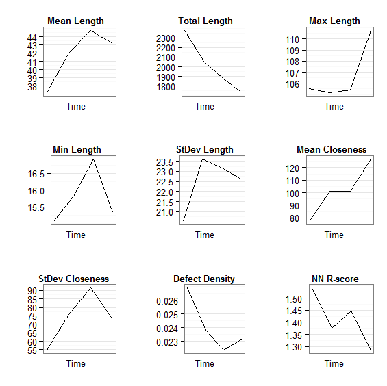
Now, I thought I'd been pretty clever by now, and was pleased with the result (see below). However, I realised it could do with improving...

Grid of plots (arrange-based method)
The graphs weren't aligned very well, and the whole thing looked rather amateurish - not what I want if I end up publishing in a journal. So, I contacted the ggplot2 mailing list for help. You can read the whole thread here if you want, but I'll be explaining how I progressed below.
Members of the mailing list suggested that I used the faceting feature to make a better grid of plots. I had considered this, as I knew faceting created grids of plots, but I'd never really understood this whole facet thing. Still after some help from the mailing list I found I could easily create a 'dummy faceting variable' to get this to work.
Originally, my data frame looked like this:
|
To use faceting I needed to reshape this data frame so that I had a variable field giving the name of the variable, repeated as many times as needed to get all of the data in. That sounds complicated, but comparing the example below to the example above should explain it:
|
This can be easily accomplished using the melt command in the reshape package. The command I used was:
m <- melt(df, id = c('name', 't'))
This performs a melt operation on the data frame df using name and t as ID variables (that is, variables that identify each row - in this case the time and the name of the model run). Once you've melted the data frame you can plot it using the faceting feature of ggplot2, for example, in the code below:
g <- ggplot(m, aes(x = t, y = value))
g + geom_point() + geom_line() +
     facet_wrap( ~ variable, ncol = 3, scales = 'free_y') +
	theme_bw() + opts(strip.background=theme_blank()) +
	scale_x_continuous(breaks=0:4, labels="")
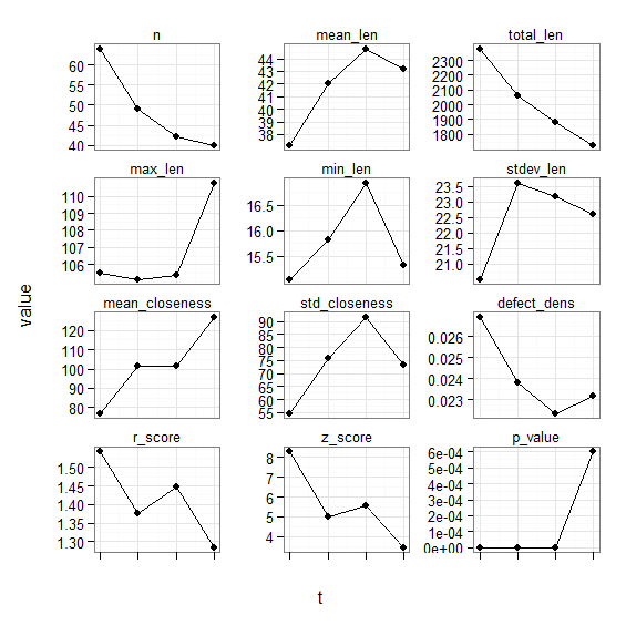
This code, combined with the data frame loading and melting above produced the following output:
That's a lot better, but still needs some tweaking. Members of the mailing list advised how to change the order of the plots, and I also found out how to remove variables that I didn't want. I then tweaked the appearance of the plot. The final task was to wrap the whole lot in a function called plot_graphs which takes an argument of the path to a CSV file and then plots the graphs based on it.
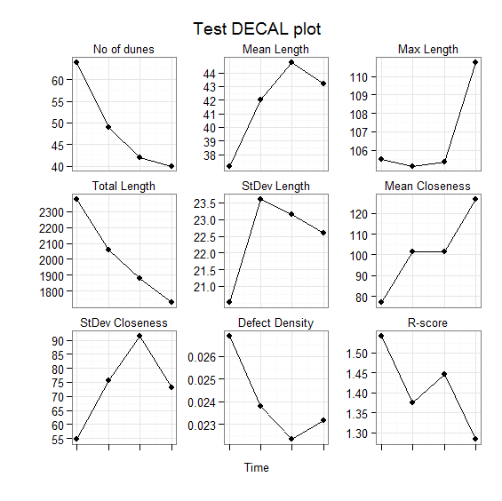
The final code is below, followed by the final output:
library(ggplot2)
library(reshape)

plot_graphs("D:\\results.csv", "Test DECAL plot")

plot_graphs <- function(filename, title) {
df = read.csv(filename, header=T)

df <- df[,-match("z_score",names(df))]
df <- df[,-match("p_value",names(df))]
df <- df[,-match("min_len",names(df))]

names(df)

m <- melt(df, id = c('name', 't'))

m$titles <- ordered(m$variable,
		levels = c('n', 'mean_len', 'max_len', 'total_len', 'stdev_len', 'mean_closeness', 'std_closeness', 'defect_dens', 'r_score'),
		labels = c('No of dunes', 'Mean Length', 'Max Length', 'Total Length', 'StDev Length', 'Mean Closeness', "StDev Closeness", "Defect Density", "R-score"))

g <- ggplot(m, aes(x = t, y = value))
g + geom_point() + geom_line() +
     facet_wrap( ~ titles, ncol = 3, scales = 'free_y') +
	theme_bw() + ylab("") + xlab("Time") + opts(strip.background=theme_blank()) +
	scale_x_continuous(breaks=0:4, labels="") +
	opts(axis.title.x = theme_text(size = 10, vjust = 2.5, hjust = 0.5)) +
	opts(title = title)
}
You'd think that would be the end of it...but the most useful part of this whole process was the advice given by members of the mailing list after I'd succeeded with my task.
This advice was a suggestion of a way of working within R and ggplot2 that will bring dividends: that is, to do as much of the data processing as possible outside ggplot2, and then just use simple graph plotting functions. R has loads of useful packages (like reshape which provides the melt command used above), and can do a lot of very clever processing very easily. Also, the ability of R to link to databases was mentioned, as SQL queries can often be a very good way to extract data for visualisation (something I may use to store dune metrics in a later version of DunesGIS).
So, thanks are due to all the members of the ggplot2 group who contributed to this 'journey of discovery': Baptiste, Dennis, Hadley, Brandon and Mark - thanks guys!
If you found this post useful, please consider buying me a coffee.
This post originally appeared on Robin's Blog.
Categorised as: Programming, R


Wow, I definitely have to try something like this! Curiosity speaking here: do you think there are any significant advantages in doing this kind of work with R, over other methods? And which other methods would have you considered for the task? Thanks a lot!
Glad you like the post 🙂
I find significant advantages in doing this sort of work in some kind of programming language as that makes it very easily reproducible (see some of my latest posts on reproducibility). Doing something through a GUI can be nice, but then when you want to go and do the same graph again but change the axis label (as a reviewer asked me to do on my latest paper) you have to remember exactly what buttons you clicked to do it – which is harder than it sounds! If you have written it as code then all you have to do is edit the code file and change the axis label string. Similarly, once you’ve written something through code you can easily run it multiple times for different datasets (as I did with my plot function in this post).
I happened to do this in R as it is one of my favourite languages for data processing, but the same thing could easily be done in Python, Matlab, IDL etc. I’m using R quite a lot at the moment as my work is becoming quite statistical (lots of time-series validation), but I have done lots of previous work in Python and IDL.
Thanks a lot for the reply! I will definitely consider R then: I read from you about reproducibility, and as a matter of fact, I had had reproducibility issues recently, so the time is right to change.
IDL is not a free solution right?
No, unfortunately IDL is not free – but your university/institution may have a copy. There is, in fact, a free ‘clone’ of IDL called GDL which is fairly feature-complete – see http://gnudatalanguage.sourceforge.net/.