Travel times, over time
A fun analysis I did a while back was using the Google Maps API to look at travel times between certain locations over time. I originally got interested in this because I found that travelling from my house to the university (yes, that’s how long ago this started…) seemed to either take a very short time, or a very long time, but rarely anything in the middle. I wondered if the histogram of travel times might be bi-modal – so I thought I’d investigate. This then led to doing various other analyses of local travel times.
It was actually very easy to gather the data for this. Google Maps will give you an estimated travel time for any route that you plan, and I’ve usually found these estimated times quite accurate – so I’ve relied on these for my data here. There is a googlemaps package for Python that wraps the Google Maps API and you can get the travel time between two locations using code like this:
def get_travel_time(from_loc, to_loc):
    now = datetime.now()
    directions_result = gmaps.directions(from_loc,
                                         to_loc,
                                         mode="driving",
                                         departure_time=now)

    return directions_result[0]['legs'][0]['duration_in_traffic']['value'] / 60
Back when I did this, the Google Maps API didn’t require authentication for most uses, and had a very generous free tier. This changed after a while, and now I suspect you’d need to give an API key, and have a credit card set up on your API account, and so on.
Anyway, as you can see, this code is just one API call, and then extracting the ‘duration_in_traffic’ from the result (it comes in seconds, we convert it to minutes).
To get a dataset of travel times over time, you just need to run this regularly (using chron, or equivalent), giving a sensible set of from and to locations. These locations can be anything that Google Maps recognises: an address, a lat/lon pair, a business etc. One warning is that you must pick the from and to locations carefully if you’re starting on a dual carriageway or a motorway: if you give the starting location on the wrong carriageway (just a small change in the latitude and longitude values) then your route will be wrong as it will show you travelling down that carriage way until a junction where you can turn onto the correct carriageway.
So, lets look at some results:
Home to University histograms
Looking at my initial question, here is a histogram of travel times from my home to the university (click on any image to see a larger version):

You can see that my hypothesis was wrong: the distribution is not bimodal, but it is definitely one-sided. The peak is around 11-12 minutes, and then there is a long tail extending to the right as delays increase, with a few journeys taking almost double that time.
Southampton to Bournemouth
A more interesting analysis is the travel time between Southampton and Bournemouth (for those not familiar with UK geography, Southampton is a city on the south coast of the UK but without a beach, and Bournemouth has a nice beach about 45mins drive from Southampton). Again, this idea came from personal experience: I was going over to the Bournemouth area relatively frequently during the spring/summer to go to the beach, and was interested in how long it would take. It’s well-known that the traffic between Southampton and Bournemouth is particularly bad on a summer weekend, and I wondered how bad it was on bank holidays.
So, I plotted travel time between Southampton and Bournemouth on normal Mondays, compared to bank holiday Mondays:
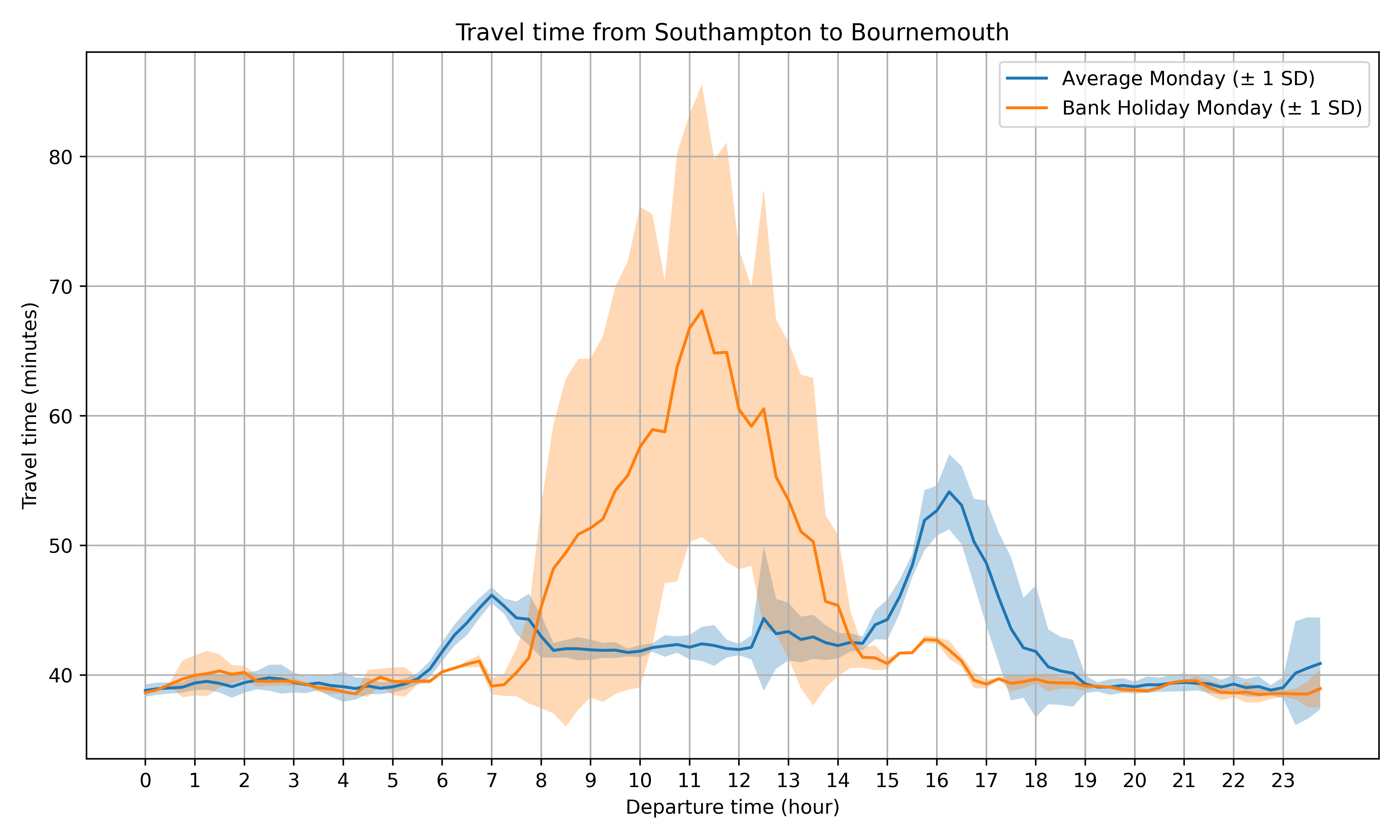
There are a few interesting patterns in this graph: firstly, and most obviously, there is a big difference in travel times on bank holidays – travel in mid-morning can take over 50% longer than on a normal Monday. You can see the rush hour peaks on normal Mondays for journeys leaving at around 7am and 4:30pm. These peaks are still there on bank holiday Mondays, but are significantly smaller. The travel time on a bank holiday starts to exceed a normal day from around 8-9am, and reaches its peak for journeys starting from Southampton around 11am (after all, who wants to get up early on a bank holiday!).
Looking at the reverse journey, from Bournemouth back to Southampton, you can see a far broader peak on bank holidays:
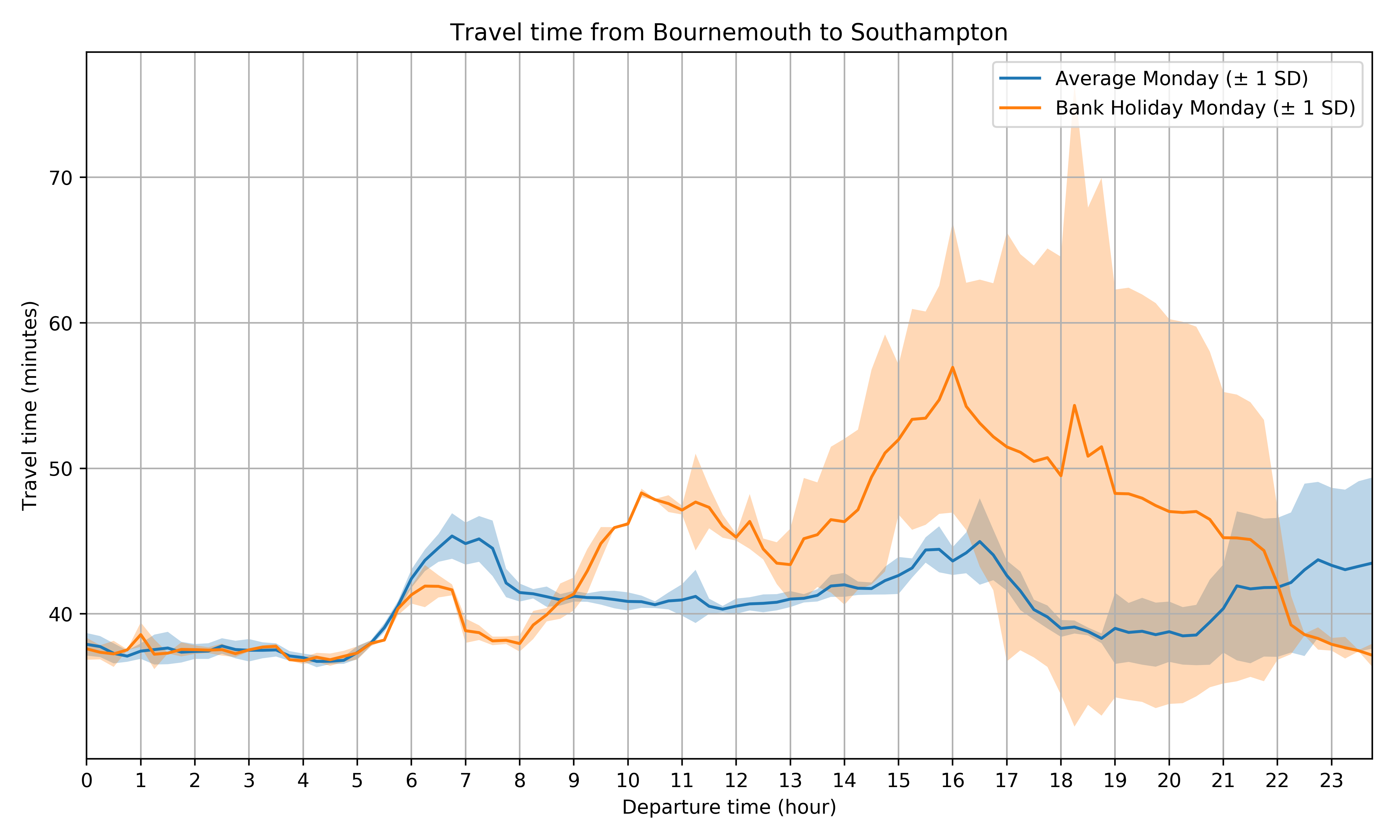
Again, there is a standard rush hour peak (though less well-defined) on normal Mondays at around 7am and 4-5pm, but the bank holiday peak starts around 10am (presumably for people travelling from Bournemouth for some other reason than to go directly to Southampton), and then there is a broad peak starting in the early afternoon of people travelling back to Southampton, extending right up until around 8-9pm.
So, from a practical purpose, if you’re going to the beach in Bournemouth on a bank holiday Monday, when should you leave Southampton? Traffic is probably best if you leave before 8am (a bit early for a bank holiday!) or after 3pm, and you’re likely to hit the traffic if you come home any time after lunch.
Just for amusement purposes, I decided to look at the travel time between Southampton and Bournemouth on Fridays, Saturdays and Sundays and compare it to the temperature. I got the temperature data for Bournemouth from the Weather Underground API (which doesn’t seem to work any more, as I found when I tried to re-run this analysis). Plotting temperature against travel time gives this graph:
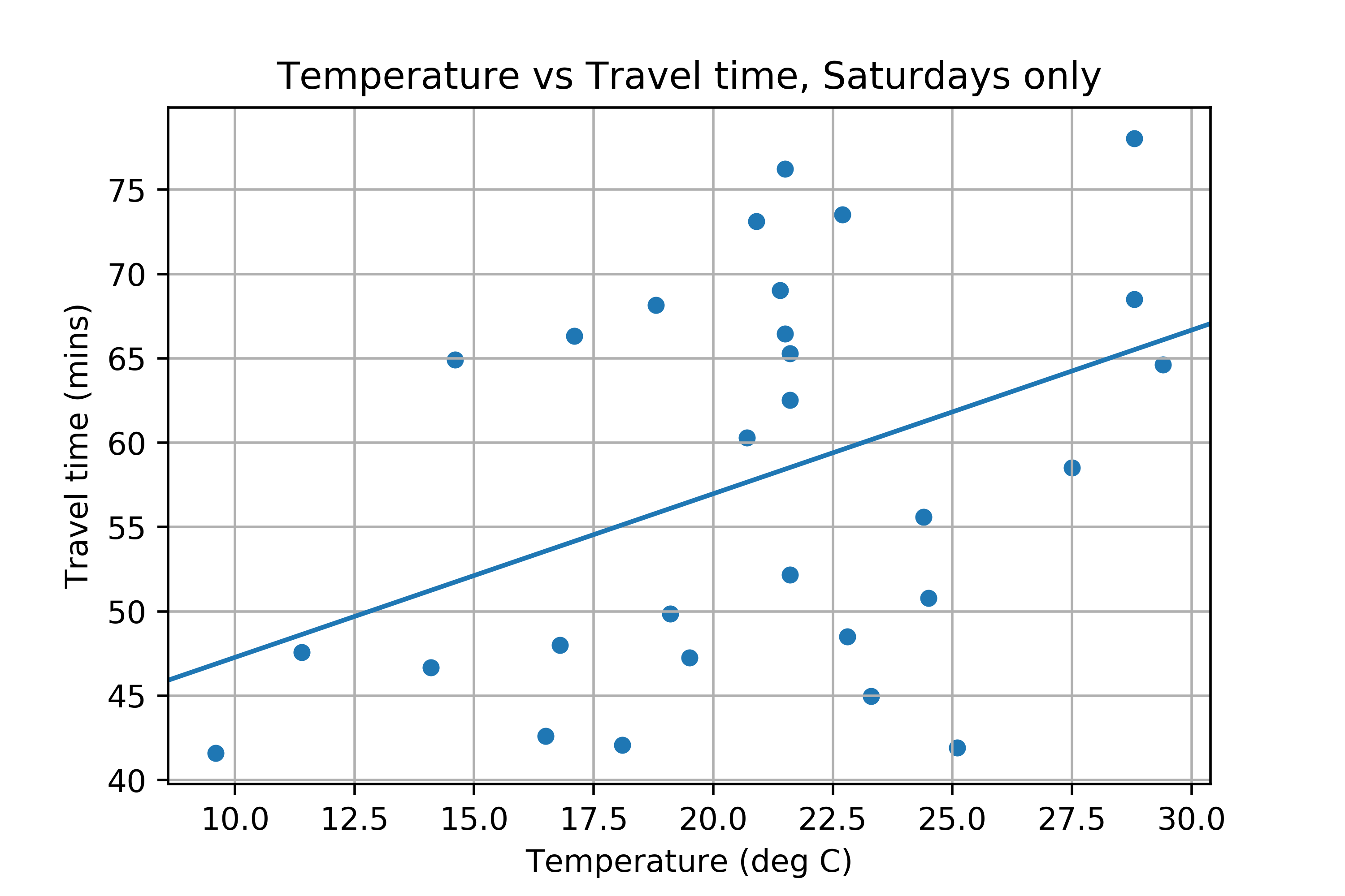
The straight line fit doesn’t look great, but apparently it has a R^2 of 0.67!
The Avenue in Southampton
Finally, let’s look at The Avenue in Southampton. This is a long, straight road running north-south from the end of the M3 at the north of Southampton, right down to the city centre in the south. It gets fairly busy during rush hour, so I thought I’d look at travel time along it. Here’s the graph:

Firstly, you can see that it is quicker to travel southbound on the Avenue than it is to travel northbound. I think this is due to the way that traffic lights and junctions wait: there are various right turns when travelling northbound that cause traffic to queue, and travelling southbound most junctions are either No Right Turn, or have filter lanes for right turns.
Also, the peak in the morning is offset: travel time peaks earlier for traffic going northbound, and later for traffic going southbound. I assume this is because traffic going northbound is leaving Southampton to go somewhere else, so it is the beginning of their journey, whereas traffic going southbound is arriving in Southampton as their destination. There are some other interesting patterns on this graph that I haven’t quite worked out yet – so I’ll leave you to ponder them.
If you found this post useful, please consider buying me a coffee.
This post originally appeared on Robin's Blog.
Categorised as: Academic, GIS, Programming, Python
[…] https://blog.rtwilson.com/travel-times-over-time/ […]