The quick summary of this post is: I give talks. You might like them. Here are some details of talks I’ve done. Feel free to invite me to speak to your group – contact me at robin@rtwilson.com. Read on for more details.
I enjoy giving talks on a variety of subjects to a range of groups. I’ve mentioned some of my programming talks on my blog before, but I haven’t mentioned anything about my other talks so far. I’ve spoken at amateur science groups (Cafe Scientifique or U3A science groups and similar), programming conferences (EuroSciPy, PyCon UK etc), schools (mostly to sixth form students), unconferences (including short talks made up on the day) and at academic conferences.
Feedback from audiences has been very good. I’ve won the ‘best talk’ prize at a number of events including the Computational Modelling Group at the University of Southampton, the Student Conference on Complexity Science, and EuroSciPy. A local science group recently wrote:
"The presentation that Dr Robin Wilson gave on Complex systems in the world around us to our Science group was excellent. The clever animated video clips, accompanied by a clear vocal description gave an easily understood picture of the underlining principles involved. The wide range of topics taken from situations familiar to everyone made the examples pertinent to all present and maintained their interest throughout. A thoroughly enjoyable and thought provoking talk."
A list of talks I’ve done, with a brief summary for each talk, is at the end of this post. I would be happy to present any of these talks at your event – whether that is a science group, a school Geography class, a programming meet-up or something else appropriate. Just get in touch on robin@rtwilson.com.
Science talks
All of these are illustrated with lots of images and videos – and one even has live demonstrations of complex system models. They’re designed for people with an interest in science, but they don’t assume any specific knowledge – everything you need is covered from the ground up.
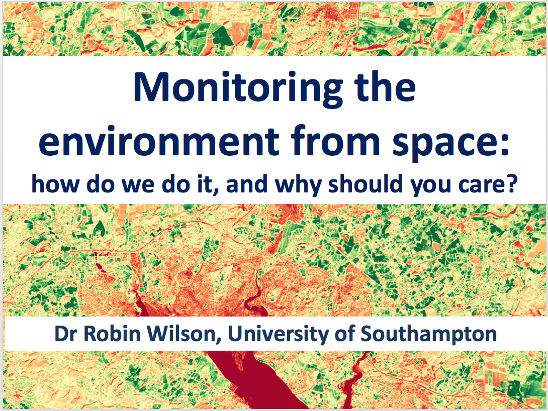
Monitoring the environment from space
Hundreds of satellites orbit the Earth every day, collecting data that is used for monitoring almost all aspects of the environment. This talk will introduce to you the world of satellite imaging, take you beyond the ‘pretty pictures’ to the scientific data behind them, and show you how the data can be applied to monitor plant growth, air pollution and more.
From segregation to sand dunes: complex systems in the world around us
‘Complex’ systems are all around us, and are often difficult to understand and control. In this talk you will be introduced to a range of complex systems including segregation in cities, sand dune development, traffic jams, weather forecasting, the cold war and more – and will show how looking at these systems in a decentralised way can be useful in understanding and controlling them. I’m also working on a talk for a local science and technology group on railway signalling, which should be fascinating. I’m happy to come up with new talks in areas that I know a lot about – just ask.
Programming talks
These are illustrated with code examples, and can be made suitable for a range of events including local programming meet-ups, conferences, keynotes, schools and more.
Writing Python to process millions of row of mobile data – in a weekend
In April 2105 there was a devastating earthquake in Nepal, killing thousands and displacing hundreds of thousands more. Robin Wilson was working for the Flowminder Foundation at the time, and was given the task of processing millions of rows of mobile phone call records to try and extract useful information on population displacement due to the disaster. The aid agencies wanted this information as quickly as possible, so he was given the unenviable task of trying to produce preliminary outputs in one bank-holiday weekend! This talk is the story of how he wrote code in Python to do this, and what can be learnt from his experience. Along the way he’ll show how Python enables rapid development, introduce some lesser-used built-in data structures, explain how strings and dictionaries work, and show a slightly different approach to data processing.
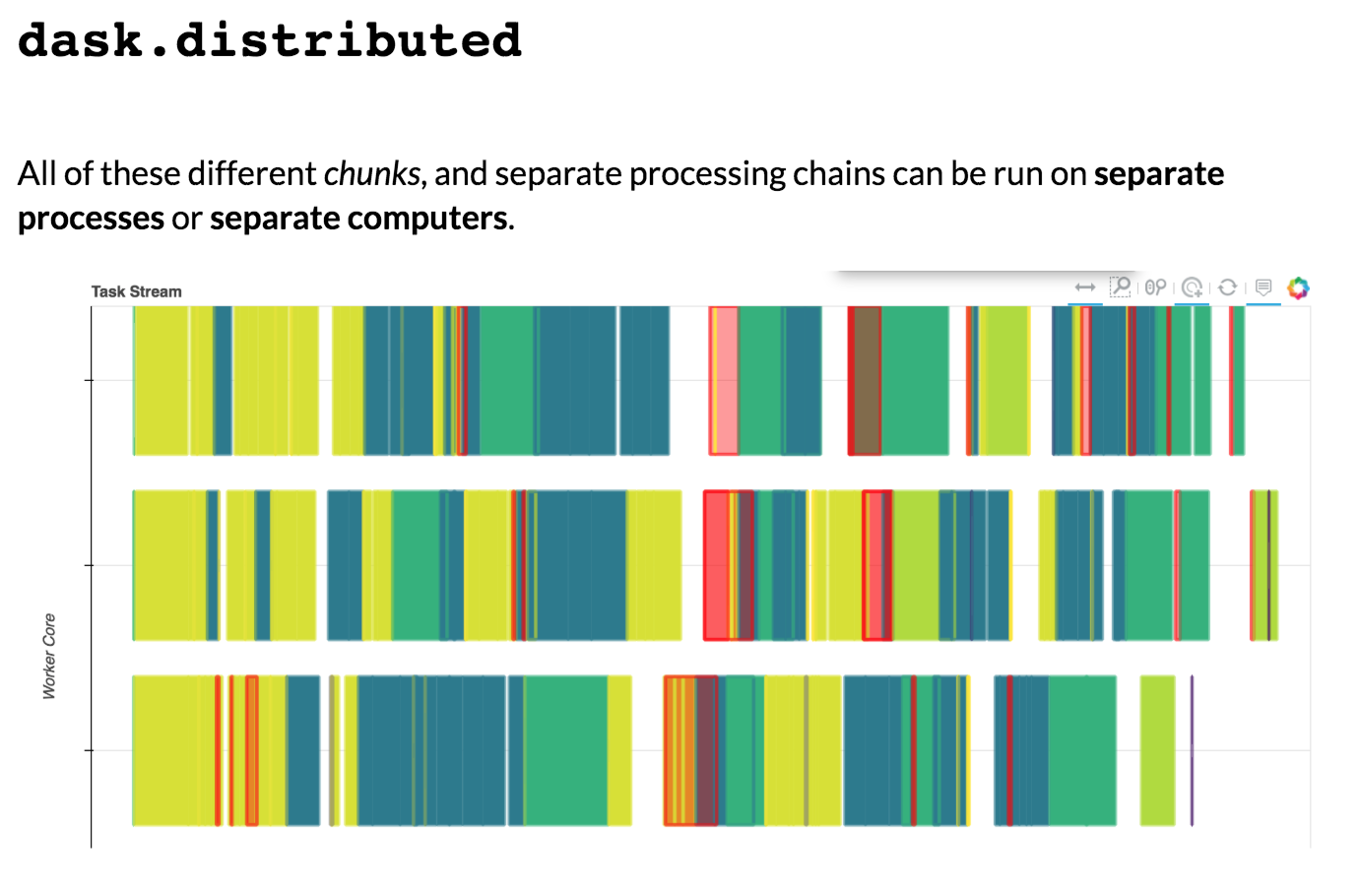
xarray: the power of pandas for multidimensional arrays
"I wish there was a way to easily manipulate this huge multi-dimensional array in Python…", I thought, as I stared at a huge chunk of satellite data on my laptop. The data was from a satellite measuring air quality – and I wanted to slice and dice the data in some supposedly simple ways. Using pure numpy was just such a pain. What I wished for was something like pandas – with datetime indexes, fancy ways of selecting subsets, group-by operations and so on – but something that would work with my huge multi-dimensional array.
The solution: xarray – a wonderful library which provides the power of pandas for multi-dimensional data. In this talk I will introduce the xarray library by showing how just a few lines of code can answer questions about my data that would take a lot of complex code to answer with pure numpy – questions like ‘What is the average air quality in March?’, ‘What is the time series of air quality in Southampton?’ and ‘What is the seasonal average air quality for each census output area?’.
After demonstrating how these questions can be answered easily with xarray, I will introduce the fundamental xarray data types, and show how indexes can be added to raw arrays to fully utilise the power of xarray. I will discuss how to get data in and out of xarray, and how xarray can use dask for high-performance data processing on multiple cores, or distributed across multiple machines. Finally I will leave you with a taster of some of the advanced features of xarray – including seamless access to data via the internet using OpenDAP, complex apply functions, and xarray extension libraries.
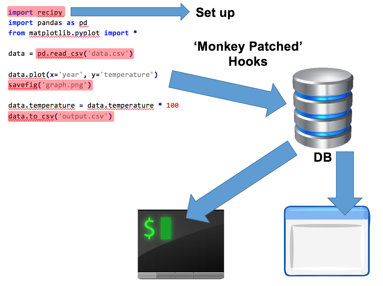
recipy: effortless provenance in Python
Imagine the situation: You’ve written some wonderful Python code which produces a beautiful output: a graph, some wonderful data, a lovely musical composition, or whatever. You save that output, naturally enough, as awesome_output.png. You run the code a couple of times, each time making minor modifications. You come back to it the next week/month/year. Do you know how you created that output? What input data? What version of your code? If you’re anything like me then the answer will often, frustratingly, be "no".
This talk will introduce recipy, a Python module that will save you from this situation! With the addition of a single line of code to the top of your Python files, recipy will log each run of your code to a database, keeping track of all of your input files, output files and the code that was used – as well as a lot of other useful information. You can then query this easily and find out exactly how that output was created.
In this talk you will hear how to install and use recipy and how it will help you, how it hooks into Python and how you can help with further development.
School talks/lessons
Decentralised systems, complexity theory, self-organisation and more
This talk/lesson is very similar to my complex systems talk described above, but is altered to make it more suitable for use in schools. So far I have run this as a lesson in the International Baccalaureate Theory of Knowledge (TOK) course, but it would also be suitable for A-Level students studying a wide range of subjects.
GIS/Remote sensing for geographers
I’ve run a number of lessons for sixth form geographers introducing them to the basics of GIS and remote sensing. These topics are often included in the curriculum for A-Level or equivalent qualifications, but it’s often difficult to teach them without help from outside experts. In this lesson I provide an easily-understood introduction to GIS and remote sensing, taking the students from no knowledge at all to a basic understanding of the methods involved, and then run a discussion session looking at potential uses of GIS/RS in topics they have recently covered. This discussion session really helps the content stick in their minds and relates it to the rest of their course.
Computing
As an experienced programmer, and someone with formal computer science education, I have provided input to a range of computing lessons at sixth-form level. This has included short talks and part-lessons covering various programming topics, including examples of ‘programming in the real world’ and discussions on structuring code for larger projects. Recently I have provided one-on-one support to A-Level students on their coursework projects, including guidance on code structure, object-oriented design, documentation and GUI/backend interfaces.
A while back a friend on Twitter pointed me towards a question on the GIS StackExchange site about the 6S model, asking if "that was the thing you wrote". I didn’t write the 6S model (Eric Vermote and colleagues did that), but I did write a fairly well-used Python interface to the 6S model, so I know a fair amount about it.
The question was about atmospherically correcting radiance values using 6S. When you configure the atmospheric correction mode in 6S you give it a radiance value measured at the sensor and it outputs an atmospherically-corrected radiance value. Simple. However, it also outputs three coefficients: xa, xb and xc which can be used to atmospherically-correct other at-sensor radiance values. These coefficients are used in the following formulae, given in the 6S output:
y=xa*(measured radiance)-xb
acr=y/(1.+xc*y)
where acr is the atmospherically-corrected radiance.
The person asking the question had found that when he used the formula to correct the same radiance that he had corrected using 6S itself, he got a different answer. In his case, the result from 6S itself was 0.02862, but when he ran his at-sensor radiance through the formula he got a different answer: 0.02879, a difference of 0.6%.
I was intrigued by this question, as I’ve used 6S for a long time and never noticed this before…strangely, I’d never thought to check! The rest of this post is basically a copy of my answer on the StackExchange site, but with a few bits of extra explanation.
I thought originally that it might be an issue with the parameterisation of 6S – but I tried a few different parameterisations myself and came up with the same issue – I was getting a slightly different atmospherically-corrected reflectance when putting the coefficients through the formula, compared to the reflectance that was output by the 6S model directly.
The 6S manual is very detailed, but somehow never seems to answer the questions that I have – for example, it doesn’t explain anywhere how the three coefficients are calculated. It does, however, have an example output file which includes the atmospheric correction results (see the final page of Part 1 of the manual). This includes the following outputs:
******************************************************************************** atmospheric correction result **-----------------------------** input apparent reflectance :0.100** measured radiance [w/m2/sr/mic]:38.529** atmospherically corrected reflectance **Lambertian case :0.22180** BRDF case :0.22180** coefficients xa xb xc :0.006850.038850.06835** y=xa*(measured radiance)-xb; acr=y/(1.+xc*y)********************************************************************************
If you work through the calculation using the formula given you find that the result of the calculation doesn’t match the 6S output. Let me say that again: in the example provided by the 6S authors, the model output and formula don’t match! I couldn’t quite believe this…
So, I wondered if the formula was some sort of simple curve fitting to a few outputs from 6S, and would therefore be expected to have a small error compared to the actual model outputs. As mentioned earlier, the manual explains a lot of things in a huge amount of detail, but is completely silent on the calculation of these coefficients. Luckily the 6S source code is available to download. Less conveniently, the source code is in written in Fortran 77!
I am by no means an expert in Fortran 77 (in fact, I’ve never written any Fortran code in real-life), but I’ve had a dig in to the code to try and find out how the coefficients are calculated.
If you want to follow along, the code to calculate the coefficients starts at line 3382 of main.f. The actual coefficients are set in lines 3393-3397:
(strangely xb is set twice, to the same value, and another coefficient xap is set, which never seems to be used – I have no idea why!).
It’s fairly obvious from this code that there is no complicated curve fitting algorithm used – the coefficients are simply algebraic manipulations of other variables used in the model. For example, xc is set to the value of the variable sast, which, through a bit of detective work, turns out to be the total spherical albedo (see line 3354). You can check this in the 6S output: the value of xc is always the same as the total spherical albedo which is shown a few lines further up in the output file. Similarly xb is calculated based on various variables including tgasm, which is the total global gas transmittance and sdtott, which is the total downward scattering transmittance, and so on. (These variables are difficult to decode, because Fortran 77 has a limit of six characters for variable names, so they aren’t very descriptive!).
I was stumped at this point, until I thought about numerical precision. I realised that the xacoefficient has a number of zeros after the decimal point, and wondered if there might not be enough significant figures to produce an accurate output when using the formula. It turned out this was the case, but I’ll go through how I altered the 6S code to test this.
Line 3439 of main.f is responsible for writing the coefficients to the file. It consists of:
write(iwr,944)xa,xb,xc
This tells Fortran to write the output to the file/output stream iwr using the format code specified at line 944, and write the three variables xa, xb and xc. Looking at line 944 (that is, the line given a Fortran line number of 944, which is actually line 3772 in the file…just to keep you on your toes!) we see:
944 format(1h*,6x,40h coefficients xa xb xc :,
s 1x,3(f8.5,1x),t79,1h*,/,1h*,6x,
s ' y=xa*(measured radiance)-xb; acr=y/(1.+xc*y)',
s t79,1h*,/,79(1h*))
This rather complicated line explains how to format the output. The key bit is 3(f8.5,1x) which tells Fortran to write a floating point number (f) with a maximum width of 8 characters, and 5 decimal places (8.5) followed by a space (1x), and to repeat that three times (the 3(...)). We can alter this to print out more decimal places – for example, I changed it to 3(f10.8,1x), which gives us 8 decimal places. If we do this, then we find that the output runs into the *‘s that are at the end of each line, so we need to alter a bit of the rest of the line to reduce the number of spaces after the text coefficients xa xb xc. The final, working line looks like this:
944 format(1h*,6x,35h coefficients xa xb xc :,
s 1x,3(f10.8,1x),t79,1h*,/,1h*,6x,
s ' y=xa*(measured radiance)-xb; acr=y/(1.+xc*y)',
s t79,1h*,/,79(1h*))
If you alter this line in main.f and recompile 6S, you will see that your output looks like this:
******************************************************************************** atmospheric correction result **-----------------------------** input apparent reflectance :0.485** measured radiance [w/m2/sr/mic]:240.000** atmospherically corrected reflectance **Lambertian case :0.45439** BRDF case :0.45439** coefficients xa xb xc :0.002973620.202919300.24282509** y=xa*(measured radiance)-xb; acr=y/(1.+xc*y)********************************************************************************
If you then apply the formula you will find that the output of the formula, and the output of the model match – at least, to the number of decimal places of the model output.
In my tests of this, I got the following for the original 6S code:
Model: 0.4543900000
Formula: 0.4537049078
Perc Diff: 0.1507718536%
(the percentage difference I was getting was smaller than the questioner found – but that will just depend on the parameterisation used)
and this for my altered 6S code:
Model: 0.4543900000
Formula: 0.4543942552
Perc Diff: -0.0009364659%
A lot better!
For reference, to investigate this I used Py6S, the Python interface to the 6S model that I wrote. I used the following functions to automatically calculate the results using the formula from a Py6S SixS object, and to calculate the percentage difference automatically:
def calc_acr(radiance, xa, xb, xc):
y = xa * radiance - xb
acr = y/(1.0+ xc * y)return acr
def calc_acr_from_obj(radiance, s):return calc_acr(radiance, s.outputs.coef_xa, s.outputs.coef_xb, s.outputs.coef_xc)def difference_between_formula_and_model(s):
formula = calc_acr_from_obj(s.outputs.measured_radiance, s)
model = s.outputs.atmos_corrected_reflectance_lambertian
diff = model - formula
perc_diff =(diff / model)*100print("Model: %.10f"% model)print("Formula: %.10f"% formula)print("Perc Diff: %.10f%%"% perc_diff)
and my example errors above came from running Py6S using the following parameterisation:
s =SixS()
s.altitudes.set_sensor_satellite_level()
s.atmos_corr =AtmosCorr.AtmosCorrLambertianFromRadiance(240)
s.wavelength =Wavelength(PredefinedWavelengths.LANDSAT_OLI_B1)
s.run()
Just as a slight addendum, if you’re atmospherically-correcting Sentinel-2 data with 6S then you might want to consider using ARCSI – an atmospheric correction tool that uses Py6S internally, but does a lot of the hard work for you. The best way to learn ARCSI is with their tutorial document.
As I mentioned in the previous post, I attended – and spoke at – PyCon UK 2018 in Cardiff. Last time I provided a link to my talk on xarray – this time I want to provide some general thoughts on the conference, some suggested talks to watch, and a particular comment on the creche/childcare that was available.
In summary: I really enjoyed my time at PyCon UK and I would strongly suggest you attend. Interestingly for the first time I think I got more out of some of the informal activities than some of the talks – people always say that the ‘hallway track’ is one of the best bits of the conference, but I’d never really found this before.
So, what bits did I particularly enjoy?
Talks
Of the many talks that I attended, I’d particularly recommend watching the videos of:
There were two other things that went on that were very interesting. One was a ‘bot competition’ run by Peter Ingelsby, where you had to write Python bots to play Connect 4 against each other. I didn’t have the time (or energy!) to write a bot, but I enjoyed looking at the code of the various bots that won at the end – some very clever techniques in there! Some of the details of the bots are described in this presentation at the end of the conference.
On the final day of the conference, people traditionally take part in ‘sprints’ – working on a whole range of Python projects. However, this year there was another activity taking place during the sprints day: a set of ‘Lean Coffee’ discussions run by David MacIver. I won’t go into the way this worked in detail, as David has written a post all about it, but I found it a very satisfying way to finish the conference. We had discussions about a whole range of issues – including the best talks at the conference, how to encourage new speakers, testing methods for Python code, other good conferences, how to get the most out of the ‘hallway track’ and lots more. Because of the way the ‘Lean Coffee’ works, each discussion is time-bound, and only occurs if the majority of the people around the table are interested in it – so it felt far more efficient than most group discussions I’ve been in. I left wanting to run some Lean Coffee sessions myself sometime (and, while writing this, am kicking myself for not suggesting it at a local unconference I went to last week!). I may also have volunteered myself to run some more sessions like it during the main conference next year – wait to hear more on that front.
Creche/Childcare
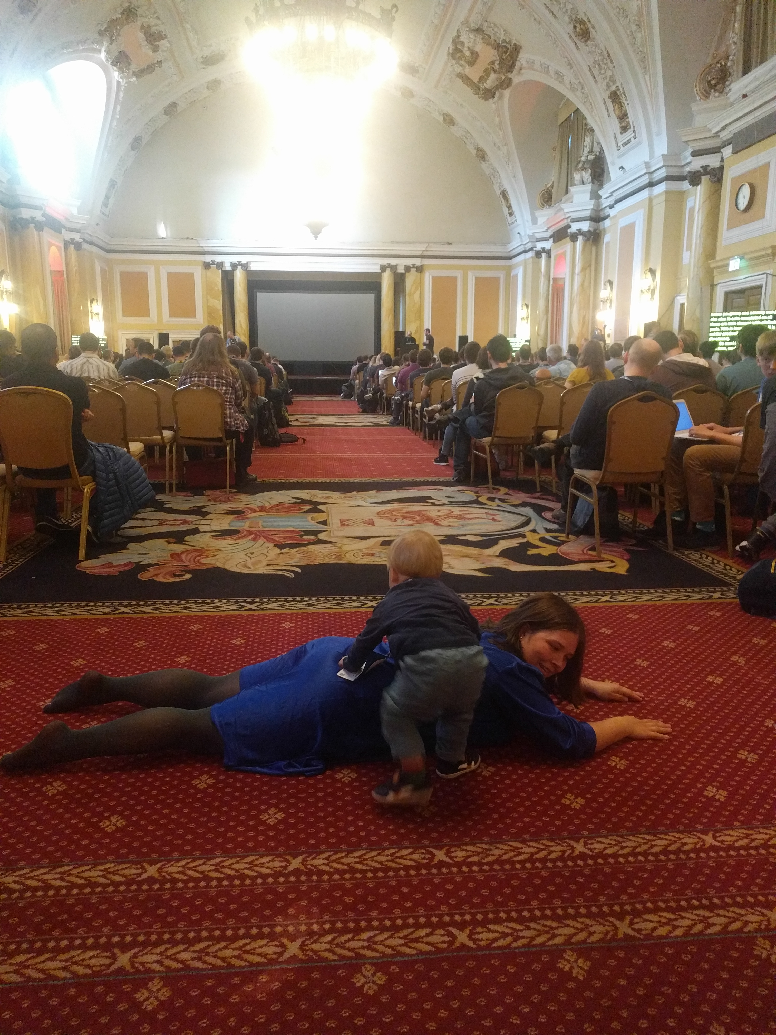
My wife and I wouldn’t have been able to attend PyCon UK without their childcare offer. The childcare is described on the conference website, but there isn’t a huge amount of detail. My aim in this section is to provide a bit more real-world information on how it actually worked and what it was like – along with some cute photos.
So, having said we wanted to use the creche when we booked our tickets, we got an email a few days before the conference asking us to provide our child’s name, age and any special requirements. We turned up on the first day at about 8:45 (the first session started at 9:00), not really sure what to expect, and found a room for the creche just outside of the main hall (the Assembly Room). It was a fairly small room, but that didn’t matter as there weren’t that many children.
Inside there were two nursery staff, from Brecon Mobile Childcare. They specialise in doing childcare at conferences, parties, weddings and so on – so they were used to looking after children that they didn’t know very well. They introduced themselves to us, and to our son, and got us to fill in a form with our details and his details, including emergency contact details for us. We talked a little about his routine and when he tends to nap, snack and so on, and then we kissed him goodbye and left. They assured us that if he got really upset and they couldn’t settle him (because they didn’t know him very well) then they’d call our mobiles and we could come and calm him down. We could then go off and enjoy the conference – and, in fact, the staff suggested that we shouldn’t come visiting during the breaks as that was likely to just upset him as he’d have to say goodbye to Mummy and Daddy multiple times.
I think there were something like 5 children there on the first day, ranging in age from about six months to ten years. The room had a variety of toys in it suitable for various different ages (including colouring and board games for the older ones, and soft toys and play mats for the younger ones), plus a small TV showing some children’s TV programmes (Teletubbies was on when we came in).
We came back at lunchtime and found that he’d had a good time. He cried a little when we left, but stopped in about a minute, and the staff engaged him with some of the toys. He’d had a short nap in his pram (we left that with them in the room) and had a few of his snacks. We collected him for lunch and took him down to the main lunch hall to get some food.
PyCon UK make it very clear that children are welcomed in all parts of the conference venue, and no-one looked at us strangely for having a child with us at lunchtime. Various other attendees engaged with our son nicely, and we soon had him sitting on a seat and eating some of the food provided. Those with younger children should note that there wasn’t any special food provided for children: our son was nearly 18 months old, so he could just eat the same as us, but younger children may need food bringing specially for them. There also weren’t any high chairs around, which could have been useful – but our son managed fairly well sitting on a chair and then on the floor, and didn’t make too much mess.
After eating lunch we took him for a walk in his pram around the park outside the venue, with the aim of getting him to sleep. We didn’t manage to get him to sleep, but he did get some fresh air. We then took him up to the creche room again and said goodbye, and left him to have fun playing with the staff for the afternoon.
We were keen to go to the lightning talks that afternoon, so went to the main hall at 5:30pm in time for them. Part-way through the talks, when popping to the toilet, we found one of the creche staff outside the main hall with our son. It turned out that the creche only continued until 5:30, not until 6:30 when the conference actually finished. We were a little surprised by this (and gave feedback to the organisers saying that the creche should finish when the main conference finishes), but it didn’t actually cause us much problem. We’d been told that children are welcome in any of the talks – and the lightning talks are more informal than most of the talks – so we brought him into the main hall and played with him at the back.
He enjoyed wandering around with his Mummy’s conference badge around his neck, and kept walking up and down the aisle smiling at people. Occasionally he got a bit too near the front, and we were asked very nicely by one of the organisers the next day to try and keep him out of the main eye-line of the speakers as it can be a bit distracting for them, but we were assured that they were more than happy to have him in the room. He even did some of his climbing over Mummy games at the back, and then breastfed for a bit, and no-one minded at all.
The rest of the days were just like the first, except that there were less children in the creche, and therefore only one member of staff. For most of the days there were just two children: our son, and a ten year old girl. On the last day (the sprints day) there was just Julian. During some of these days the staff member was able to take Julian out for a walk in his pram, which was nice, and got him a bit of fresh air.
So, that’s pretty-much all there is to say about the creche. It worked very well, and it allowed both my wife and me to attend – something which isn’t possible with most conferences. We were happy to leave our son with the staff, and he seemed to have a nice time. We’ll definitely use the creche again!
Last week I attended PyCon UK 2018 in Cardiff, and had a great time. I’m going to write a few posts about this conference – and this first one is focused on my talk.
I spoke in the ‘PyData’ track, with a talk entitled XArray: the power of pandas for multidimensional arrays. PyCon UK always do a great job of getting the videos up online very quickly, so you can watch the video of my talk below:
The slides for my talk are available here and a Github repository with the notebook which was used to create the slides here.
I think the talk went fairly well, although I found my positioning a bit awkward as I was trying to keep out of the way of the projector, while also being in range of the microphone, and trying to use my pointer to point out specific parts of the screen.
Feedback was generally good, with some useful questions afterwards, and a number of positive comments from people throughout the rest of the conference. One person emailed me to say that my talk was "the highlight of the conference" for him – which was very pleasing. My tweet with a link to the video of my talk also got a number of retweets, including from the PyData and NumFocus accounts, which got it quite a few views
In the interests of full transparency, I have posted online the full talk proposal that I submitted, as this may be helpful to others trying to come up with PyCon talk proposals.
Next up in my PyCon UK series of posts: a general review of the conference.
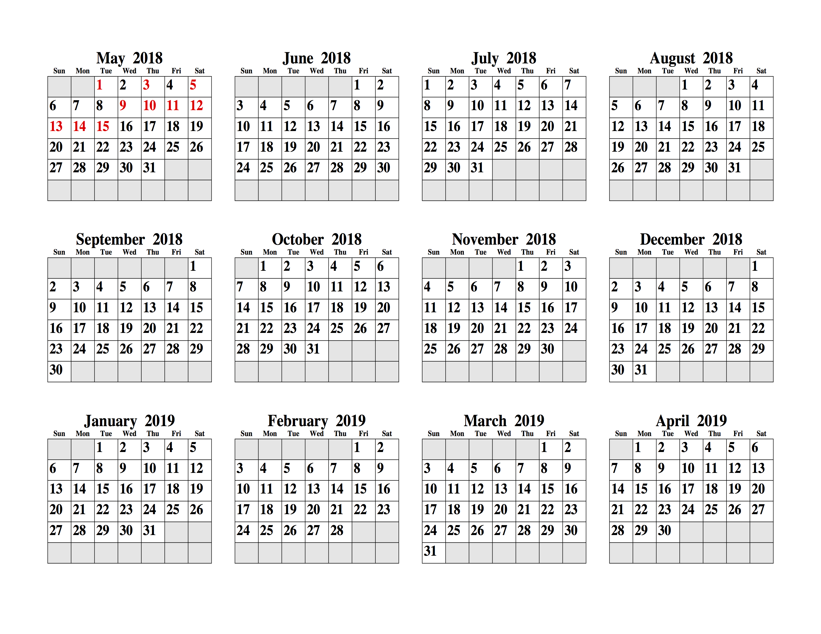
During the Nepal earthquake response project I worked on, we were gradually getting access to historical mobile phone data for use in our analyses. I wanted to keep track of which days of data we had got access to, and which ones we were still waiting for.
I wrote a simple script to print out a list of days that we had data for – but that isn’t very easy to interpret. Far easier would be a calendar with days highlighted. I thought this would be very difficult to generate – but then I found the pcal utility, which makes it easy to produce something like this:I’m not going to go into huge detail here, as the pcal man page is very comprehensive – and pcal can do far more than I show here. However, to create an output like the one shown above you’ll need to put together a list of dates in a text file. Here’s what my dates.txt file looks like:
It is simply a list of dates (in dd/mm/yyyy format), each followed by an asterisk and a newline.
Then, to create the calendar, install pcal (on Linux it should be available via your package manager, on OS X it is available through brew) and run it like this:
-E configures pcal to use European-style dates (dd/mm/yyyy)
-s 1.0:0.0:0.0 sets up the highlighting colour in R:G:B format, in this case, pure red
-n /18 sets the font (in this case the default, so blank) and the font size (the /18 bit)
-b sat-sun stops Saturday and Sunday being highlighted, which is the default
-f dates.txt takes a list of dates from dates.txt
5 2018 1 tells pcal to produce a calendar starting on the 5th month (May) of 2018, and running for one month. 5 2018 6 would do the same, but producing 6 separate pages with one month per page
This produces a postscript file, which can be opened directly on many systems (eg. on OS X it opens by default in Preview) or can be converted to pdf using the ps2pdf tool.
There are loads of other options for pcal – one handy one is -w which switches to a year-per-page layout, handy for getting an overview of data availability across a whole year:
Back in 2012, I wrote the following editorial for SENSED, the magazine of the Remote Sensing and Photogrammetry Society. I found it recently while looking through back issues, and thought it deserved a wider audience, as it is still very relevant. I’ve made a few updates to the text, but it is mostly as published.
In this editorial, I’d like to delve a bit deeper into our subject, and talk about the assumptions that we all make when doing our work.
In a paper written almost twenty years ago, Duggin and Robinove produced a list of assumptions which they thought were implicit in most remote sensing analyses. These were:
There is a very high degree of correlation between the surface attributes of interest, the optical properties of the surface, and the data in the image.
The radiometric calibration of the sensor is known for each pixel.
The atmosphere does not affect the correlation (see 1 above), or the atmospheric correction perfectly corrects for this.
The sensor spatial response characteristics are accurately known at the time of image acquisition.
The sensor spectral response and calibration characteristics are accurately known at the time of image acquisition.
Image acquisition conditions were adequate to provide good radiometric contrast between the features of interest and the background.
The scale of the image is appropriate to detect and quantify the features of interest.
The correlation (see 1 above) is invariant across the image.
The analytical methods used are appropriate and adequate to the task.
The imagery is analysed at the appropriate scale
There is a method of verifying the accuracy with which ground attributes have been determined, and this method is uniformly sensitive across the image.
I firmly believe that now is a very important time to start examining this list more closely. We are in an era when products are being produced routinely from satellites: end-user products such as land-cover maps, but also products designed to be used by the remote sensing community, such as atmospherically-corrected surface reflectance products. Similarly, GUI-based ‘one-click’ software is being produced which purports to perform very complicated processing, such as atmospheric correction or vegetation canopy modelling, very easily.
My question to you, as scientists and practitioners in the field is: Have you stopped to examine the assumptions underlying the products you use?, and even if you’re not using products such as those above, have you looked at your analysis to see whether it really stands up to a scrutiny of its assumptions?
I suspect the answer is no – it certainly was for me until recently. There is a great temptation to use satellite-derived products without really looking into how they are produced and the assumptions that may have been made in their production process (seriously, read the Algorithm Theoretical Basis Document!). Ask yourself, are those assumptions valid for your particular use of the data?
Looking at the list of assumptions above, I can see a number which are very problematic. Number 8 is one that I have struggled with myself – how do I know whether the correlation between the ground data of interest and the image data is uniform across the image. I suspect it isn’t – but I’d need a lot of ground data to test it, and even then, what could I do about it? Of course, number 11 causes lots of problems for validation studies too. Number 4 and 5 are primarily related to the calibration of the sensors, which is normally managed by the operators themselves. We might not be able to do anything about it – but have we considered it, particularly when using older and therefore less well-calibrated data?
As a relatively young member of the field, it may seem like I’m ‘teaching my grandparents to suck eggs’, and I’m sure this is familiar to many of you. Those of you who have been in the field a while have probably read the paper – more recent entrants may not have done so. Regardless of experience, I think we could all do with thinking these through a bit more. So on go, have a read of the list above, maybe read the paper, and have a think about your last project: were your assumptions valid?
I’m interested in doing some more detailed work on the Duggin and Robinove paper, possibly leading to a new paper revisiting their assumptions in the modern era of remote sensing. If you’re interested in collaborating with me on this then please get in touch via robin@rtwilson.com.
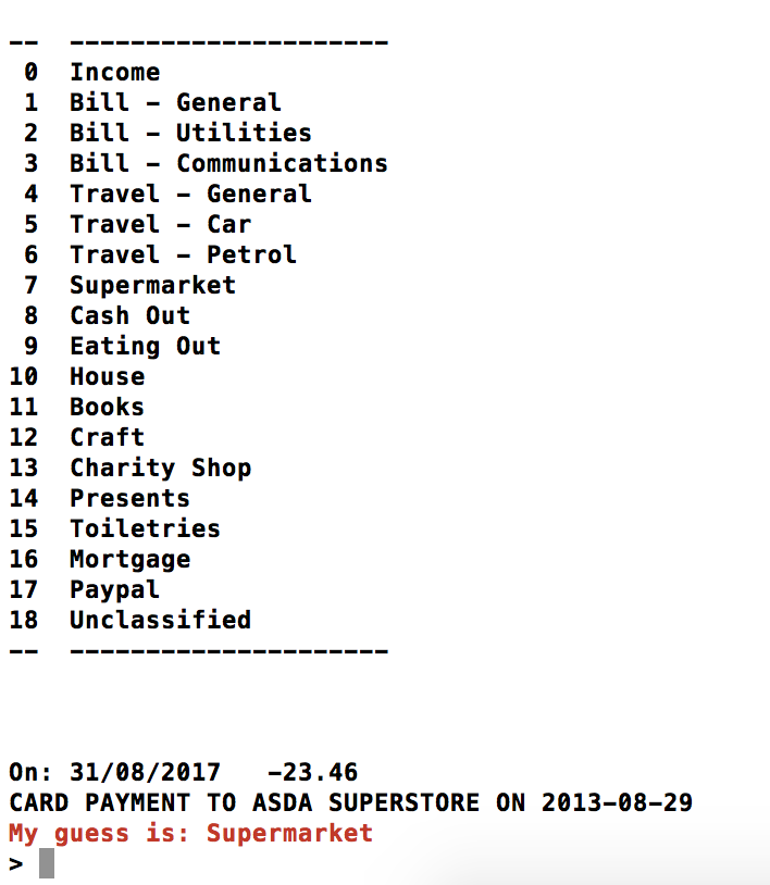
This is another entry in my ‘Previously Unpublicised Code’ series – explanations of code that has been sitting on my Github profile for ages, but has never been discussed publicly before. This time, I’m going to talk about BankClassify a tool for classifying transactions on bank statements into categories like Supermarket, Eating Out and Mortgage automatically. It is an interactive command-line application that looks like this:
For each entry in your bank statement, it will guess a category, and let you correct it if necessary – learning from your corrections.
I’ve been using this tool for a number of years now, as I never managed to find another tool that did quite what I wanted. I wanted to have an interactive classification process where the computer guessed a category for each transaction but you could correct it if it got it wrong. I also didn’t want to be restricted in what I could do with the data once I’d categorised it – I wanted a simple CSV output, so I could just analyse it using pandas. BankClassify meets all my needs.
If you want to use BankClassify as it is written at the moment then you’ll need to be banking with Santander – as it can only important text-format data files downloaded from Santander Online Banking at the moment. However, if you’ve got a bit of Python programming ability (quite likely if you’re reading this blog) then you can write another file import function, and use the rest of the module as-is. To get going, just look at the README in the repository.
So, how does this work? Well it uses a Naive Bayesian classifier – a very simple machine learning tool that is often used for spam filtering (see this excellent article by Paul Graham introducing its use for spam filtering). It simply splits text into tokens (more on this later) and uses training data to calculate probabilities that text containing each specific token belongs in each category. The term ‘naive’ is used because of various naive, and probably incorrect, assumptions which are made about independence between features, using a uniform prior distribution and so on.
Creating a Naive Bayesian classifier in Python is very easy, using the textblob package. There is a great tutorial on building a classifier using textblob here, but I’ll run quickly through my code anyway:
First we load all the previous data from the aptly-named AllData.csv file, and pass it to the _get_training function to get the training data from this file in a format acceptable to textblob. This is basically a list of tuples, each of which contains (text, classification). In our case, the text is the description of the transaction from the bank statement, and the classification is the category that we want to assign it to. For example ("CARD PAYMENT TO SHELL TOTHILL,2.04 GBP, RATE 1.00/GBP ON 29-08-2013", "Petrol"). We use the _extractor function to split the text into tokens and generate ‘features’ from these tokens. In our case this is simply a function that splits the text by either spaces or the '/' symbol, and creates a boolean feature with the value True for each token it sees.
Now we’ve got the classifier, we read in the new data (_read_santander_file) and the list of categories (_read_categories) and then get down to the classification (_ask_with_guess). The classification just calls the classifier.classify method, giving it the text to classify. We then do a bit of work to nicely display the list of categories (I use colorama to do nice fonts and colours in the terminal) and ask the user whether the guess is correct. If it is, then we just save the category to the output file – but if it isn’t we call the classifier.update function with the correct tuple of (text, classification), which will update the probabilities used within the classifier to take account of this new information.
That’s pretty-much it – all of the rest of the code is just plumbing that joins all of this together. This just shows how easy it is to produce a useful tool, using a simple machine learning technique.
Just as a brief aside, you can do interesting things with the classifier object, like ask it to tell you what the most informative features are:
Most Informative Features
                      IN = True           Cheque : nan    =      6.5 : 1.0
              UNIVERSITY = True           Cheque : nan    =      6.5 : 1.0
                 PAYMENT = None           Cheque : nan    =      6.5 : 1.0
                COWHERDS = True           Eating : nan    =      6.5 : 1.0
                    CARD = None           Cheque : nan    =      6.5 : 1.0
                  CHEQUE = True           Cheque : nan    =      6.5 : 1.0
        TICKETOFFICESALE = True           Travel : nan    =      6.5 : 1.0
             SOUTHAMPTON = True           Cheque : nan    =      6.5 : 1.0
                   CRAFT = True            Craft : nan    =      4.3 : 1.0
                     LTD = True            Craft : nan    =      4.3 : 1.0
                   HOBBY = True            Craft : nan    =      4.3 : 1.0
                    RATE = None           Cheque : nan    =      2.8 : 1.0
                     GBP = None           Cheque : nan    =      2.8 : 1.0
              SAINSBURYS = True           Superm : nan    =      2.6 : 1.0
                WAITROSE = True           Superm : nan    =      2.6 : 1.0
Here we can see that tokens like IN, UNIVERSITY, PAYMENT and SOUTHAMPTON are highly predictive of the category Cheque (as most of my cheque pay-ins are shown in my statement as PAID IN AT SOUTHAMPTON UNIVERSITY), and that CARD not existing as a feature is also highly predictive of the category being cheque (fairly obviously). Names of supermarkets also appear there as highly predictive for the Supermarket class and TICKETOFFICESALE for Travel (as that is what is displayed on my statement for a ticket purchase at my local railway station). You can even see some of my food preferences in there, with COWHERDS being highly predictive of the Eating Out category.
So, have a look at the code on Github, and have a play with it – let me know if you do anything cool.
This is another post that I found sitting in my drafts folder… It was written by my wife while she was doing her Computer Science MSc about 18 months ago. I expect that most of what she says is still correct, but things may have changed since then. Also, please don’t comment asking questions about Android and OpenCV – I have no experience with it, and my wife isn’t writing for Android these days.
Hello, I’m Olivia, Robin’s wife, and I thought I’d write a guest post for this blog about how to get Android and OpenCV playing nicely together.
Having just started writing for Android, I was astonished at the amount of separate tutorials I had to follow just to get started. It didn’t help that:
I had never programmed for Android
I had never programmed in Java (yes, I know)
I had never used a complex code building IDE
I needed to get OpenCV working with this
Needless to say I was a little flummoxed by the sheer amount of things that I had to learn. The fact that methods can only have one return type still bewilders me (coming from a Python background, where methods can easily return loads of different objects, of all sorts of different types).
So for those of you who are in a similar situation I thought I’d provide a quick start guide which joins together the tutorials I found the best to create your first Android app using OpenCV.
First things first, you will need to have the following downloaded:
Android Studio (when installing pretty much tick everything, just to make sure!)
First start by following Google’s first Android tutorial Building Your First App through to Starting Another Activity (if you get to Supporting different devices then you’ve gone too far). This takes you through setting up a project, the files you will need to edit, setting up an emulator (or using a actual Android device), running the app, creating a user interface, and possibly most importantly Android ‘Activities’. It also gives a brilliant introduction in the sidebars into the concepts involved. If you just want to get things working with OpenCV the only parts you need to follow is up to Running Your Application.
To get OpenCV working within Android Studio you need to have unzipped the download. Then follow the instructions from this blog post, using whichever OpenCV version you have. This should get everything set up properly, but now we need to check everything has worked and that our app compiles.
Add these import statements at the top of your activity file:
If you now try and run this, it should work, if it doesn’t it may suggest that OpenCV isn’t properly loaded. If this doesn’t work, then the comments on this blog post are fairly comprehensive – your problem has probably already been solved!
If you understand all of this and just want to have a ready made ‘project template’ to use all of this then I have put one together at https://github.com/oew1v07/AndroidOpenCVTemplate where all the libraries are already in the required folders. To get this working follow these steps:
Clone the repository using git clone https://github.com/oew1v07/AndroidOpenCVTemplate.git
Open Android Studio and choose Open an existing Android Studio project
Navigate to the cloned folder and click Open.
Using the Project button on the left side navigate to Gradle Scripts/build.gradle(Module: app). The settings here are not necessarily the ones that you will want to use. The following example from here shows in blue the areas you might want to change.
compileSdkVersion is the Android version you wish to compile for
buildToolsVersion are the build tools version you want to use
minSdkVersion is the minimum Android version you want the app to run under
targetSdkVersion is the version that will be the mostly commonly used.
applicationId should reflect the name of your app. However this is very difficult to change after the initial setting up. The one in the cloned repository is com.example.name.myapplication. Should you wish to change this there is a list of places you would need to edit, in a list at the bottom of this article.
In the file local.properties you need to change sdk.dir to the directory where the Android SDK is installed on your computer.
Once this is finished you should be able to run it with no problems, and it should display a text message saying “Elmer is the best Elephant of them all!” (for an explanation of this message, see here)
Hopefully this was helpful to other people in a similar situation to me – and brought all of the various tutorials together.
List of places to change app name
These files and folders can be navigated from the cloned repository.
Where
What to change
What to change it to
app/build.gradle
com.example.name.myapplication
Whatever you want this to be called. Generally something along the lines of com.example.maker.appname
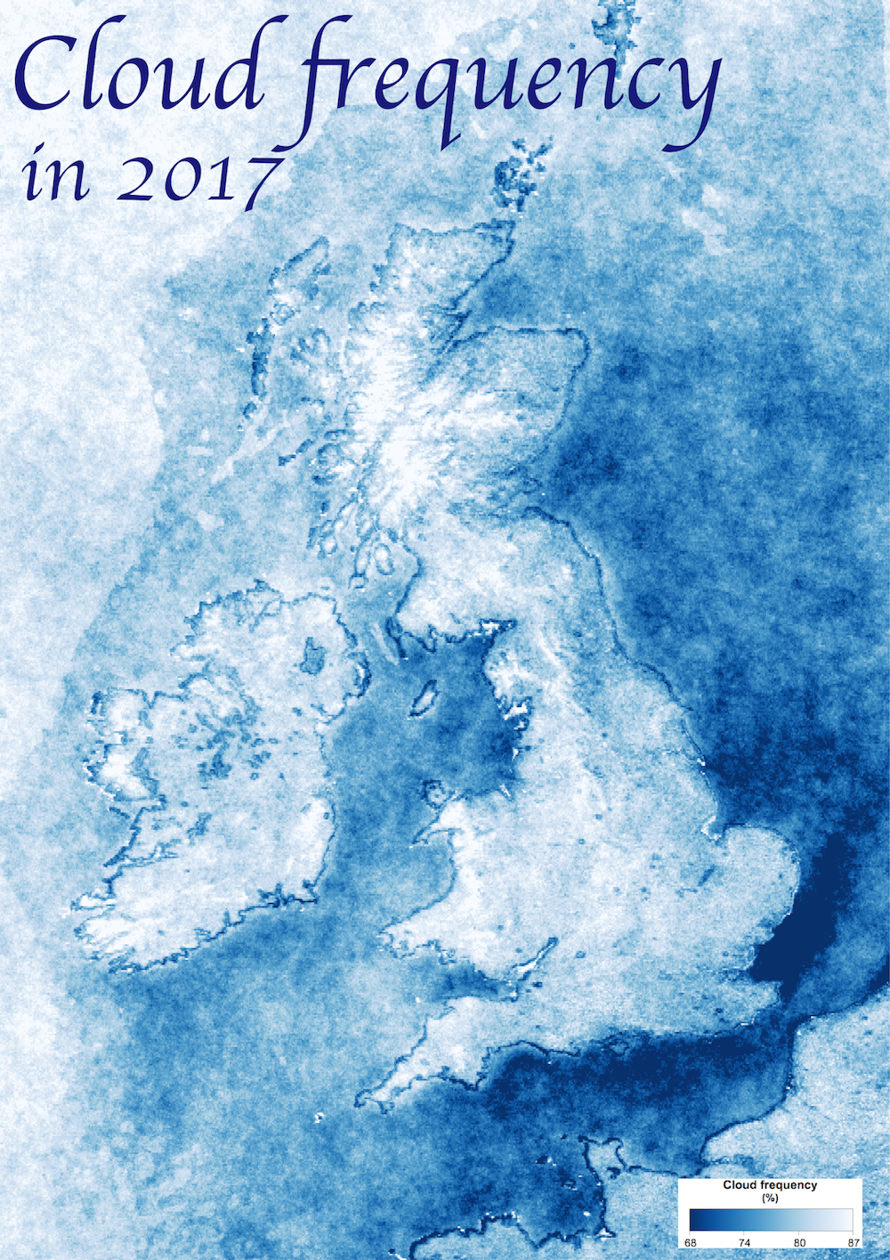
I’ve posted before about the cloud frequency map that I created using Google Earth Engine. This post is just a quick update to mention a couple of changes.
Firstly, I’ve produced some nice pretty maps of the data from 2017 over Europe and the UK respectively. I posted the Europe one to the DataIsBeautiful subreddit and got quite a few upvotes, so people obviously liked the visualisation. The two maps are below – click on the images to get the full resolution copies.
Interestingly, you can see quite a lot of artefacts around the coast – particularly in the UK one. I think this is a problem with the algorithm that occurs around coasts – or at least discontinuities from the different algorithms used over land and water.
This is an old post that I found stuck in my ‘drafts’ folder – somehow I never got round to clicking ‘publish’. I attended EGU in 2016, and haven’t been back since – so things may have changed. However, I suspect that the majority of this post is still correct.
Right, so, in case you hadn’t guessed from the title of this post: I use a wheelchair. I won’t go into all of the medical stuff, but in summary: I can’t walk more than about 100m without getting utterly exhausted, so I use an electric wheelchair for anything more than that. This has only happened relatively recently, and I got my new electric wheelchair about a month ago.
For a number of years I’d been trying to go to either the European Geophysical Union General Assembly (EGU) or the American Geophysical Union Fall Meeting (AGU), but I either hadn’t managed to get any funding, or hadn’t been well enough to travel.
This year, I’d had two talks accepted for oral presentation at EGU, and had also managed to win the Early Career Scientists Travel Award, which would pay my registration fees. So, if I was going to go, then this year was the right time to do it… I decided to ‘bite the bullet’ and go – and it actually went very well.
However, before I went I was quite worried about the whole process: I hadn’t flown with my wheelchair before, I didn’t know how accessible the conference centre would be, I was worried about getting too tired, or getting rude comments about being in a wheelchair, and so on. The rest of this post is going to be very detailed – and some of you may wonder why on earth I’ve gone in to so much detail. The reason is explained very well in this post by Hannah Ensor:
Friends, family – and even strangers – often want to be supportive. The most common phrase is: “Don’t worry, I’m sure it will be fine.” After all, accessibility is a legal requirement so that shouldn’t be a problem. And you want to make me feel better about the trip.
But think about it: Do you really understand all my needs and differences, and have an equally detailed knowledge and of everything that might present challenges, and suitable solutions to each one from the moment I leave my home until I return to it again? Have you inspected the accessible loos and checked the temperature control in the rooms? Do you realise how many places that call themselves ‘accessible’ have steps to the bathroom or even steps to the entrance?
Most of the information I could find before going was of this ‘everything will be fine; it is accessible’ type – and so that’s why I am putting all of the details in this post: hopefully it will make someone else’s life far easier in the future. Although I’m writing primarily from the point of view of a wheelchair user, I’ve also tried to think about some of the issues that people with other disabilities may experience.
I’ll start with the things that will be most generally applicable – in this case, the venue. EGU is held at the Austria Centre Vienna, close to the Danube in Vienna. The EGU website helpfully stated “The conference centre is fully-accessible”, but gave no further details – and most disabled people have learnt from painful experience not to trust these sorts of statements.
Luckily, that statement was actually true. Most people will get to the conference centre from the local U-bahn station (Kaisermühlen-VIC – which, like all of the U-bahn stations, has lifts to each platform) or one of the local hotels. There are various sets of steps along the paths leading to the conference centre, but there are always nice long sloping ramps provided too:
The entrance to the conference centre is large and flat. There are automatic doors into the ‘entrance hall’, and then push/pull doors into the conference centre itself (they are possible to open in a wheelchair, but most of the time people held them open for me).
Some of the poster halls are in a separate building (although they can be accessed by an underground link from the main conference centre). The entrance here isn’t totally flat: there is a small, but significant bump (‘mini step’) which my electric wheelchair didn’t like. Going in the door backwards worked, but that can be a bit difficult if there are lots of people around.
Each floor of the conference centre is entirely on the level, and there are multiple sets of lifts (two in each set, and I think there are three locations in the buildings):
The lifts are of a reasonable size, with enough space for me to turn my wheelchair around inside them. I could reach the buttons inside the lifts, but people who have shorter arms than me might struggle to reach from their chair. Also, as far as I could see, there were no braille markings on any of the buttons, which would make it difficult for a visually-impaired person to use the lifts.
The other minor issue with the lifts was that it was sometimes difficult to reach the call buttons for the lifts, as a set of recycling bins were usually located directly in front of the call buttons (I have no idea why…). I could reach ok most of the time, but people with shorter arms than me would struggle.
One thing that you may have noticed from the pictures above is how well-signed everything is: this was a really pleasing aspect of the conference organisation. As you may also have noticed from the maps, the building is symmetrical in a number of axes, so it could be hard to work out where you were (everything kinda looked the same…) – so the maps and signs were much appreciated!
The rooms that were actually used for the talks varied significantly in size from small ‘classroom/seminar room’ size to large ‘auditorium’ size. I didn’t manage to get many photos of the rooms because I was usually busy either listening to a talk or giving a talk, but here is an example of one of the smaller rooms:
As you can see, the floor is entirely flat here, so it is very easy to get anywhere you need to get to. When listening to talks in these sorts of rooms I tended to place my wheelchair at the end of one of the rows of seats, or – if appropriate – ask someone to move one of the seats out of the way to give me space to fit into a row properly.
When I gave a talk in one of these sorts of rooms, I spoke from my wheelchair at the front of the room (directly underneath the projection screen), with a portable microphone and a remote to change the slides. I didn’t use the official lecturn as in my chair I would have been hidden entirely behind it – and I’m not sure the microphone would have reached properly!
I haven’t got a photo of any of the larger rooms, but they have a stage at the front – which obviously makes things a bit more difficult for wheelchair users. I was offered a range of ways to present in that room: from my wheelchair on the main floor (ie. not up on the stage), or walking up the stairs to the stage and presenting from a seat behind the lecturn, or presenting from a seat behind the convenor’s table on the stage. I chose the latter option, with a microphone and laptop to control the slides – but any of them would have worked.
Each time when trying to sort out the arrangements for my talk, I found the ‘people in yellow’ (the EGU assistants in yellow t-shirts who sort out the presentations, laptops and so on) to be very helpful in arranging anything I needed.
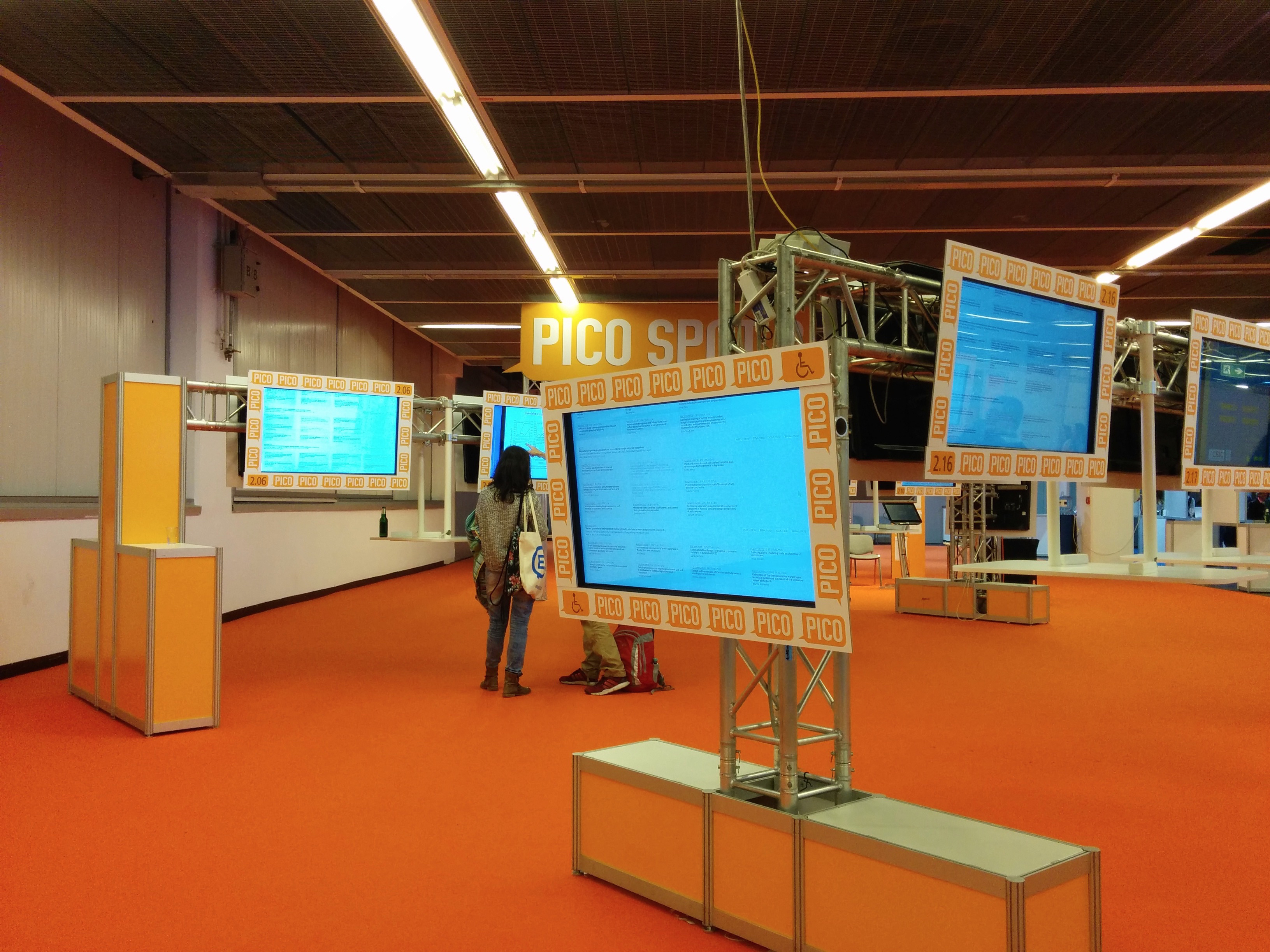
I didn’t do a PICO presentation, but I attended a number of PICO sessions, and was impressed to see that each ‘PICO Spot’ had a lower screen for wheelchair users:
The exhibition area was generally accessible with two unfortunate exceptions: both the Google Earth Engine stand and the EGU stand were on a raised platform about 3 inches off the floor…very frustrating! I expressed my frustration to the people on the EGU stand and was assured that this wouldn’t be the case next year. All of the rest of the stands were flat on the ground and I could access them very easily.
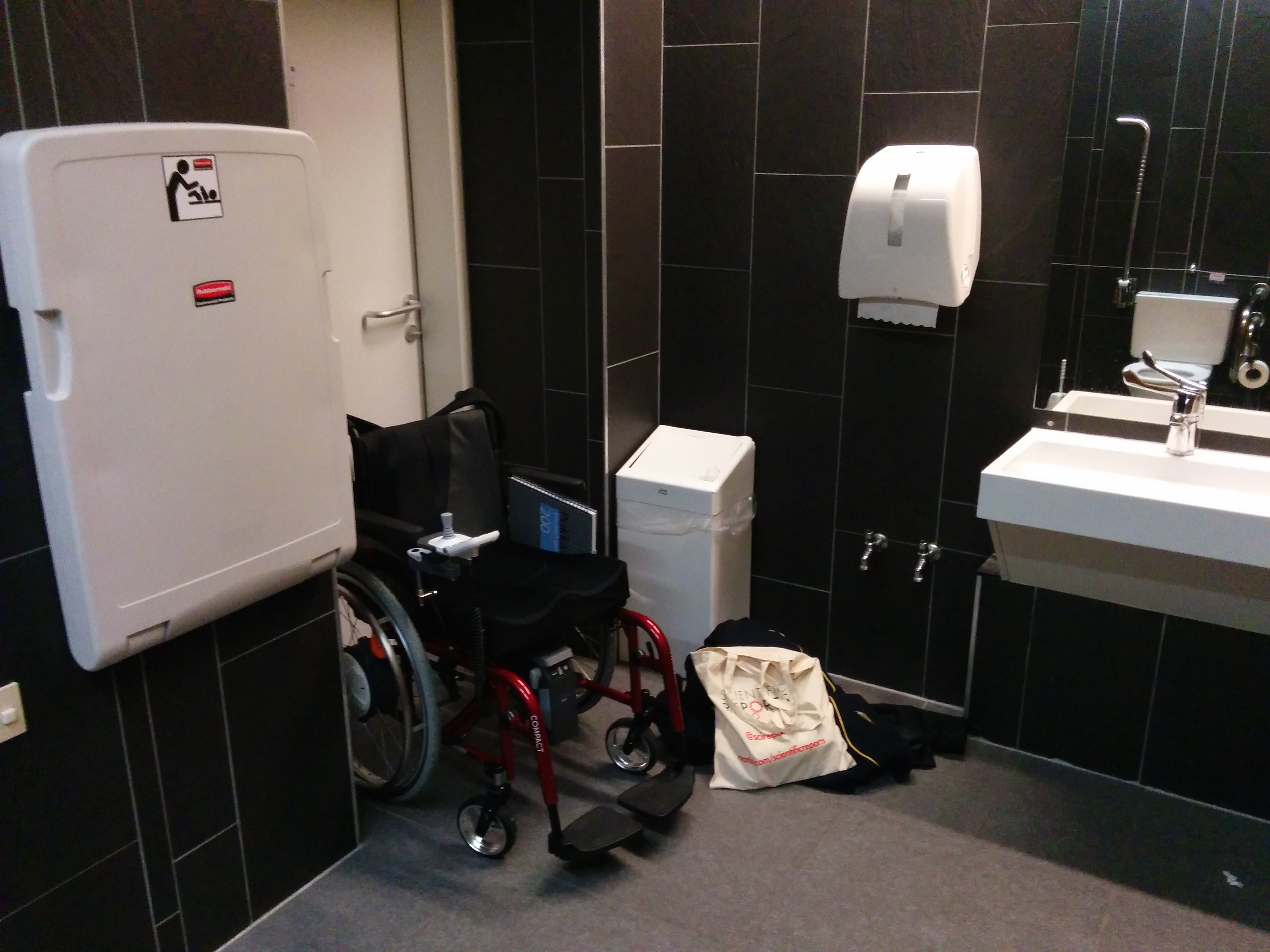
I’ve left one of the most important things to last…a real essential item: disabled toilets. As many disabled people will know, disabled toilets can leave a lot to be desired. However, I was generally impressed with the conference centre’s toilets:
It’s difficult to show the full size of the toilet without a fisheye lens, but they were large enough to get my wheelchair in and still have a fair amount of space to move around (far better than the sort of ‘disabled’ toilets that will barely fit a wheelchair!). They were also clean, nicely decorated, and had all of the extra handles and arm-rests that should be present. What’s more, the space next to the toilet itself was kept free so that if you needed to transfer directly from a chair to the toilet then that would be possible.
All of the toilets in the main part of the conference centre were like the example above – very impressive – but unfortunately the toilets in the other building (which contained poster halls X1-4) weren’t as good. They were still better than some toilets I’ve used, but they had turned into a bit of a store-room making them cluttered and difficult to manouvere around, and also stopping anyone from transferring directly from a chair to the toilet. In this building the disabled toilets were also located in such a way that the open door to the disabled toilet would block the entrance to one of the ‘normal’ toilets…and this means that when you open the door to come out of the toilet it is quite easy to almost knock someone over!
In summary, things worked remarkably well, and accessibility was good. I would have no hesitation in attending EGU again, and using my wheelchair while there.


 recipy: effortless provenance in Python