This has been a bit slow coming, but I am now sticking to my promise to write a Behind the paper post for each of my published academic papers. This is about:
Wilson, R. T., E. J. Milton, and J. M. Nield (2015). Are visibility-derived AOT estimates suitable for parameterising satellite data atmospheric correction algorithms? International Journal of Remote Sensing 36 (6) 1675-1688
Aerosol Optical Thickness (AOT) is a measure of how hazy the atmosphere is – that is, how easy it is for light to pass through it. It’s important to measure this accurately, as it has a range of applications. In this paper we focus on satellite image atmospheric correction. When satellites collect images of the Earth, the light has to pass through the atmosphere twice (once on the way from the sun to the Earth, once again on the way back from the Earth to the satellite) and this affects the light significantly. For example, it can be scattered or absorbed by various atmospheric constituents. We have to correct for this before we can use satellite images – and one of the ways to do that is to simulate what happens to light under the atmospheric conditions at the time, and then use this simulated information to remove the effects from the image.
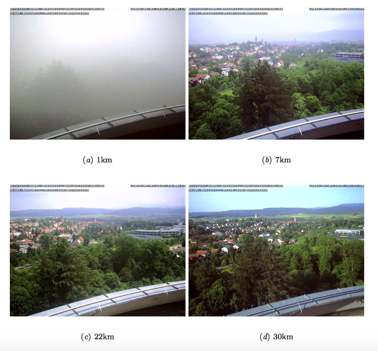
To do this simulation we need various bits of information on what the atmosphere was like when the image was acquired – and one of these is the AOT value. The problem is that it’s quite difficult to get hold of AOT values. There are some ground measurements sites – but only about 300 of them across the whole world. Therefore, quite a lot of people use measurements of atmospheric visibility as a proxy for AOT. This has many benefits, as loads of these measurements are taken (by airports, and local meteorological organisations), but is a bit scientifically questionable, because atmospheric visibility is measured horizontally (as in "I can see for miles!") and AOT is measured vertically. There are various ‘standard’ ways of estimating AOT from visibility – and some of these are built in to tools that do atmospheric correction of images – and I wanted to investigate how well these worked.
I used a few different datasets which had both visibility and AOT measurements, collected at the same time and place, and investigated the relationship. I found that the relationship was often very poor – and the error in the estimated AOT was never less than half of the mean AOT value (that is, if the mean AOT was 0.2, then the error would be 0.1 – not great!), and sometimes more than double the mean value! Simulating the effect on atmospheric correction showed that significant errors could result – and I recommended that visibility-derived AOT data should only be used for atmospheric correction as a last resort.
Key conclusions
Estimation of AOT from horizontal visibility measurements can produce significant errors.
Radiative transfer simulations using different models (eg. MODTRAN and 6S) with the same visibility may produce significantly different results due to the differing methods used for estimating AOT from visibility
Errors can be significant for both radiance values (significantly larger than the noise level of the sensor) and vegetation indices such as NDVI and ARVI.
Overall: other methods for estimating AOT should be used wherever possible – as they nearly all have smaller errors than visibility-based estimates – and great care should be taken at low visibilities, when the error is even higher.
Key results
Error in visibility-derived AOT is highest at low visibilities
Root Mean Square Error ranges from 1.05 for visibilities < 10km to 0.05 for visibilities > 40km
The error for low visibilities is many times the mean AOT at those visibilities (for example, an average error of 0.76 for visibilities < 10km, when the average AOT is only 0.38!)
Overall, MODTRAN appears to perform poorly compared to the other methods (6S and the Koschmieder formula) – and this is particularly pronounced at low visibilities
Atmospheric correction with these erroneously-estimate AOT values can produce significant errors in radiance, which range from three times the Noise Equivalent Delta Radiance to over thirty times the NEDR!
There can still be significant errors in vegetation indices (NDVI/ARVI), of up to 0.12 and 0.09 respectively.
I had always been a bit frustrated that lots of atmospheric correction tools required visibility as an input parameter – and wouldn’t allow you enter AOT even if you had an actual AOT measurement (eg. from an AERONET site or a Microtops measurement). I started to wonder about the error involved in the use of visibility rather than AOT – and did a very brief assessment of the accuracy as part of my investigation for the spatial variability paper. An extension of that accuracy assessment turned into this paper.
Data, Code & Methods
The good news is that the analysis performed for this paper was designed from the beginning to be reproducible. I used the R programming language, and the ProjectTemplate package to make this really nice and easy. All of the code is available on Github, and the README file there explains that all you need to do to reproduce the analysis is run:
source('go.r')
to initialise everything, install all of the packages etc. You can then run any of the files in the src directory to reproduce a specific analysis.
That’s all good news, so what is the bad news? Well, the problem with reproducing this work is that you need access to the data – and most of the data I used is only available to academics, or cannot be ‘rehosted’ by me. There are instructions in the repository showing how to get hold of the data, but it’s quite a complex process which requires registering with the British Atmospheric Data Centre, requesting access to datasets, and then downloading the various pieces of data.
This is a real pain, but there’s absolutely nothing I can do about it – sorry! I was really hoping I could use this as an example of reproducible research…but the data access situation makes that a bit difficult.
Continuing my series of code that I’ve written in the past, and stuck up on Github, but never actually talked about…this post is about PyMicrotops: a Python library for processing data from the Microtops Sun Photometer.
The Microtops (pictured above) measures light coming from the sun in a number of narrow wavebands, and then calculates various atmospheric parameters including the Aerosol Optical Thickness (AOT) and Precipitable Water Content (PWC). The instrument has it’s own built-in data logger, and the stored data can be downloaded by a serial connection to a computer (yes, it’s a fairly old – but very good – piece of kit!).
I’ve done a lot of work with Microtops instruments over the last few years, and put together the PyMicrotops library to help me. It’s functionality can be split into two main parts: downloading Microtops data from the instrument, and then processing the data itself.
Downloading the data from the Microtops instrument is difficult to do these days – as the original software provided by the manufacturer seems to no longer work. However, with PyMicrotops it is easy – just run read_microtops from the terminal, or the following snippet of Python code:
from PyMicrotops import Microtops
m = Microtops.read_from_serial('COM3', 'output_filename.csv')
Changing the port (you may want something like /dev/serial0 on Linux/Mac) and filename as appropriate).
Once you’ve read the data you can process it nice and easily in Python. If you read it using the Python code snippet above then you’ll already have the m object created, but if not then run the code below:
from PyMicrotops import Microtops

m = Microtops('filename.csv')
You can then do a range of useful tasks with the data, for example:
# Plot all of the AOT data
m.plot()
# Plot for a specific time period
m.plot('2014-07-10','2014-07-19')
# Get AOT at a specific wavelength - interpolating
# if needed, using the Angstrom coefficient
m.aot(550)
All outputs are returned as Pandas Series or DataFrames, and if you want to do more advanced processing then you can access the raw data read from the file as m.data.
PyMicrotops can be installed from PyPI by running pip install PyMicrotops, and the code is available on Github, which is also where any bug reports/feature requests should be posted.
My last post about my favourite ‘new’ (well, new to me) Python packages seemed to be very well received. I’ll post a ‘debrief’ post within the next few weeks, reflecting on the various comments that were made on Hacker News, Reddit and so on, but before that I want to post a slightly more personal post about my work with Python during the last year. It’s been quite a big year for me in terms of my Python work – so lets get started!
My packages
At the beginning of 2015 I had four modules published on PyPI; now I have seven! Lets have a look at each of them in turn:
Py6S
Py6S is my Python interface to the 6S Radiative Transfer Model (a model used to simulate how light passes through the atmosphere). It is a fairly specialist tool so will never get record numbers of downloads, but I’ve been impressed with number of users it has gained over the last year. It’s taken a while, but it seems to have started being used routinely by a range of scientists at various organisations including NASA!
The major change to Py6S in 2015 has been adding support for Python 3. This was actually meant to have been done in July 2014, but I think managed to make some sort of awful mistake with Git and revert the wrong commit… Anyway, it’s all working for Python 2 and Python 3 now! Most of the rest of the changes have just been small bugfixes, adding tests and so on.
Downloads in last month: ~1700
daterangeparser
daterangeparser is a module to parse, you guessed it…date ranges. For example, it will take something like ’20th – 29th July 2014′ and create two datetime objects to represent the start and end dates. I first released it in April 2012 and it reached 1.0 in October 2013. I haven’t used it much recently, but other people seem to have found it and started using it – and submitting bug reports and pull requests! This really shows one of the huge benefits of open-source code: I’ve done very little with the code, but I’ve had nine pull requests adding new functionality and fixing bugs, which is great! I’m really glad that others can benefit from it.
Downloads in last month: ~1700
recipy
recipy is a new module for reproducible research in Python which was first released in August 2015. I’ve explained the story behind recipy elsewhere, but in brief: I created the first version at the Collaborations Workshop 2015 Hack Day (which my team won!), and we worked to improve it, before presenting at EuroSciPy 2015. The best way to find out how it works is to watch the video of my talk at EuroSciPy 2015.
Anyway, recipy was the first time that anything I had created went ‘viral’ (well, in a relatively minor way!). There were a lot of tweets about it, and a good discussion on reddit, and this led to a lot of downloads, quite a few contributions, and even a Linux Journal article! Overall there have been over 200 commits, 7 merged PRs, 52 closed issues and 7 released versions – not bad for a module released only six months ago!
Downloads in the last month: ~8800
vanHOzone
I’ve already written a post about my implementation of the van Heuklon Ozone model – and this year I turned it into a proper package and released it on PyPI. Basically, I just got fed up with having to install it from git on new machines, as a lot of my scientific code requires it! It’s not particularly impressive – but it is useful to get a simple (computationally efficient) estimation of atmospheric ozone concentrations.
The only real change that I did this year was to make a conda package for it – see my previous post for details.
Downloads in the last month: ~110
Others
Two other modules of mine have been ticking along with no work done to them: PyProSAIL (an interface to the ProSAIL model of canopy reflectance) and bib2coins (a tool to convert from BibTeX to COINS metadata for inclusion on webpages). Whenever I’ve used them they’ve worked fine for me – and I assume that either no-one else is using them, or that everything is working fine for them too (probably the former!).
Downloads in the last month:Â ~260 and ~100 respectively
Conferences
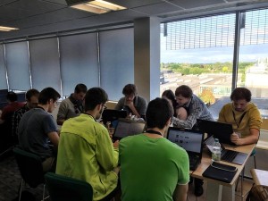
For the first time this year I attended a conference designed entirely for programmers (all the conferences I’ve attended before have been for academics)…and it was great! I really enjoyed myself at EuroSciPy 2015: lots of the talks were interesting, my talk seemed to go down well (I won one of the Best Talk awards!), I managed to contribute usefully during the sprints, I met loads of interesting people…and even took my wife with me and introduced her to the Python programming community (you can see us both in the photo below). She was very proud to contribute a couple of PRs to the scikit-image project.
My wife and I at the EuroSciPy skimage sprint (photo by Juan Nunez-Iglesias)
Things I’ve (finally) started using…
This year I have finally started doing various things that I should have been doing for many years. A non-exhaustive list includes:
I’m now using Python 3 by default (hooray!). I can blame one of my colleagues in the Flowminder team for this – he insisted that we should write our code for mobile phone data analysis in Python 3 (not even trying to support Python 2) and I agreed, and now haven’t looked back! I’m now trying to ensure that as much of my code as possible (and definitely all of my code released to PyPI) supports Python 3…and I always start with Python 3 by default. The only code that I haven’t yet moved to Python 3 is the main algorithm I developed during my PhD…not because it can’t be converted, but just because I’ve got more important things to do to the code at the moment, and as I’m the only person using it (at the moment…) it isn’t a major problem.
I’m writing code that conforms to PEP8…at long last! I was doing quite a lot of the ‘really stupidly obvious’ bits of PEP8 anyway, but I’m now trying to stick very closely to PEP8, and it has made a noticeable difference in terms of the readability of my code. I have chosen to ignore a few bits of PEP8 (such as the 80 character line length, which I find is too short by the time you’ve had a couple of levels of indentation), but overall I like it. I use the flake8 tool to check this, and the linter and linter-flake8 packages for Atom to automatically check it while I’m coding. I must admit that most of this is my wife’s ‘fault’, as she was introduced to PEP8 as a non-negotiable requirement for submitting PRs to skimage while she was at EuroSciPy, and never considered that there was another way to write Python code (I sometimes wondered if she thought Python would raise a NotPEP8Compliant exception if she didn’t use PEP8!), and so – like a lot of good things – I picked it up from her.
I’ve written a lot of Python code this year, and for the first time a lot of this code has been written in a team – so I’ve learnt a lot about how to write maintainable, understandable code – and what problems will come back and bite me later and should really be sorted at the beginning.
I’ve started blogging a lot more, and some of my blog posts have actually become quite popular (particularly my post about my favourite 5 ‘new’ Python packages). I’ve also started a series called Previously Unpublicised Code, in which I talk about various pieces of code that I’ve put on Github over the years but have never really publicised or talked about at all. This has forced me to tidy up a lot of my code on Github – and I’ve made it a rule that I won’t post about any code unless it has a README, a LICENSE, and is mostly PEP8-compliant.
So, that’s mostly what I’ve been up-to in 2015 from a Python perspective – what have you been doing in Python in 2015?
As I’ve been blogging a lot more about Python over the last year, I thought I’d list a few of my favourite ‘new’ Python modules from 2015. These aren’t necessarily modules that were newly released in 2015, but modules that were ‘new to me’ this year – and may be new to you too!
This module is so simple but so useful – it makes it stupidly easy to display progress bars for loops in your code. So, if you have some code like this:
for item in items:
    process(item)
Just wrap the iterable in the tqdm function:
from tqdm import tqdm

for item in tqdm(items):
    process(item)
and you’ll get a beautiful progress bar display like this: 18%|############ | 9/50 [00:09<;00:41, 1.00it/s
I introduced my wife to this recently and it blew her mind – it’s so beautifully simple, and so useful.
I had come across joblib previously, but I never really ‘got’ it – it seemed a bit of a mismash of various functions. I still feel like it’s a bit of a mishmash, but it’s very useful. I was re-introduced to it by one of my Flowminder colleagues, and we used it extensively in our data analysis code. So, what does it do? Well, three main things: 1) caching, 2) parallelisation, and 3) persistence (saving/loading data). I must admit that I haven’t used the parallel programming functionality yet, but I have used the other functions extensively.
The caching functionality allows you to easily ‘memoize’ functions with a simple decorator. This caches the results, and loads them from the cache when calling the function again using the same parameters – saving a lot of time. One tip for this is to choose the arguments of the function that you memoize carefully: although joblib uses a fairly fast hashing function to compare the arguments, it can still take a while if it is processing an absolutely enormous array (many Gigabytes!). In this case, it is often better to memoize a function that takes arguments of filenames, dates, model parameters or whatever else is used to create the large array – cutting out the loading of the large array and the hashing of that array on each call.
The persistence functionality is strongly linked to the memoization functions – as it is what is used to save the cached results to file. It basically performs the same function as the built-in pickle module (or the dill module – see below), but works really efficiently for objects that contain numpy arrays. The interface is exactly the same as the pickle interface (simple load and dump functions), so it’s really easy to switch over. One thing I didn’t realise before is that if you set compressed=True then a) your output files will be smaller (obviously!) and b) the output will all be in one file (as opposed to the default, which produces a .pkl file along with many .npy files).
I’ve barely scratched the surface of this library, but it’s been really helpful for doing quick visualisations of geographic data from within Python – and it even plays well with the Jupyter Notebook!
One of the pieces of example code from the documentation shows how easily it can be used:
You can easily configure almost every aspect of the map above, including the background map used (any leaflet tileset will work), point icons, colours, sizes and pretty-much anything else. You can visualise GeoJSON data and do choropleth maps too (even linking to Pandas data frames!).
Again, I used this in my work with Flowminder, but have since used it in all sorts of other contexts too. Just taking the code above and putting the call to simple_marker in a loop makes it really easy to visualise a load of points.
The example above shows how to save a map to a specified HTML file – but to use it within the Jupyter Notebook just make sure that the map object (map_1 in the example above) is by itself on the final line in a cell, and the notebook will work its magic and display it inline…perfect!
The first version of my ‘new’ module recipy (as presented at the Collaborations Workshop 2015) used MongoDB as the backend data store. However, this added significant complexity to the installation/set-up process, as you needed to install a MongoDB server first, get it running etc. I went looking for a pure-Python NoSQL database and came across TinyDB…which had a simple interface, and has handled everything I’ve thrown at it so far!
In the longer-term we are thinking of making the backend for recipy configurable – so that people can use MongoDB if they want some of the advantages that brings (being able to share the database easily across a network, better performance), but we’ll still keep TinyDB as the default as it just makes life so much easier!
dill is a better pickle (geddit?). You’ve probably used the built-in pickle module to store various Python objects to disk but every so often you may have received an error like this:
---------------------------------------------------------------------------
PicklingError                             Traceback (most recent call last)
<ipython-input-5-aa42e6ee18b1> in <module>()
----> 1 pickle.dumps(x)

PicklingError: Can't pickle <function <lambda> at 0x103671e18>: attribute lookup <lambda> on __main__ failed
That’s because the pickle object is relatively limited in what it can pickle: it can’t cope with nested functions, lambdas, slices, and more. You may not often want to pickle those objects directly – but it is fairly common to come across these inside other objects you want to pickle, thus causing the pickling to fail.
dill solves this by simply being able to pickle a lot more stuff – almost everything, in fact, apart from frames, generators and tracebacks. As with joblib above, the interface is exactly the same as pickle (load and dump), so it’s really easy to switch.
Also, for those of you who like R’s ability to save the entire session in a .RData file, dill has dump_session and load_session functions too – which do exactly what you’d expect!
This is a ‘bonus’ as it isn’t actually a Python module, but is something that I started using for the first time in 2015 (yes, I was late to the party!) but couldn’t manage without now!
Anaconda can be a little confusing because it consists of a number of separate things – multiple of which are called ‘Anaconda’. So, these are:
A cross-platform Scientific Python distribution – along the same lines as the Enthought Python Distribution, WinPython and so on. Once you’ve downloaded and installed it you get a full scientific Python stack including all of the standard libraries (numpy, scipy, pandas, matplotlib, sklearn, skimage…and many more). It is available in four flavours overall: Python 2 or Python 3, each of which has the option of the full Anaconda distribution, or the reduced-size Miniconda distribution. This leads nicely on to…
The conda package management system. This is designed to work with Python packages, but can be used for installing any binaries. You may think this sounds very much like pip, but it’s far better because a) it installs binaries (no more compiling numpy from source!), b) it deals with dependencies better, and c) you can easily create multiple environments which can have different packages installed and run different Python versions
The anaconda.org repository (previously called binstar) where you can create an account and upload binary conda packages to easily share with others. For example, I’ve got a couple of conda packages hosted there, which makes them really easy to install for anyone running conda.
So, there we go – my top five Python modules that were new to me in 2015. Hope you found it useful – and Merry Christmas and Happy New Year to you all!
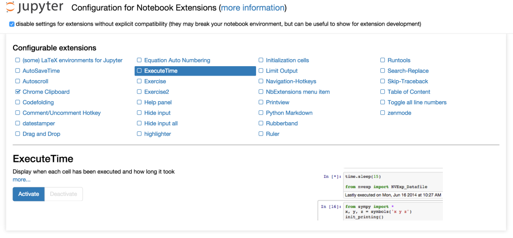
I wrote a post a few months ago about a couple of useful Jupyter (formerly known as IPython) notebook extensions, and commented that they were a bit of a pain to install. Well, I’ve found a great way to get around that problem – an extension called nbextensions that will help you manage your notebook extensions.
After installing it (see below for more about how to do this), you can go to a new URL in the notebook /nbextensions, and you get the wonderful page below (click to enlarge):
Here you can browse through a list of extensions, read their documentation and enable/disable them – all very easily.
Installing the nbextensions can be a little tricky, but there are detailed instructions at the nbextensions Github page. I’ve tried to make it easier by building a conda package which you can install by running:
I haven’t tested this on many other computers – so beware that it may not work for you, and it will definitely only work on Jupyter 4.0 or newer (there are instructions on the nbextensions github page for how to get it working with IPython 2.0 and 3.0). Let me know if this package works for you – and enjoy your new extensions!
Slightly boringly, this very similar to my last post – but it’s also something useful that you may want to know, and that I’ll probably forget if I don’t write it down somewhere.
I run convolutions a lot on satellite images, and Landsat images are around 8000 x 8000 pixels. Using a random 8000 x 8000 pixel image, with a 3 x 3 kernel (a size I often use), I find that convolve2d takes 2.9 seconds, whereas convolve takes 1.1 seconds – a useful speedup, particularly if you’re running a loop of various convolutions. The same sort of speed-up can be seen with larger kernel sizes, for example, a 9 x 9 kernel takes 14.7 seconds and 6.8 seconds – an even more useful speed-up.
When I switched my code from convolve2d to convolve, I had to do a bit of playing around to get the various options set to ensure that I got the same results. For reference, the following two lines of code are equivalent:
Interestingly these functions are both within scipy, so there must be a reason for them both to exist. Can anyone enlighten me? My naive view is that they could be merged – or if not, then a note could be added to the documentation saying that convolve is far faster!
This entry in my series covers manifestoclouds: my code for producing word clouds from political party manifestos.
This is very simple, generic code that just ties together a few libraries – and is by no means restricted to just political party manifestos – but I keep it around because I find it useful occasionally. I use the Python WordCloud library and matplotlib to produce the word clouds – after manually extracting the text from the PDFs using one of a myriad of tools depending on your platform.
The results look quite nice – and the results for the political party manifestos are quite politically interesting:
Everyone is very focused on people and what the party will do, but there are some interesting differences. The Conservatives have the joint focus on continuing things they have been doing during their years in coalition, but also doing various new things now that they’re no longer ‘held back’ by the Lib Dems. The Green party focus a lot on local things, and have a focus on what the public (both in terms of people, and in terms of the public sector) can do. The Labour party are talking a lot about needs, but also talk about work more than the Tories (surprisingly!).
Anyway, ignoring the politics, the code is available on Github as usual.
Recently I’ve been investigating a key dataset in my research, and really seeking to understand what is causing the patterns that I see. I realised that it would be really useful if I could plot an interactive scatter plot in Python, and then hover over points to find out further information in them.
Putting this into more technical terms: I wanted a scatter plot with tooltips (or ‘hover boxes’, or whatever else you want to call them) that showed information from the other columns in the pandas DataFrame that held the original data.
I’m fairly experienced with creating graphs using matplotlib, but I have very little experience with other systems (although I had played a bit with bokeh and mpld3). So, I emailed my friend and colleague Max Albert, asking if he knew of a nice simple function that looked a bit like this:
# df is a pandas DataFrame with columns A, B, C and D
#
# scatter plot of A vs B, with a hover tool giving the
# values of A, B, C and D
plot(A, B, 'x')
# same, but only showing C (to deal with DataFrames with
# loads of columns)
plot(A, B, 'x', cols=['C'])
He got back to me saying that he didn’t know of a function that worked quite like that, but that it was relatively simple to do in bokeh – and sent some example code. I’ve now tidied that code up and created a function that is very similar to the example above.
My function is called scatter_with_hover, and using it, the two examples above would be written as:
You can pass all sorts of other parameters to the function too – such as marker shapes to use (circles, squares etc), a figure to plot on to, and any other parameters that the bokeh scatter function accepts (such as color, size etc).
Anyway, the code is available at this gist – feel free to use it in any way you want, and I hope it’s useful.
As a fellow of the Software Sustainability Institute, I have talked a lot about how important software is in science, and how we need to make sure we recognise its contribution. Writing good scientific software takes a lot of work, and can have a lot of impact on the community, but it tends not to be recognised anywhere near as much as writing papers. This needs to change!
Depsy, a new project run by ImpactStory, have developed an awesome new tool which allows you to investigate impact metrics for scientific software which has been published to the Python and R package indexes (PyPI and CRAN respectively). For example, if you go to the page for Py6S, you see something like this (click to enlarge):
This gives various statistics about my Py6S library, such as number of downloads, number of citations, and the PageRank value in the dependency network. However, far more importantly it gives the percentiles for each of these too. This is particularly useful for non-computing readers who may have absolutely no idea how many downloads to expect for a scientific Python library (what counts as "good"? 20 downloads? 20,000 downloads?). Here, they can see that Py6S is at the 89th percentile for downloads, 77th for citations and 84th for dependencies, and has an overall ‘impact’ percentile of 95%.
As well as making me feel nice and warm inside, this gives me some actual numbers to show that the time I spent on Py6S hasn’t been wasted, and it has actually had an impact. You can take this further and click on my name on the bottom left, and get to my metrics page, which shows that I am at the 91st percentile for impact…again something that makes me feel good, but can also be used in job applications, etc.
I won’t tell you how long I spent browsing around various projects and people that I know, but it was far too long, when I really should have been doing something else (fixing bugs in an algorithm, I think) instead.
Anyway, I thought I’d finish this post by summarising a few of the brilliant things about Depsy, and a few of the areas that could be improved. I’ve discussed all of the latter issues with the authors, and they are very keen to continue working on Depsy and improve it – and are currently actively seeking funding to do this. So, if you happen to have lots of money, please throw it their way!
So, great things:
The percentiles. I’ve talked about this above, but they’re really great. (I think percentiles should be used a lot more in life generally, but that’s another blog post…)
Their incredibly detailed about page, which links to huge amounts of information on how every statistic is calculated
The open-source code that powers it, which allows you to check their algorithms and hack around with it (yes, I did spend a little while checking to make sure that they weren’t vulnerable to Little Bobby Tables attacks)
The responsiveness of the development team: Jason and Heather have responded to my emails quickly, and taken on board lots of my comments already.
A few things that will be improved in the future, and a few more general concerns:
Currently they try to guess whether a library is research software or not, but it seems to get a fair few things wrong. I believe they’re actively working on this.
Citation searching is a bit dodgy at the moment. For example, it shows one citation for Py6S, but actually there is a paper on Py6S which has seven citations on Google Scholar. My idea for CITATION files could help them to link up packages and papers – so that’s another reason to add a CITATION file to your project!
Not all scientific software is in Python and R, or hosted on Github, so they are hoping to expand their sources in the future.
More generally, the issue with all metrics is that they never quite manage to capture what you’re interested in. Unfortunately, metrics are a fact of life in academia – but we need to be careful that we don’t start blindly applying ‘software impact metrics’ in unsuitable situations. Still, even if these metrics do start being used stupidly, they’re definitely better than the Impact Factor (after all, we know how they’re calculated for a start!)
So, enough waffling from me: go and check out Depsy, if you find any problems then post an issue on Github – and tell your friends!
This is just a brief public service announcement reporting something that I’ve just found: np.percentile is a lot faster than scipy.stats.scoreatpercentile – almost an order of magnitude faster in some cases.
Someone recently asked me why on earth I was using scoreatpercentile anyway – and it turns out that np.percentile was only added in numpy 1.7, which was released part-way through my PhD in Feb 2013, hence why the scipy function is used in some of my code.
In my code I frequently calculate percentiles from satellite images represented as large 2D numpy arrays – and the speed differences can be quite astounding:
Image size
scoreatpercentile
percentile
speedup
100
595us
169us
3.5x
1000
84ms
13ms
6.5x
3000
927ms
104ms
9x
8000
8s
1s
8x
As you can see, we get 3-4 times speedup for even small arrays (100 x 100, so 10,000 elements), and up to 8-9 times speedup for large arrays (tens of millions of elements).
Anyway, the two functions have very similar signatures and options – the only thing missing from np.percentile is the ability to set hard upper or lower limits – so it should be fairly easy to switch over, and it’s worth it for the speed boost!


